

The BUX design system offers a centralized source of truth for UI components, templates and guidelines, helping teams build consistent, scalable digital experiences at Ohio State.
But how did we arrive at these elements? What drove our thinking and our decisions? Our digital design principles aim to answer these questions and provide a guide for designers to follow as they expand on BUX’s core components to create custom solutions for individual units.
What are design principles?
Design principles are the foundation that guides decision-making and ensures the design system remains cohesive, usable and adaptable. Within BUX, they are high-level guidelines that articulate the “why” and “how” behind our design decisions. The design principles explain how we translated brand experience principles and brand visual guidelines into the core elements of the BUX design system.
On the Design Principles webpages, users will find detailed guidance, visual examples, and practical dos and don'ts across key areas such as color, fonts, webpage layout and more — helping teams apply these principles effectively in their work.
Why do they matter?
Think of the design principles as the compass that keeps the design system on course. They create a common ground, helping teams stay aligned with BUX, whether they are combining existing BUX components onto a web page or creating their own customized components.
While BUX offers a robust set of pre-built components and templates, some content may not conform to an existing pattern. For example, if a team needs to build a new storytelling component that doesn’t exist in the system, they can reference the design principles to guide decisions around stroke properties, color and font usage, and interaction behavior. Even though the component is custom, following the principles ensures it feels cohesive with existing BUX components and maintains brand integrity.
How are they reflected in BUX?
In BUX, design principles are reflected through thoughtful application of visual and structural elements. For example, look at the Card. Our font choices ensure readability and follow our typography standards. The image follows a standard image ratio to place emphasis on content in the image in a way that aligns with our photography guidelines. Design elements, like the decorative border, create a cohesive look and feel. Motion upon hovering encourages user interaction.
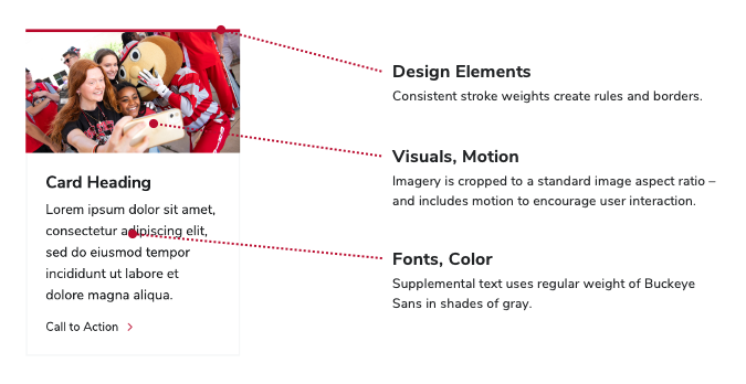 Several design principles are reflected in visual and structural elements of the Card component.
How does a BUX subscriber use these?
Each design principle is documented to provide clarity and direction. The following areas are available to explore:
- Color
- Design Elements
- Fonts
- Motion
- Visuals
- Webpage Layout
If your unit’s content does not conform to an existing BUX UI pattern —such as a component or template —please explore our design principles in detail on the Brand Center website to make consistent design choices.
View BUX Design Principles