Dark Mode
Dark mode switches from using light colored background with dark colored text to using dark colored backgrounds with light colored text. It is designed to be an alternative mode to the default (or light) mode.
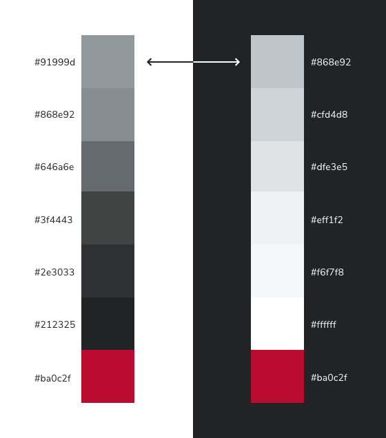 Primary colors values map from light mode (left) to their corresponding dark mode values (right).
Dark mode is designed to support comfort and usability across different environments and has become a standard user expectation.
- Supports accessibility by reducing glare and offering an alternative for users sensitive to bright interfaces.
- Improves user comfort in lowlight environments by providing a softer, less visually intense experience.
- Adapts to different device contexts, especially mobile, where users frequently switch between bright and dim settings.
By offering both light and dark modes, BUX helps ensure users can choose the interface that best fits their needs, preferences, and device contexts.
Considerations for media
To maintain a good user experience, review your website to ensure all logos, icons, and data remain legible in dark mode.
Logos
- Remove white backgrounds and use transparent backgrounds where possible.
- In your Site Footer, provide an alternate unit logo that works on a dark background. Check the DAM for approved unit logo variants (often included in .zip files).
Icons
- Confirm icons map from scarlet (light mode) to white (dark mode).
- If using BUX UI icons as a webfont, ensure icons inherit color from the theme.
- If using image-based icons (.jpg, .png, etc.), provide a dark mode version (white with transparent background) to display based on the active color mode.
Data visualizations and illustrations
- Review charts for visibility. Ensure strokes, fills, gridlines and labels have sufficient contrast with the background.
Photos
- No changes are required! Photos should remain natural and unchanged.
Implementation
Dark mode in BUX works automatically based on a user's device or browser settings. If a user has dark mode turned on at the system level, any application using BUX tokens will display the dark theme. No additional action is needed from the user or the implementing unit—BUX simply follows the device or browser preference.
As of the 1.5 release, the Sass color variables have been replaced with CSS variables. If your project includes any custom styling overrides in your codebase, you'll need to update those overrides to use the new CSS variables for dark mode to function correctly. Sass variables remain available for backwards compatibility, but they no longer control color behavior in dark mode. It is a one-to-one swap — for example, $scarlet becomes var(--scarlet).
These new variables are mapped to light and dark theme values and get updated automatically when the theme switches. If you need to manually override a color in dark mode, simply target the bux-dark-theme class that is applied to the top level of the DOM.
This documentation covers the how of dark mode in BUX products, including implementation patterns and considerations for media across interfaces. It translates design intent into practical, usable guidance.
For the underlying brand rationale — design principles, primary and utility color mapping, and the Scarlet decision tree — visit the Brand Center's dark mode documentation.
Explore Dark Mode Design Foundations in the Brand Center