
Dark mode has become an expectation in modern digital experiences — and BUX is evolving to meet it. Designing for dark mode requires more than a color inversion. Learn how BUX approaches dark mode through accessibility, usability and Ohio State brand principles.
With the introduction of dark mode in the BUX design system, this post focuses on the design principles and decisions that shaped how dark mode supports accessibility, usability and Ohio State's brand. And as it turns out, dark mode isn't as simple as flipping a switch.
True accessibility goes beyond inverting a color palette. It's about making sure every user, regardless of how they're viewing our product, has a clear and consistent experience. For BUX, that came with some unique challenges: Ohio State scarlet doesn't meet accessibility standards on dark backgrounds, our brand is rooted around a "light and bright" aesthetic and preserving the visual hierarchy our users have come to rely on required deliberate, careful decisions at every step.
The challenge with scarlet
The scarlet challenge required exploration. Did we lighten the red to more of a pink, hoping that it would still appear mostly red when surrounded by black? No, we tried that and to make it accessible requires a hot pink that absolutely no one would mistake for our beloved scarlet. Well, could we switch all that text and stuff to white? Yes, but now the entire website is grayscale with only images as pops of color. We still need to represent our brand. So we decided to keep scarlet in all the "decorative" places it already existed, like the lines above cards, and add in a scarlet nav bar so that every page could have at least a little scarlet right off the bat. In the end, scarlet was considered in each individual application and we developed a scarlet decision tree that allowed us to show our thinking for why each part of the webpage would appear light gray, white, scarlet or even bright blue.
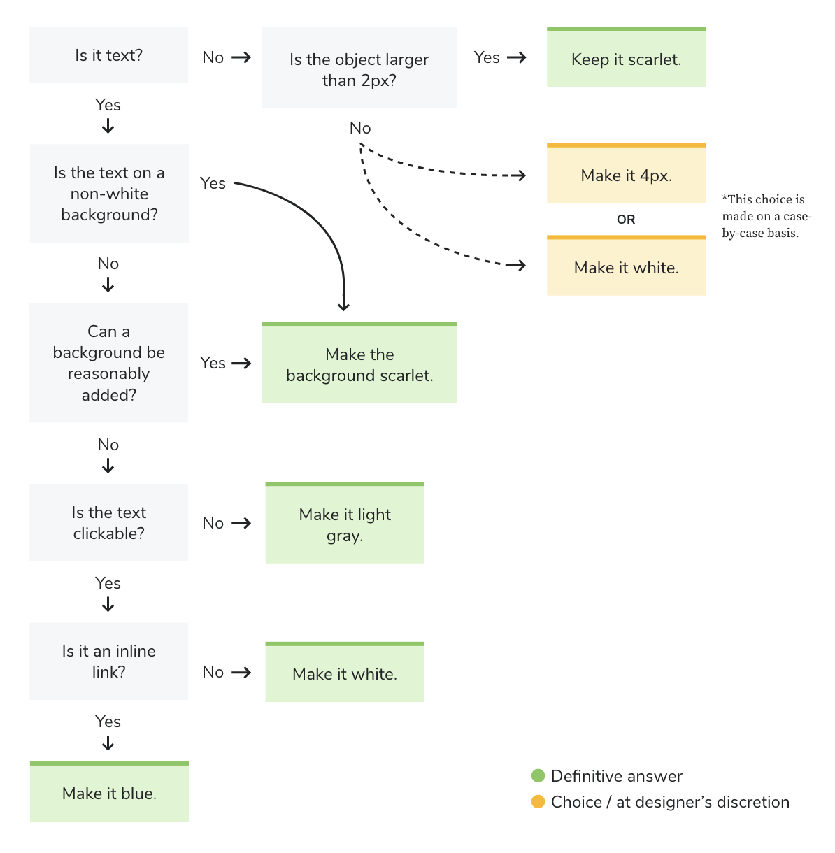 Starting from the top-left question, use this decision tree to determine when to apply scarlet, or use an alternative, based on content type, size, background and interactivity.
Blue?!
Yes, blue! As it turns out, we had issues making body copy links stand out. Before, they were scarlet. Now, following our decision tree, they would be white, and they didn't stand out at all from all the surrounding light gray body copy. After reviewing many websites with well-implemented dark modes, we saw some reputable brands with red as a primary color rely on blue for links, since blue is a widely recognized, universal link color. We explored multiple approaches, including white, bold, blue, and pink, and determined that blue was the best choice for our brand. We already used that exact shade of blue for accessibility purposes, specifically info banners and focus states, so it didn't feel too outside the box to assign text links that same color. Never fear, it's far more cyan than the blue of the state up North.
Images and graphics
Now we took all this knowledge, started applying it to mockups and templates and all went well... until we hit the images and graphics. Icons were the first to be noted, usually a 2px line art in scarlet. That was an easy CSS swap to white. Next, we spotted the logo, looking a bit grim and hard to read. A little more work, but it essentially just took swapping the block O outlines to white as well as the text of the logo. Lastly, while reviewing the templates, we found that the 404 page graphic of people jumping and forming an O-H-I-O was blending into the background a bit too much. This one got a special treatment, because we wanted to inject some scarlet, but still wanted the shape to be distinct from the background, so the final result was a scarlet graphic with a white outline. As other live websites strive to incorporate dark mode, considerations will have to be made for things like images with clear backgrounds, logos, graphics, and charts to ensure they all remain visible without being eye-searingly bright on a now-dark page.
Testing, testing
Now that BUX dark mode has moved from ideas and mockups into templates, live components and even through a rigorous accessibility review, we wanted to get some final thoughts from real users before we launched. Diane Meves set up one-on-one tests that recorded their impressions and reactions. Because dark mode will only appear if a user has their preferences set for it, we intentionally chose participants that frequently used and liked dark mode on other websites and applications.
That testing surfaced several clear takeaways:
- Dark mode met the general expectations of frequent dark mode users, earning an average score of 4.5 / 5
- Readability scored slightly lower at ~ 4 / 5, reinforcing previously flagged template issues while also revealing new opportunities for refinement
- Users immediately recognized the OSU brand despite the reduced use of scarlet, resulting in another 4.5 / 5 rating
- Overall feedback confirmed readiness for launch, with only minor tweaks remaining
For more details
If you're interested in the "why" behind our color choices and how they align with Ohio State's brand, you can find that guidance in the Color section of the Brand Center. If you're looking for more hands‑on, technical guidance, including best practices and implementation details, head to the Dark Mode page on the BUX website. And if you have more specific questions, feel free to reach out to us at bux@osu.edu.