Featured Card
With high visual emphasis, a Featured Card displays content and an action about a single subject.
A Featured Card is often used on a Landing page layout, such as a homepage, campaign page or section index page, but can be used simply to break up the monotony of long-form content.
An event variant of a Featured Card is often used for a single event that is of high-priority, high-impact, popular, or time-sensitive.
Examples
Right Image
Featured Card Heading
Lorem ipsum dolor sit amet, consectetur adipiscing elit, sed do
eiusmod tempor incididunt ut labore et dolore magna aliqua.
Call to Action

<div
  class="bux-featured-card bux-grid bux-grid--no-gutters bux-featured-card--image-right"
>
  <div
    class="bux-featured-card--wrapper bux-grid__cell bux-grid__cell--12 bux-grid__cell--5@md"
  >
    <div class="bux-card bux-card--featured" role="group" aria-label="Card">
      <a class="bux-card__link" href="#" aria-hidden="true" tabindex="-1"></a>

      <div class="bux-card__content">
        <h2 class="bux-card__heading">
          <span>Featured Card Heading</span>
        </h2>

        <div class="bux-card__body">
          Lorem ipsum dolor sit amet, consectetur adipiscing elit, sed do
          eiusmod tempor incididunt ut labore et dolore magna aliqua.
        </div>

        <a class="bux-button bux-button--alt" href="#">Call to Action</a>
      </div>
    </div>
  </div>

  <div
    class="bux-featured-card--image bux-grid__cell bux-grid__cell--12 bux-grid__cell--7@md"
  >
    <img
      class="bux-image"
      src="https://bux.osu.edu/img/example-images/osu-bux-2.jpg"
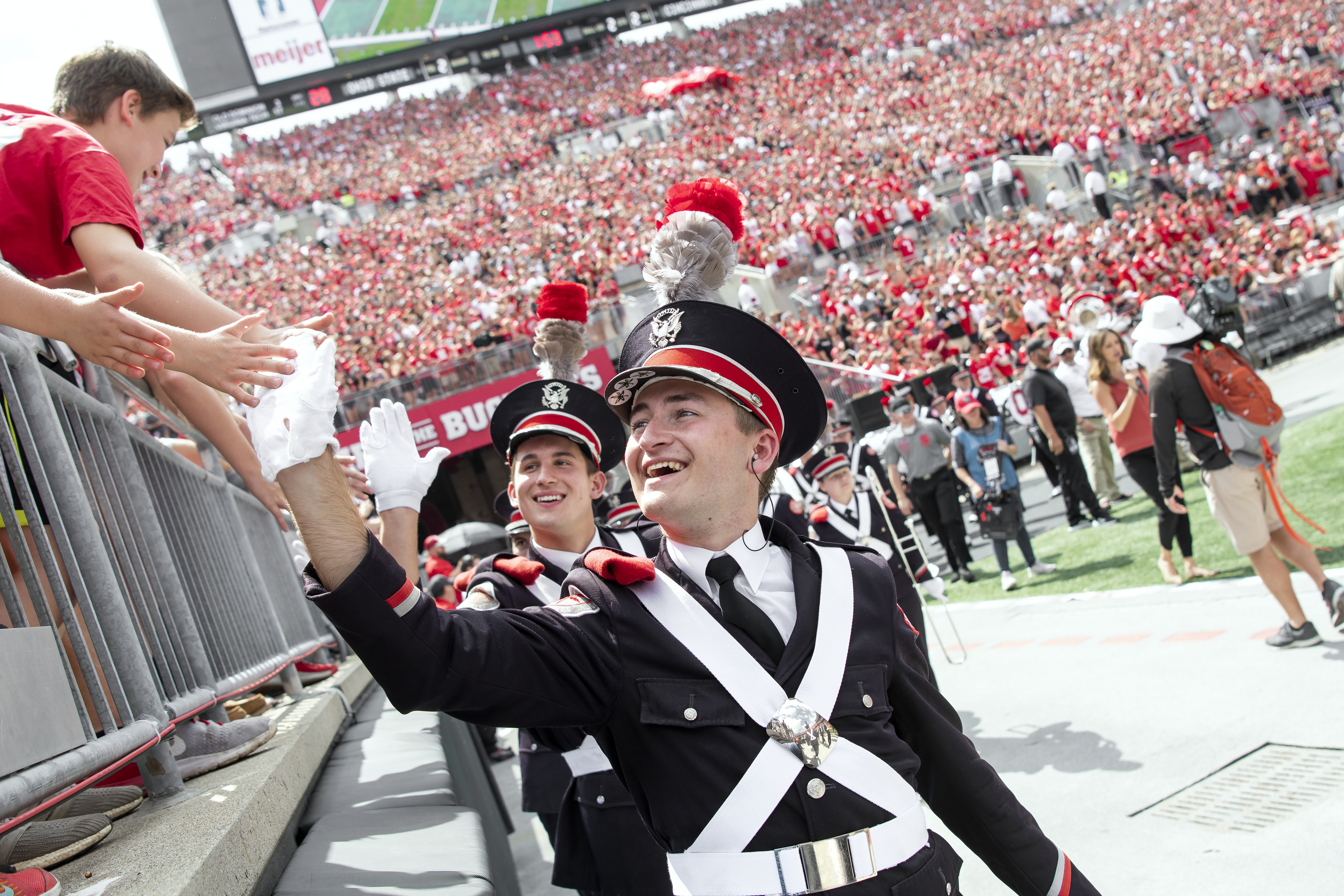
      alt="A marching band member high-fiving a crowd"
    />
  </div>
</div>
{#
Buckeye UX - version 1.2.0
Copyright (C) 2025 The Ohio State University
#}

{#

Featured Card

This component uses the card with the 'featured' modifier as a sub-component.

Available variables:

- image_position:       Sets the position of the featured card image. Either
                        'left' or 'right'.

See the 'card' component for variables to be passed into the card.

#}

<div class="bux-featured-card bux-grid bux-grid--no-gutters {% if image_position %} bux-featured-card--image-{{image_position}} {% endif %}">

  <div class="bux-featured-card--wrapper bux-grid__cell bux-grid__cell--12 bux-grid__cell--5@md">
    {% if modifier == "event" %}
        {% include base_path ~ directory ~ bux ~ '/twig/card--event-no-image.twig' %}
    {% else %}
        {% include base_path ~ directory ~ bux ~ '/twig/card.twig' %}
    {% endif %}
  </div>

  <div class="bux-featured-card--image bux-grid__cell bux-grid__cell--12 bux-grid__cell--7@md">
    {% include base_path ~ directory ~ bux ~ '/twig/image.twig' %}
  </div>

</div>
Left Image
Featured Card Heading
Lorem ipsum dolor sit amet, consectetur adipiscing elit, sed do
eiusmod tempor incididunt ut labore et dolore magna aliqua.
Call to Action

<div
  class="bux-featured-card bux-grid bux-grid--no-gutters bux-featured-card--image-left"
>
  <div
    class="bux-featured-card--wrapper bux-grid__cell bux-grid__cell--12 bux-grid__cell--5@md"
  >
    <div class="bux-card bux-card--featured" role="group" aria-label="Card">
      <a class="bux-card__link" href="#" aria-hidden="true" tabindex="-1"></a>

      <div class="bux-card__content">
        <h2 class="bux-card__heading">
          <span>Featured Card Heading</span>
        </h2>

        <div class="bux-card__body">
          Lorem ipsum dolor sit amet, consectetur adipiscing elit, sed do
          eiusmod tempor incididunt ut labore et dolore magna aliqua.
        </div>

        <a class="bux-button bux-button--alt" href="#">Call to Action</a>
      </div>
    </div>
  </div>

  <div
    class="bux-featured-card--image bux-grid__cell bux-grid__cell--12 bux-grid__cell--7@md"
  >
    <img
      class="bux-image"
      src="https://bux.osu.edu/img/example-images/osu-bux-2.jpg"
      alt="A marching band member high-fiving a crowd"
    />
  </div>
</div>
{#
Buckeye UX - version 1.2.0
Copyright (C) 2025 The Ohio State University
#}

{#

Featured Card

This component uses the card with the 'featured' modifier as a sub-component.

Available variables:

- image_position:       Sets the position of the featured card image. Either
                        'left' or 'right'.

See the 'card' component for variables to be passed into the card.

#}

<div class="bux-featured-card bux-grid bux-grid--no-gutters {% if image_position %} bux-featured-card--image-{{image_position}} {% endif %}">

  <div class="bux-featured-card--wrapper bux-grid__cell bux-grid__cell--12 bux-grid__cell--5@md">
    {% if modifier == "event" %}
        {% include base_path ~ directory ~ bux ~ '/twig/card--event-no-image.twig' %}
    {% else %}
        {% include base_path ~ directory ~ bux ~ '/twig/card.twig' %}
    {% endif %}
  </div>

  <div class="bux-featured-card--image bux-grid__cell bux-grid__cell--12 bux-grid__cell--7@md">
    {% include base_path ~ directory ~ bux ~ '/twig/image.twig' %}
  </div>

</div>
Event
Sept.
23

<div
  class="bux-featured-card bux-grid bux-grid--no-gutters bux-featured-card--image-left"
>
  <div
    class="bux-featured-card--wrapper bux-grid__cell bux-grid__cell--12 bux-grid__cell--5@md"
  >
    <div
      class="bux-card bux-card--event"
      role="group"
      aria-label="Featured Event Card"
    >
      <a class="bux-card__link" href="#" aria-hidden="true" tabindex="-1"></a>

      <div class="bux-card--event__date--wrapper">
        <div class="bux-card--event__date">
          <div class="bux-card--event__date--month">Sept.</div>
          <div class="bux-card--event__date--day">23</div>
        </div>
      </div>

      <div class="bux-card__content">
        <span class="bux-card__taxonomy"> Optional topic </span>

        <h2 class="bux-card__heading">
          <a href="#" class="bux-card__heading--link">
            <span>Event Title</span>
          </a>
        </h2>

        <div class="bux-mar-top-sp-16">
          <dl class="bux-icon-dl bux-icon-dl--event">
            <div class="bux-icon-dl__item">
              <dt class="icon icon-clock">Time</dt>
              <dd>1:30 p.m. - 3:30 p.m.</dd>
            </div>
            <div class="bux-icon-dl__item">
              <dt class="icon icon-location-pin">Location</dt>
              <dd>BLIC / Library</dd>
            </div>
          </dl>
        </div>
      </div>
    </div>
  </div>

  <div
    class="bux-featured-card--image bux-grid__cell bux-grid__cell--12 bux-grid__cell--7@md"
  >
    <img
      class="bux-image"
      src="https://bux.osu.edu/img/example-images/osu-bux-2.jpg"
      alt="A marching band member high-fiving a crowd"
    />
  </div>
</div>
{#
Buckeye UX - version 1.2.0
Copyright (C) 2025 The Ohio State University
#}

{#

Featured Card

This component uses the card with the 'featured' modifier as a sub-component.

Available variables:

- image_position:       Sets the position of the featured card image. Either
                        'left' or 'right'.

See the 'card' component for variables to be passed into the card.

#}

<div class="bux-featured-card bux-grid bux-grid--no-gutters {% if image_position %} bux-featured-card--image-{{image_position}} {% endif %}">

  <div class="bux-featured-card--wrapper bux-grid__cell bux-grid__cell--12 bux-grid__cell--5@md">
    {% if modifier == "event" %}
        {% include base_path ~ directory ~ bux ~ '/twig/card--event-no-image.twig' %}
    {% else %}
        {% include base_path ~ directory ~ bux ~ '/twig/card.twig' %}
    {% endif %}
  </div>

  <div class="bux-featured-card--image bux-grid__cell bux-grid__cell--12 bux-grid__cell--7@md">
    {% include base_path ~ directory ~ bux ~ '/twig/image.twig' %}
  </div>

</div>
Usage
Dos
- Use to call attention to most important features among all content
- Limit to one per page; use occasionally on pages without sidebars
- Include a high-quality image
- Strongly consider using the included Button as a call-to-action
- Use the “right image” variant if the subject of the image faces left
- Use the “left image” variant if the subject of the image faces right
Don’ts
- Don’t write multiple paragraphs into the body
- Don't use if a high-visual emphasis is needed on a homepage; consider a Hero instead
- Don’t use images that contain text
- Don't use images that are low resolution or low quality
Accessibility
- Make sure to write appropriate alternative text if including an image in your card
- See the WebAIM website for more information on writing alternative text for images