Hero
JSThis component requires JavaScript.
With high visual emphasis, a Hero displays content and an action about a single subject.
A Hero is often used at the top of a Landing page layout, such as a homepage, campaign page or section index page.
A Hero does have the capability of carouseling multiple slide. However, analytics have shown that engagement significantly decreases after the first slide, so only carousel if necessary.
Examples
Default
<section
  class="bux-hero bux-hero--card-left bux-hero--3x2"
  aria-roledescription="false"
  aria-label="false"
>
  <div
    id="bux-hero__carousel-1744238022-items"
    class="bux-hero__carousel-items"
  >
    <div
      id="bux-hero__carousel-1744238022-tab-1"
      class="bux-hero__container showing"
      aria-label="false"
    >
      <div class="bux-hero__content">
        <h2 class="bux-heading bux-hero__header">Headline lorem ipsum</h2>

        <div class="bux-hero__subheader">
          <span>Subhead lorem ipsum dolor met</span>
        </div>

        <a class="bux-button bux-button--alt" href="#" rel="noopener">
          <span class="bux-button__text bux-button--alt__text">
            Call to Action
          </span>
        </a>
      </div>

      <div class="bux-hero__image-container">
        <div class="bux-hero__image bux-hero__image--3x2">
          <img
            class="bux-image"
            src="/images/placeholders/osu-bux-5.jpg"
            alt="Graduates performing the O-H-I-O pose"
            height=""
            width=""
          />
        </div>
      </div>
    </div>
  </div>
</section>
{#
Buckeye UX - version 1.6.0
Copyright (C) 2026 The Ohio State University
#}

{#

Hero

Available Variables:
  - background:           Optional. Sets the Hero background color: null, gray, scarlet.
  - card_orientation:     Sets the card orientation: card-left, card-right, card-full.
  - ratio:                Sets the hero's image ratio: null, 16x9, 3x2.
  - hero_heading_level:   Integer. Sets the heading level of the header.
  - cards:                Array containing the cards for the hero carousel: hero_header, hero_subheader, hero_image, hero_image_alt, button_text, button_url, hero_video_mp4, hero_aria_label.
  - carousel_aria_label:  Optional. String for the carousel aria-label.
  - carousel_id:          Unique ID for the carousel.

This DocBlock is auto-generated and any changes could be overwritten.
Use the component's corresponding *.config.ts to make changes to this file.

Last Updated: 05-06-2026 11:39:01
#}

{% import '@bux/_macros/attributes.twig' as Attributes %}

{% set random_seed = random() %}
{% set carousel_uniqueid = carousel_id ~ '-' ~ random_seed %}
{% set hero_heading_level = hero_heading_level|default(2) %}

{% set section_classes =
  [
    'bux-hero',
    background ? 'bux-hero--' ~ background : '',
    'bux-hero--' ~ card_orientation,
    (cards|length) > 1 ? 'bux-hero--carousel' : '',
    ratio ? 'bux-hero--' ~ ratio : ''
  ]
    |join(' ')
    |trim
%}

{% set section_attributes = {
  class: section_classes,
  'aria-roledescription': (cards|length) > 1 ? 'carousel' : null,
  'aria-label': (cards|length) > 1 ? carousel_aria_label : null
} %}

<section {{ Attributes.render(section_attributes) }}>
  {% if (cards|length) > 1 %}
    <div class="visually-hidden">
      Carousel of {{ cards|length }} slides. Use the Previous and Next buttons to navigate the slides.
    </div>
    <button
      class="bux-hero__button bux-hero__button--left"
      type="button"
      aria-controls="{{ carousel_uniqueid }}-items"
      aria-label="Previous Slide"
    >
      <span class="icon icon-chevron-left" aria-hidden="true"></span>
    </button>
    <button
      class="bux-hero__button bux-hero__button--right"
      type="button"
      aria-controls="{{ carousel_uniqueid }}-items"
      aria-label="Next Slide"
    >
      <span class="icon icon-chevron-right" aria-hidden="true"></span>
    </button>
  {% endif %}

  {% if (cards|length) > 1 %}
    <div class="bux-hero__tabs" role="tablist" aria-label="Slides">
      {% for card in cards %}
        {% set tab_attributes = {
          id: carousel_uniqueid ~ '-tabbutton-' ~ loop.index,
          class: 'bux-hero__tab' ~ (loop.index == 1 ? ' bux-hero__tab--active' : ''),
          type: 'button',
          role: 'tab',
          'aria-label': 'Slide ' ~ loop.index,
          'aria-controls': carousel_uniqueid ~ '-tab-' ~ loop.index,
          tabindex: '-1'
        } %}
        <button {{ Attributes.render(tab_attributes) }}>
          <span class="visually-hidden">Slide {{ loop.index }}</span>
        </button>
      {% endfor %}
    </div>
  {% endif %}

  <div id="{{ carousel_uniqueid }}-items" class="bux-hero__carousel-items">
    {% for card in cards %}
      {% set panel_attributes = {
        id: carousel_uniqueid ~ '-tab-' ~ loop.index,
        class: 'bux-hero__container' ~ (loop.index == 1 ? ' showing' : ''),
        role: (cards|length) > 1 ? 'tabpanel' : null,
        'aria-label': (cards|length) > 1 ? loop.index ~ ' of ' ~ (cards|length) : null
      } %}
      <div {{ Attributes.render(panel_attributes) }}>
        <div class="bux-hero__content">
          {% include '@bux/heading/heading.twig' with {
            heading_text: card.hero_header,
            heading_level: hero_heading_level,
            base_class: 'bux-hero__header'
          } only %}

          {% if card_orientation != 'card-full' %}
            <div class="bux-hero__subheader">
              <span>{{ card.hero_subheader }}</span>
            </div>
            {% include '@bux/link/link.twig' with {
              base_class: 'bux-button bux-button--alt',
              show_underline: false,
              link_url: card.button_url,
              link_text: card.button_text
            } only %}
          {% else %}
            {% include '@bux/text-link/text-link.twig' with {
              base_class: 'bux-hero__subheader bux-text-link',
              text_link_url: card.button_url,
              text_link_text: card.hero_subheader
            } only %}
          {% endif %}
        </div>

        <div class="bux-hero__image-container">
          {% if card.hero_image %}
            <div class="bux-hero__image bux-hero__image--{{ ratio }} ">
              {% set image_url = card.hero_image %}
              {% set image_alt_text = card.hero_image_alt %}
              {% include '@bux/image/image.twig' %}
            </div>
          {% elseif card.hero_video_mp4 %}
            <div class="bux-hero__image">
              {% set video_attributes = {
                'aria-label': card.hero_aria_label,
                tabindex: '-1',
                loop: true,
                autoplay: true,
                playsinline: true,
                muted: true,
                class: 'bux-hero__video'
              } %}
              <video {{ Attributes.render(video_attributes) }}>
                <source src="{{ card.hero_video_mp4 }}" type="video/mp4" />
              </video>
              <button type="button" class="bux-hero__video-button">
                <span class="visually-hidden">Pause video</span>
                <div class="bux-hero__video-button-icon bux-hero__video-button-icon--play" aria-hidden="true">
                  <span class="bux-icon icon-play-fill" aria-hidden="true"></span>
                </div>
                <div class="bux-hero__video-button-icon bux-hero__video-button-icon--pause" aria-hidden="true">
                  <span class="bux-icon icon-pause-fill" aria-hidden="true"></span>
                </div>
              </button>
            </div>
          {% endif %}
        </div>
      </div>
    {% endfor %}
  </div>
</section>
Scarlet Left 3:2
<section
  class="bux-hero bux-hero--scarlet bux-hero--card-left bux-hero--3x2"
  aria-roledescription="false"
  aria-label="false"
>
  <div
    id="bux-hero__carousel-1879529664-items"
    class="bux-hero__carousel-items"
  >
    <div
      id="bux-hero__carousel-1879529664-tab-1"
      class="bux-hero__container showing"
      aria-label="false"
    >
      <div class="bux-hero__content">
        <h2 class="bux-heading bux-hero__header">Headline lorem ipsum</h2>

        <div class="bux-hero__subheader">
          <span>Subhead lorem ipsum dolor met</span>
        </div>

        <a class="bux-button bux-button--alt" href="#" rel="noopener">
          <span class="bux-button__text bux-button--alt__text">
            Call to Action
          </span>
        </a>
      </div>

      <div class="bux-hero__image-container">
        <div class="bux-hero__image bux-hero__image--3x2">
          <img
            class="bux-image"
            src="/images/placeholders/osu-bux-5.jpg"
            alt="Graduates performing the O-H-I-O pose"
            height=""
            width=""
          />
        </div>
      </div>
    </div>
  </div>
</section>
{#
Buckeye UX - version 1.6.0
Copyright (C) 2026 The Ohio State University
#}

{#

Hero

Available Variables:
  - background:           Optional. Sets the Hero background color: null, gray, scarlet.
  - card_orientation:     Sets the card orientation: card-left, card-right, card-full.
  - ratio:                Sets the hero's image ratio: null, 16x9, 3x2.
  - hero_heading_level:   Integer. Sets the heading level of the header.
  - cards:                Array containing the cards for the hero carousel: hero_header, hero_subheader, hero_image, hero_image_alt, button_text, button_url, hero_video_mp4, hero_aria_label.
  - carousel_aria_label:  Optional. String for the carousel aria-label.
  - carousel_id:          Unique ID for the carousel.

This DocBlock is auto-generated and any changes could be overwritten.
Use the component's corresponding *.config.ts to make changes to this file.

Last Updated: 05-06-2026 11:39:01
#}

{% import '@bux/_macros/attributes.twig' as Attributes %}

{% set random_seed = random() %}
{% set carousel_uniqueid = carousel_id ~ '-' ~ random_seed %}
{% set hero_heading_level = hero_heading_level|default(2) %}

{% set section_classes =
  [
    'bux-hero',
    background ? 'bux-hero--' ~ background : '',
    'bux-hero--' ~ card_orientation,
    (cards|length) > 1 ? 'bux-hero--carousel' : '',
    ratio ? 'bux-hero--' ~ ratio : ''
  ]
    |join(' ')
    |trim
%}

{% set section_attributes = {
  class: section_classes,
  'aria-roledescription': (cards|length) > 1 ? 'carousel' : null,
  'aria-label': (cards|length) > 1 ? carousel_aria_label : null
} %}

<section {{ Attributes.render(section_attributes) }}>
  {% if (cards|length) > 1 %}
    <div class="visually-hidden">
      Carousel of {{ cards|length }} slides. Use the Previous and Next buttons to navigate the slides.
    </div>
    <button
      class="bux-hero__button bux-hero__button--left"
      type="button"
      aria-controls="{{ carousel_uniqueid }}-items"
      aria-label="Previous Slide"
    >
      <span class="icon icon-chevron-left" aria-hidden="true"></span>
    </button>
    <button
      class="bux-hero__button bux-hero__button--right"
      type="button"
      aria-controls="{{ carousel_uniqueid }}-items"
      aria-label="Next Slide"
    >
      <span class="icon icon-chevron-right" aria-hidden="true"></span>
    </button>
  {% endif %}

  {% if (cards|length) > 1 %}
    <div class="bux-hero__tabs" role="tablist" aria-label="Slides">
      {% for card in cards %}
        {% set tab_attributes = {
          id: carousel_uniqueid ~ '-tabbutton-' ~ loop.index,
          class: 'bux-hero__tab' ~ (loop.index == 1 ? ' bux-hero__tab--active' : ''),
          type: 'button',
          role: 'tab',
          'aria-label': 'Slide ' ~ loop.index,
          'aria-controls': carousel_uniqueid ~ '-tab-' ~ loop.index,
          tabindex: '-1'
        } %}
        <button {{ Attributes.render(tab_attributes) }}>
          <span class="visually-hidden">Slide {{ loop.index }}</span>
        </button>
      {% endfor %}
    </div>
  {% endif %}

  <div id="{{ carousel_uniqueid }}-items" class="bux-hero__carousel-items">
    {% for card in cards %}
      {% set panel_attributes = {
        id: carousel_uniqueid ~ '-tab-' ~ loop.index,
        class: 'bux-hero__container' ~ (loop.index == 1 ? ' showing' : ''),
        role: (cards|length) > 1 ? 'tabpanel' : null,
        'aria-label': (cards|length) > 1 ? loop.index ~ ' of ' ~ (cards|length) : null
      } %}
      <div {{ Attributes.render(panel_attributes) }}>
        <div class="bux-hero__content">
          {% include '@bux/heading/heading.twig' with {
            heading_text: card.hero_header,
            heading_level: hero_heading_level,
            base_class: 'bux-hero__header'
          } only %}

          {% if card_orientation != 'card-full' %}
            <div class="bux-hero__subheader">
              <span>{{ card.hero_subheader }}</span>
            </div>
            {% include '@bux/link/link.twig' with {
              base_class: 'bux-button bux-button--alt',
              show_underline: false,
              link_url: card.button_url,
              link_text: card.button_text
            } only %}
          {% else %}
            {% include '@bux/text-link/text-link.twig' with {
              base_class: 'bux-hero__subheader bux-text-link',
              text_link_url: card.button_url,
              text_link_text: card.hero_subheader
            } only %}
          {% endif %}
        </div>

        <div class="bux-hero__image-container">
          {% if card.hero_image %}
            <div class="bux-hero__image bux-hero__image--{{ ratio }} ">
              {% set image_url = card.hero_image %}
              {% set image_alt_text = card.hero_image_alt %}
              {% include '@bux/image/image.twig' %}
            </div>
          {% elseif card.hero_video_mp4 %}
            <div class="bux-hero__image">
              {% set video_attributes = {
                'aria-label': card.hero_aria_label,
                tabindex: '-1',
                loop: true,
                autoplay: true,
                playsinline: true,
                muted: true,
                class: 'bux-hero__video'
              } %}
              <video {{ Attributes.render(video_attributes) }}>
                <source src="{{ card.hero_video_mp4 }}" type="video/mp4" />
              </video>
              <button type="button" class="bux-hero__video-button">
                <span class="visually-hidden">Pause video</span>
                <div class="bux-hero__video-button-icon bux-hero__video-button-icon--play" aria-hidden="true">
                  <span class="bux-icon icon-play-fill" aria-hidden="true"></span>
                </div>
                <div class="bux-hero__video-button-icon bux-hero__video-button-icon--pause" aria-hidden="true">
                  <span class="bux-icon icon-pause-fill" aria-hidden="true"></span>
                </div>
              </button>
            </div>
          {% endif %}
        </div>
      </div>
    {% endfor %}
  </div>
</section>
Scarlet Right 3:2
<section
  class="bux-hero bux-hero--scarlet bux-hero--card-right bux-hero--3x2"
  aria-roledescription="false"
  aria-label="false"
>
  <div id="bux-hero__carousel-588185244-items" class="bux-hero__carousel-items">
    <div
      id="bux-hero__carousel-588185244-tab-1"
      class="bux-hero__container showing"
      aria-label="false"
    >
      <div class="bux-hero__content">
        <h2 class="bux-heading bux-hero__header">Headline lorem ipsum</h2>

        <div class="bux-hero__subheader">
          <span>Subhead lorem ipsum dolor met</span>
        </div>

        <a class="bux-button bux-button--alt" href="#" rel="noopener">
          <span class="bux-button__text bux-button--alt__text">
            Call to Action
          </span>
        </a>
      </div>

      <div class="bux-hero__image-container">
        <div class="bux-hero__image bux-hero__image--3x2">
          <img
            class="bux-image"
            src="/images/placeholders/osu-bux-5.jpg"
            alt="Graduates performing the O-H-I-O pose"
            height=""
            width=""
          />
        </div>
      </div>
    </div>
  </div>
</section>
{#
Buckeye UX - version 1.6.0
Copyright (C) 2026 The Ohio State University
#}

{#

Hero

Available Variables:
  - background:           Optional. Sets the Hero background color: null, gray, scarlet.
  - card_orientation:     Sets the card orientation: card-left, card-right, card-full.
  - ratio:                Sets the hero's image ratio: null, 16x9, 3x2.
  - hero_heading_level:   Integer. Sets the heading level of the header.
  - cards:                Array containing the cards for the hero carousel: hero_header, hero_subheader, hero_image, hero_image_alt, button_text, button_url, hero_video_mp4, hero_aria_label.
  - carousel_aria_label:  Optional. String for the carousel aria-label.
  - carousel_id:          Unique ID for the carousel.

This DocBlock is auto-generated and any changes could be overwritten.
Use the component's corresponding *.config.ts to make changes to this file.

Last Updated: 05-06-2026 11:39:01
#}

{% import '@bux/_macros/attributes.twig' as Attributes %}

{% set random_seed = random() %}
{% set carousel_uniqueid = carousel_id ~ '-' ~ random_seed %}
{% set hero_heading_level = hero_heading_level|default(2) %}

{% set section_classes =
  [
    'bux-hero',
    background ? 'bux-hero--' ~ background : '',
    'bux-hero--' ~ card_orientation,
    (cards|length) > 1 ? 'bux-hero--carousel' : '',
    ratio ? 'bux-hero--' ~ ratio : ''
  ]
    |join(' ')
    |trim
%}

{% set section_attributes = {
  class: section_classes,
  'aria-roledescription': (cards|length) > 1 ? 'carousel' : null,
  'aria-label': (cards|length) > 1 ? carousel_aria_label : null
} %}

<section {{ Attributes.render(section_attributes) }}>
  {% if (cards|length) > 1 %}
    <div class="visually-hidden">
      Carousel of {{ cards|length }} slides. Use the Previous and Next buttons to navigate the slides.
    </div>
    <button
      class="bux-hero__button bux-hero__button--left"
      type="button"
      aria-controls="{{ carousel_uniqueid }}-items"
      aria-label="Previous Slide"
    >
      <span class="icon icon-chevron-left" aria-hidden="true"></span>
    </button>
    <button
      class="bux-hero__button bux-hero__button--right"
      type="button"
      aria-controls="{{ carousel_uniqueid }}-items"
      aria-label="Next Slide"
    >
      <span class="icon icon-chevron-right" aria-hidden="true"></span>
    </button>
  {% endif %}

  {% if (cards|length) > 1 %}
    <div class="bux-hero__tabs" role="tablist" aria-label="Slides">
      {% for card in cards %}
        {% set tab_attributes = {
          id: carousel_uniqueid ~ '-tabbutton-' ~ loop.index,
          class: 'bux-hero__tab' ~ (loop.index == 1 ? ' bux-hero__tab--active' : ''),
          type: 'button',
          role: 'tab',
          'aria-label': 'Slide ' ~ loop.index,
          'aria-controls': carousel_uniqueid ~ '-tab-' ~ loop.index,
          tabindex: '-1'
        } %}
        <button {{ Attributes.render(tab_attributes) }}>
          <span class="visually-hidden">Slide {{ loop.index }}</span>
        </button>
      {% endfor %}
    </div>
  {% endif %}

  <div id="{{ carousel_uniqueid }}-items" class="bux-hero__carousel-items">
    {% for card in cards %}
      {% set panel_attributes = {
        id: carousel_uniqueid ~ '-tab-' ~ loop.index,
        class: 'bux-hero__container' ~ (loop.index == 1 ? ' showing' : ''),
        role: (cards|length) > 1 ? 'tabpanel' : null,
        'aria-label': (cards|length) > 1 ? loop.index ~ ' of ' ~ (cards|length) : null
      } %}
      <div {{ Attributes.render(panel_attributes) }}>
        <div class="bux-hero__content">
          {% include '@bux/heading/heading.twig' with {
            heading_text: card.hero_header,
            heading_level: hero_heading_level,
            base_class: 'bux-hero__header'
          } only %}

          {% if card_orientation != 'card-full' %}
            <div class="bux-hero__subheader">
              <span>{{ card.hero_subheader }}</span>
            </div>
            {% include '@bux/link/link.twig' with {
              base_class: 'bux-button bux-button--alt',
              show_underline: false,
              link_url: card.button_url,
              link_text: card.button_text
            } only %}
          {% else %}
            {% include '@bux/text-link/text-link.twig' with {
              base_class: 'bux-hero__subheader bux-text-link',
              text_link_url: card.button_url,
              text_link_text: card.hero_subheader
            } only %}
          {% endif %}
        </div>

        <div class="bux-hero__image-container">
          {% if card.hero_image %}
            <div class="bux-hero__image bux-hero__image--{{ ratio }} ">
              {% set image_url = card.hero_image %}
              {% set image_alt_text = card.hero_image_alt %}
              {% include '@bux/image/image.twig' %}
            </div>
          {% elseif card.hero_video_mp4 %}
            <div class="bux-hero__image">
              {% set video_attributes = {
                'aria-label': card.hero_aria_label,
                tabindex: '-1',
                loop: true,
                autoplay: true,
                playsinline: true,
                muted: true,
                class: 'bux-hero__video'
              } %}
              <video {{ Attributes.render(video_attributes) }}>
                <source src="{{ card.hero_video_mp4 }}" type="video/mp4" />
              </video>
              <button type="button" class="bux-hero__video-button">
                <span class="visually-hidden">Pause video</span>
                <div class="bux-hero__video-button-icon bux-hero__video-button-icon--play" aria-hidden="true">
                  <span class="bux-icon icon-play-fill" aria-hidden="true"></span>
                </div>
                <div class="bux-hero__video-button-icon bux-hero__video-button-icon--pause" aria-hidden="true">
                  <span class="bux-icon icon-pause-fill" aria-hidden="true"></span>
                </div>
              </button>
            </div>
          {% endif %}
        </div>
      </div>
    {% endfor %}
  </div>
</section>
Gray Left 3:2
<section
  class="bux-hero bux-hero--card-left bux-hero--3x2"
  aria-roledescription="false"
  aria-label="false"
>
  <div id="bux-hero__carousel-223132723-items" class="bux-hero__carousel-items">
    <div
      id="bux-hero__carousel-223132723-tab-1"
      class="bux-hero__container showing"
      aria-label="false"
    >
      <div class="bux-hero__content">
        <h2 class="bux-heading bux-hero__header">Headline lorem ipsum</h2>

        <div class="bux-hero__subheader">
          <span>Subhead lorem ipsum dolor met</span>
        </div>

        <a class="bux-button bux-button--alt" href="#" rel="noopener">
          <span class="bux-button__text bux-button--alt__text">
            Call to Action
          </span>
        </a>
      </div>

      <div class="bux-hero__image-container">
        <div class="bux-hero__image bux-hero__image--3x2">
          <img
            class="bux-image"
            src="/images/placeholders/osu-bux-5.jpg"
            alt="Graduates performing the O-H-I-O pose"
            height=""
            width=""
          />
        </div>
      </div>
    </div>
  </div>
</section>
{#
Buckeye UX - version 1.6.0
Copyright (C) 2026 The Ohio State University
#}

{#

Hero

Available Variables:
  - background:           Optional. Sets the Hero background color: null, gray, scarlet.
  - card_orientation:     Sets the card orientation: card-left, card-right, card-full.
  - ratio:                Sets the hero's image ratio: null, 16x9, 3x2.
  - hero_heading_level:   Integer. Sets the heading level of the header.
  - cards:                Array containing the cards for the hero carousel: hero_header, hero_subheader, hero_image, hero_image_alt, button_text, button_url, hero_video_mp4, hero_aria_label.
  - carousel_aria_label:  Optional. String for the carousel aria-label.
  - carousel_id:          Unique ID for the carousel.

This DocBlock is auto-generated and any changes could be overwritten.
Use the component's corresponding *.config.ts to make changes to this file.

Last Updated: 05-06-2026 11:39:01
#}

{% import '@bux/_macros/attributes.twig' as Attributes %}

{% set random_seed = random() %}
{% set carousel_uniqueid = carousel_id ~ '-' ~ random_seed %}
{% set hero_heading_level = hero_heading_level|default(2) %}

{% set section_classes =
  [
    'bux-hero',
    background ? 'bux-hero--' ~ background : '',
    'bux-hero--' ~ card_orientation,
    (cards|length) > 1 ? 'bux-hero--carousel' : '',
    ratio ? 'bux-hero--' ~ ratio : ''
  ]
    |join(' ')
    |trim
%}

{% set section_attributes = {
  class: section_classes,
  'aria-roledescription': (cards|length) > 1 ? 'carousel' : null,
  'aria-label': (cards|length) > 1 ? carousel_aria_label : null
} %}

<section {{ Attributes.render(section_attributes) }}>
  {% if (cards|length) > 1 %}
    <div class="visually-hidden">
      Carousel of {{ cards|length }} slides. Use the Previous and Next buttons to navigate the slides.
    </div>
    <button
      class="bux-hero__button bux-hero__button--left"
      type="button"
      aria-controls="{{ carousel_uniqueid }}-items"
      aria-label="Previous Slide"
    >
      <span class="icon icon-chevron-left" aria-hidden="true"></span>
    </button>
    <button
      class="bux-hero__button bux-hero__button--right"
      type="button"
      aria-controls="{{ carousel_uniqueid }}-items"
      aria-label="Next Slide"
    >
      <span class="icon icon-chevron-right" aria-hidden="true"></span>
    </button>
  {% endif %}

  {% if (cards|length) > 1 %}
    <div class="bux-hero__tabs" role="tablist" aria-label="Slides">
      {% for card in cards %}
        {% set tab_attributes = {
          id: carousel_uniqueid ~ '-tabbutton-' ~ loop.index,
          class: 'bux-hero__tab' ~ (loop.index == 1 ? ' bux-hero__tab--active' : ''),
          type: 'button',
          role: 'tab',
          'aria-label': 'Slide ' ~ loop.index,
          'aria-controls': carousel_uniqueid ~ '-tab-' ~ loop.index,
          tabindex: '-1'
        } %}
        <button {{ Attributes.render(tab_attributes) }}>
          <span class="visually-hidden">Slide {{ loop.index }}</span>
        </button>
      {% endfor %}
    </div>
  {% endif %}

  <div id="{{ carousel_uniqueid }}-items" class="bux-hero__carousel-items">
    {% for card in cards %}
      {% set panel_attributes = {
        id: carousel_uniqueid ~ '-tab-' ~ loop.index,
        class: 'bux-hero__container' ~ (loop.index == 1 ? ' showing' : ''),
        role: (cards|length) > 1 ? 'tabpanel' : null,
        'aria-label': (cards|length) > 1 ? loop.index ~ ' of ' ~ (cards|length) : null
      } %}
      <div {{ Attributes.render(panel_attributes) }}>
        <div class="bux-hero__content">
          {% include '@bux/heading/heading.twig' with {
            heading_text: card.hero_header,
            heading_level: hero_heading_level,
            base_class: 'bux-hero__header'
          } only %}

          {% if card_orientation != 'card-full' %}
            <div class="bux-hero__subheader">
              <span>{{ card.hero_subheader }}</span>
            </div>
            {% include '@bux/link/link.twig' with {
              base_class: 'bux-button bux-button--alt',
              show_underline: false,
              link_url: card.button_url,
              link_text: card.button_text
            } only %}
          {% else %}
            {% include '@bux/text-link/text-link.twig' with {
              base_class: 'bux-hero__subheader bux-text-link',
              text_link_url: card.button_url,
              text_link_text: card.hero_subheader
            } only %}
          {% endif %}
        </div>

        <div class="bux-hero__image-container">
          {% if card.hero_image %}
            <div class="bux-hero__image bux-hero__image--{{ ratio }} ">
              {% set image_url = card.hero_image %}
              {% set image_alt_text = card.hero_image_alt %}
              {% include '@bux/image/image.twig' %}
            </div>
          {% elseif card.hero_video_mp4 %}
            <div class="bux-hero__image">
              {% set video_attributes = {
                'aria-label': card.hero_aria_label,
                tabindex: '-1',
                loop: true,
                autoplay: true,
                playsinline: true,
                muted: true,
                class: 'bux-hero__video'
              } %}
              <video {{ Attributes.render(video_attributes) }}>
                <source src="{{ card.hero_video_mp4 }}" type="video/mp4" />
              </video>
              <button type="button" class="bux-hero__video-button">
                <span class="visually-hidden">Pause video</span>
                <div class="bux-hero__video-button-icon bux-hero__video-button-icon--play" aria-hidden="true">
                  <span class="bux-icon icon-play-fill" aria-hidden="true"></span>
                </div>
                <div class="bux-hero__video-button-icon bux-hero__video-button-icon--pause" aria-hidden="true">
                  <span class="bux-icon icon-pause-fill" aria-hidden="true"></span>
                </div>
              </button>
            </div>
          {% endif %}
        </div>
      </div>
    {% endfor %}
  </div>
</section>
Gray Right 3:2
<section
  class="bux-hero bux-hero--card-right bux-hero--3x2"
  aria-roledescription="false"
  aria-label="false"
>
  <div id="bux-hero__carousel-489228420-items" class="bux-hero__carousel-items">
    <div
      id="bux-hero__carousel-489228420-tab-1"
      class="bux-hero__container showing"
      aria-label="false"
    >
      <div class="bux-hero__content">
        <h2 class="bux-heading bux-hero__header">Headline lorem ipsum</h2>

        <div class="bux-hero__subheader">
          <span>Subhead lorem ipsum dolor met</span>
        </div>

        <a class="bux-button bux-button--alt" href="#" rel="noopener">
          <span class="bux-button__text bux-button--alt__text">
            Call to Action
          </span>
        </a>
      </div>

      <div class="bux-hero__image-container">
        <div class="bux-hero__image bux-hero__image--3x2">
          <img
            class="bux-image"
            src="/images/placeholders/osu-bux-5.jpg"
            alt="Graduates performing the O-H-I-O pose"
            height=""
            width=""
          />
        </div>
      </div>
    </div>
  </div>
</section>
{#
Buckeye UX - version 1.6.0
Copyright (C) 2026 The Ohio State University
#}

{#

Hero

Available Variables:
  - background:           Optional. Sets the Hero background color: null, gray, scarlet.
  - card_orientation:     Sets the card orientation: card-left, card-right, card-full.
  - ratio:                Sets the hero's image ratio: null, 16x9, 3x2.
  - hero_heading_level:   Integer. Sets the heading level of the header.
  - cards:                Array containing the cards for the hero carousel: hero_header, hero_subheader, hero_image, hero_image_alt, button_text, button_url, hero_video_mp4, hero_aria_label.
  - carousel_aria_label:  Optional. String for the carousel aria-label.
  - carousel_id:          Unique ID for the carousel.

This DocBlock is auto-generated and any changes could be overwritten.
Use the component's corresponding *.config.ts to make changes to this file.

Last Updated: 05-06-2026 11:39:01
#}

{% import '@bux/_macros/attributes.twig' as Attributes %}

{% set random_seed = random() %}
{% set carousel_uniqueid = carousel_id ~ '-' ~ random_seed %}
{% set hero_heading_level = hero_heading_level|default(2) %}

{% set section_classes =
  [
    'bux-hero',
    background ? 'bux-hero--' ~ background : '',
    'bux-hero--' ~ card_orientation,
    (cards|length) > 1 ? 'bux-hero--carousel' : '',
    ratio ? 'bux-hero--' ~ ratio : ''
  ]
    |join(' ')
    |trim
%}

{% set section_attributes = {
  class: section_classes,
  'aria-roledescription': (cards|length) > 1 ? 'carousel' : null,
  'aria-label': (cards|length) > 1 ? carousel_aria_label : null
} %}

<section {{ Attributes.render(section_attributes) }}>
  {% if (cards|length) > 1 %}
    <div class="visually-hidden">
      Carousel of {{ cards|length }} slides. Use the Previous and Next buttons to navigate the slides.
    </div>
    <button
      class="bux-hero__button bux-hero__button--left"
      type="button"
      aria-controls="{{ carousel_uniqueid }}-items"
      aria-label="Previous Slide"
    >
      <span class="icon icon-chevron-left" aria-hidden="true"></span>
    </button>
    <button
      class="bux-hero__button bux-hero__button--right"
      type="button"
      aria-controls="{{ carousel_uniqueid }}-items"
      aria-label="Next Slide"
    >
      <span class="icon icon-chevron-right" aria-hidden="true"></span>
    </button>
  {% endif %}

  {% if (cards|length) > 1 %}
    <div class="bux-hero__tabs" role="tablist" aria-label="Slides">
      {% for card in cards %}
        {% set tab_attributes = {
          id: carousel_uniqueid ~ '-tabbutton-' ~ loop.index,
          class: 'bux-hero__tab' ~ (loop.index == 1 ? ' bux-hero__tab--active' : ''),
          type: 'button',
          role: 'tab',
          'aria-label': 'Slide ' ~ loop.index,
          'aria-controls': carousel_uniqueid ~ '-tab-' ~ loop.index,
          tabindex: '-1'
        } %}
        <button {{ Attributes.render(tab_attributes) }}>
          <span class="visually-hidden">Slide {{ loop.index }}</span>
        </button>
      {% endfor %}
    </div>
  {% endif %}

  <div id="{{ carousel_uniqueid }}-items" class="bux-hero__carousel-items">
    {% for card in cards %}
      {% set panel_attributes = {
        id: carousel_uniqueid ~ '-tab-' ~ loop.index,
        class: 'bux-hero__container' ~ (loop.index == 1 ? ' showing' : ''),
        role: (cards|length) > 1 ? 'tabpanel' : null,
        'aria-label': (cards|length) > 1 ? loop.index ~ ' of ' ~ (cards|length) : null
      } %}
      <div {{ Attributes.render(panel_attributes) }}>
        <div class="bux-hero__content">
          {% include '@bux/heading/heading.twig' with {
            heading_text: card.hero_header,
            heading_level: hero_heading_level,
            base_class: 'bux-hero__header'
          } only %}

          {% if card_orientation != 'card-full' %}
            <div class="bux-hero__subheader">
              <span>{{ card.hero_subheader }}</span>
            </div>
            {% include '@bux/link/link.twig' with {
              base_class: 'bux-button bux-button--alt',
              show_underline: false,
              link_url: card.button_url,
              link_text: card.button_text
            } only %}
          {% else %}
            {% include '@bux/text-link/text-link.twig' with {
              base_class: 'bux-hero__subheader bux-text-link',
              text_link_url: card.button_url,
              text_link_text: card.hero_subheader
            } only %}
          {% endif %}
        </div>

        <div class="bux-hero__image-container">
          {% if card.hero_image %}
            <div class="bux-hero__image bux-hero__image--{{ ratio }} ">
              {% set image_url = card.hero_image %}
              {% set image_alt_text = card.hero_image_alt %}
              {% include '@bux/image/image.twig' %}
            </div>
          {% elseif card.hero_video_mp4 %}
            <div class="bux-hero__image">
              {% set video_attributes = {
                'aria-label': card.hero_aria_label,
                tabindex: '-1',
                loop: true,
                autoplay: true,
                playsinline: true,
                muted: true,
                class: 'bux-hero__video'
              } %}
              <video {{ Attributes.render(video_attributes) }}>
                <source src="{{ card.hero_video_mp4 }}" type="video/mp4" />
              </video>
              <button type="button" class="bux-hero__video-button">
                <span class="visually-hidden">Pause video</span>
                <div class="bux-hero__video-button-icon bux-hero__video-button-icon--play" aria-hidden="true">
                  <span class="bux-icon icon-play-fill" aria-hidden="true"></span>
                </div>
                <div class="bux-hero__video-button-icon bux-hero__video-button-icon--pause" aria-hidden="true">
                  <span class="bux-icon icon-pause-fill" aria-hidden="true"></span>
                </div>
              </button>
            </div>
          {% endif %}
        </div>
      </div>
    {% endfor %}
  </div>
</section>
Scarlet Left 16:9
<section
  class="bux-hero bux-hero--scarlet bux-hero--card-left bux-hero--16x9"
  aria-roledescription="false"
  aria-label="false"
>
  <div
    id="bux-hero__carousel-1097970718-items"
    class="bux-hero__carousel-items"
  >
    <div
      id="bux-hero__carousel-1097970718-tab-1"
      class="bux-hero__container showing"
      aria-label="false"
    >
      <div class="bux-hero__content">
        <h2 class="bux-heading bux-hero__header">Headline lorem ipsum</h2>

        <div class="bux-hero__subheader">
          <span>Subhead lorem ipsum dolor met</span>
        </div>

        <a class="bux-button bux-button--alt" href="#" rel="noopener">
          <span class="bux-button__text bux-button--alt__text">
            Call to Action
          </span>
        </a>
      </div>

      <div class="bux-hero__image-container">
        <div class="bux-hero__image bux-hero__image--16x9">
          <img
            class="bux-image"
            src="/images/placeholders/osu-bux-5.jpg"
            alt="Graduates performing the O-H-I-O pose"
            height=""
            width=""
          />
        </div>
      </div>
    </div>
  </div>
</section>
{#
Buckeye UX - version 1.6.0
Copyright (C) 2026 The Ohio State University
#}

{#

Hero

Available Variables:
  - background:           Optional. Sets the Hero background color: null, gray, scarlet.
  - card_orientation:     Sets the card orientation: card-left, card-right, card-full.
  - ratio:                Sets the hero's image ratio: null, 16x9, 3x2.
  - hero_heading_level:   Integer. Sets the heading level of the header.
  - cards:                Array containing the cards for the hero carousel: hero_header, hero_subheader, hero_image, hero_image_alt, button_text, button_url, hero_video_mp4, hero_aria_label.
  - carousel_aria_label:  Optional. String for the carousel aria-label.
  - carousel_id:          Unique ID for the carousel.

This DocBlock is auto-generated and any changes could be overwritten.
Use the component's corresponding *.config.ts to make changes to this file.

Last Updated: 05-06-2026 11:39:01
#}

{% import '@bux/_macros/attributes.twig' as Attributes %}

{% set random_seed = random() %}
{% set carousel_uniqueid = carousel_id ~ '-' ~ random_seed %}
{% set hero_heading_level = hero_heading_level|default(2) %}

{% set section_classes =
  [
    'bux-hero',
    background ? 'bux-hero--' ~ background : '',
    'bux-hero--' ~ card_orientation,
    (cards|length) > 1 ? 'bux-hero--carousel' : '',
    ratio ? 'bux-hero--' ~ ratio : ''
  ]
    |join(' ')
    |trim
%}

{% set section_attributes = {
  class: section_classes,
  'aria-roledescription': (cards|length) > 1 ? 'carousel' : null,
  'aria-label': (cards|length) > 1 ? carousel_aria_label : null
} %}

<section {{ Attributes.render(section_attributes) }}>
  {% if (cards|length) > 1 %}
    <div class="visually-hidden">
      Carousel of {{ cards|length }} slides. Use the Previous and Next buttons to navigate the slides.
    </div>
    <button
      class="bux-hero__button bux-hero__button--left"
      type="button"
      aria-controls="{{ carousel_uniqueid }}-items"
      aria-label="Previous Slide"
    >
      <span class="icon icon-chevron-left" aria-hidden="true"></span>
    </button>
    <button
      class="bux-hero__button bux-hero__button--right"
      type="button"
      aria-controls="{{ carousel_uniqueid }}-items"
      aria-label="Next Slide"
    >
      <span class="icon icon-chevron-right" aria-hidden="true"></span>
    </button>
  {% endif %}

  {% if (cards|length) > 1 %}
    <div class="bux-hero__tabs" role="tablist" aria-label="Slides">
      {% for card in cards %}
        {% set tab_attributes = {
          id: carousel_uniqueid ~ '-tabbutton-' ~ loop.index,
          class: 'bux-hero__tab' ~ (loop.index == 1 ? ' bux-hero__tab--active' : ''),
          type: 'button',
          role: 'tab',
          'aria-label': 'Slide ' ~ loop.index,
          'aria-controls': carousel_uniqueid ~ '-tab-' ~ loop.index,
          tabindex: '-1'
        } %}
        <button {{ Attributes.render(tab_attributes) }}>
          <span class="visually-hidden">Slide {{ loop.index }}</span>
        </button>
      {% endfor %}
    </div>
  {% endif %}

  <div id="{{ carousel_uniqueid }}-items" class="bux-hero__carousel-items">
    {% for card in cards %}
      {% set panel_attributes = {
        id: carousel_uniqueid ~ '-tab-' ~ loop.index,
        class: 'bux-hero__container' ~ (loop.index == 1 ? ' showing' : ''),
        role: (cards|length) > 1 ? 'tabpanel' : null,
        'aria-label': (cards|length) > 1 ? loop.index ~ ' of ' ~ (cards|length) : null
      } %}
      <div {{ Attributes.render(panel_attributes) }}>
        <div class="bux-hero__content">
          {% include '@bux/heading/heading.twig' with {
            heading_text: card.hero_header,
            heading_level: hero_heading_level,
            base_class: 'bux-hero__header'
          } only %}

          {% if card_orientation != 'card-full' %}
            <div class="bux-hero__subheader">
              <span>{{ card.hero_subheader }}</span>
            </div>
            {% include '@bux/link/link.twig' with {
              base_class: 'bux-button bux-button--alt',
              show_underline: false,
              link_url: card.button_url,
              link_text: card.button_text
            } only %}
          {% else %}
            {% include '@bux/text-link/text-link.twig' with {
              base_class: 'bux-hero__subheader bux-text-link',
              text_link_url: card.button_url,
              text_link_text: card.hero_subheader
            } only %}
          {% endif %}
        </div>

        <div class="bux-hero__image-container">
          {% if card.hero_image %}
            <div class="bux-hero__image bux-hero__image--{{ ratio }} ">
              {% set image_url = card.hero_image %}
              {% set image_alt_text = card.hero_image_alt %}
              {% include '@bux/image/image.twig' %}
            </div>
          {% elseif card.hero_video_mp4 %}
            <div class="bux-hero__image">
              {% set video_attributes = {
                'aria-label': card.hero_aria_label,
                tabindex: '-1',
                loop: true,
                autoplay: true,
                playsinline: true,
                muted: true,
                class: 'bux-hero__video'
              } %}
              <video {{ Attributes.render(video_attributes) }}>
                <source src="{{ card.hero_video_mp4 }}" type="video/mp4" />
              </video>
              <button type="button" class="bux-hero__video-button">
                <span class="visually-hidden">Pause video</span>
                <div class="bux-hero__video-button-icon bux-hero__video-button-icon--play" aria-hidden="true">
                  <span class="bux-icon icon-play-fill" aria-hidden="true"></span>
                </div>
                <div class="bux-hero__video-button-icon bux-hero__video-button-icon--pause" aria-hidden="true">
                  <span class="bux-icon icon-pause-fill" aria-hidden="true"></span>
                </div>
              </button>
            </div>
          {% endif %}
        </div>
      </div>
    {% endfor %}
  </div>
</section>
Scarlet Right 16:9
<section
  class="bux-hero bux-hero--scarlet bux-hero--card-right bux-hero--16x9"
  aria-roledescription="false"
  aria-label="false"
>
  <div
    id="bux-hero__carousel-1010339826-items"
    class="bux-hero__carousel-items"
  >
    <div
      id="bux-hero__carousel-1010339826-tab-1"
      class="bux-hero__container showing"
      aria-label="false"
    >
      <div class="bux-hero__content">
        <h2 class="bux-heading bux-hero__header">Headline lorem ipsum</h2>

        <div class="bux-hero__subheader">
          <span>Subhead lorem ipsum dolor met</span>
        </div>

        <a class="bux-button bux-button--alt" href="#" rel="noopener">
          <span class="bux-button__text bux-button--alt__text">
            Call to Action
          </span>
        </a>
      </div>

      <div class="bux-hero__image-container">
        <div class="bux-hero__image bux-hero__image--16x9">
          <img
            class="bux-image"
            src="/images/placeholders/osu-bux-5.jpg"
            alt="Graduates performing the O-H-I-O pose"
            height=""
            width=""
          />
        </div>
      </div>
    </div>
  </div>
</section>
{#
Buckeye UX - version 1.6.0
Copyright (C) 2026 The Ohio State University
#}

{#

Hero

Available Variables:
  - background:           Optional. Sets the Hero background color: null, gray, scarlet.
  - card_orientation:     Sets the card orientation: card-left, card-right, card-full.
  - ratio:                Sets the hero's image ratio: null, 16x9, 3x2.
  - hero_heading_level:   Integer. Sets the heading level of the header.
  - cards:                Array containing the cards for the hero carousel: hero_header, hero_subheader, hero_image, hero_image_alt, button_text, button_url, hero_video_mp4, hero_aria_label.
  - carousel_aria_label:  Optional. String for the carousel aria-label.
  - carousel_id:          Unique ID for the carousel.

This DocBlock is auto-generated and any changes could be overwritten.
Use the component's corresponding *.config.ts to make changes to this file.

Last Updated: 05-06-2026 11:39:01
#}

{% import '@bux/_macros/attributes.twig' as Attributes %}

{% set random_seed = random() %}
{% set carousel_uniqueid = carousel_id ~ '-' ~ random_seed %}
{% set hero_heading_level = hero_heading_level|default(2) %}

{% set section_classes =
  [
    'bux-hero',
    background ? 'bux-hero--' ~ background : '',
    'bux-hero--' ~ card_orientation,
    (cards|length) > 1 ? 'bux-hero--carousel' : '',
    ratio ? 'bux-hero--' ~ ratio : ''
  ]
    |join(' ')
    |trim
%}

{% set section_attributes = {
  class: section_classes,
  'aria-roledescription': (cards|length) > 1 ? 'carousel' : null,
  'aria-label': (cards|length) > 1 ? carousel_aria_label : null
} %}

<section {{ Attributes.render(section_attributes) }}>
  {% if (cards|length) > 1 %}
    <div class="visually-hidden">
      Carousel of {{ cards|length }} slides. Use the Previous and Next buttons to navigate the slides.
    </div>
    <button
      class="bux-hero__button bux-hero__button--left"
      type="button"
      aria-controls="{{ carousel_uniqueid }}-items"
      aria-label="Previous Slide"
    >
      <span class="icon icon-chevron-left" aria-hidden="true"></span>
    </button>
    <button
      class="bux-hero__button bux-hero__button--right"
      type="button"
      aria-controls="{{ carousel_uniqueid }}-items"
      aria-label="Next Slide"
    >
      <span class="icon icon-chevron-right" aria-hidden="true"></span>
    </button>
  {% endif %}

  {% if (cards|length) > 1 %}
    <div class="bux-hero__tabs" role="tablist" aria-label="Slides">
      {% for card in cards %}
        {% set tab_attributes = {
          id: carousel_uniqueid ~ '-tabbutton-' ~ loop.index,
          class: 'bux-hero__tab' ~ (loop.index == 1 ? ' bux-hero__tab--active' : ''),
          type: 'button',
          role: 'tab',
          'aria-label': 'Slide ' ~ loop.index,
          'aria-controls': carousel_uniqueid ~ '-tab-' ~ loop.index,
          tabindex: '-1'
        } %}
        <button {{ Attributes.render(tab_attributes) }}>
          <span class="visually-hidden">Slide {{ loop.index }}</span>
        </button>
      {% endfor %}
    </div>
  {% endif %}

  <div id="{{ carousel_uniqueid }}-items" class="bux-hero__carousel-items">
    {% for card in cards %}
      {% set panel_attributes = {
        id: carousel_uniqueid ~ '-tab-' ~ loop.index,
        class: 'bux-hero__container' ~ (loop.index == 1 ? ' showing' : ''),
        role: (cards|length) > 1 ? 'tabpanel' : null,
        'aria-label': (cards|length) > 1 ? loop.index ~ ' of ' ~ (cards|length) : null
      } %}
      <div {{ Attributes.render(panel_attributes) }}>
        <div class="bux-hero__content">
          {% include '@bux/heading/heading.twig' with {
            heading_text: card.hero_header,
            heading_level: hero_heading_level,
            base_class: 'bux-hero__header'
          } only %}

          {% if card_orientation != 'card-full' %}
            <div class="bux-hero__subheader">
              <span>{{ card.hero_subheader }}</span>
            </div>
            {% include '@bux/link/link.twig' with {
              base_class: 'bux-button bux-button--alt',
              show_underline: false,
              link_url: card.button_url,
              link_text: card.button_text
            } only %}
          {% else %}
            {% include '@bux/text-link/text-link.twig' with {
              base_class: 'bux-hero__subheader bux-text-link',
              text_link_url: card.button_url,
              text_link_text: card.hero_subheader
            } only %}
          {% endif %}
        </div>

        <div class="bux-hero__image-container">
          {% if card.hero_image %}
            <div class="bux-hero__image bux-hero__image--{{ ratio }} ">
              {% set image_url = card.hero_image %}
              {% set image_alt_text = card.hero_image_alt %}
              {% include '@bux/image/image.twig' %}
            </div>
          {% elseif card.hero_video_mp4 %}
            <div class="bux-hero__image">
              {% set video_attributes = {
                'aria-label': card.hero_aria_label,
                tabindex: '-1',
                loop: true,
                autoplay: true,
                playsinline: true,
                muted: true,
                class: 'bux-hero__video'
              } %}
              <video {{ Attributes.render(video_attributes) }}>
                <source src="{{ card.hero_video_mp4 }}" type="video/mp4" />
              </video>
              <button type="button" class="bux-hero__video-button">
                <span class="visually-hidden">Pause video</span>
                <div class="bux-hero__video-button-icon bux-hero__video-button-icon--play" aria-hidden="true">
                  <span class="bux-icon icon-play-fill" aria-hidden="true"></span>
                </div>
                <div class="bux-hero__video-button-icon bux-hero__video-button-icon--pause" aria-hidden="true">
                  <span class="bux-icon icon-pause-fill" aria-hidden="true"></span>
                </div>
              </button>
            </div>
          {% endif %}
        </div>
      </div>
    {% endfor %}
  </div>
</section>
Gray Left 16:9
<section
  class="bux-hero bux-hero--card-left bux-hero--16x9"
  aria-roledescription="false"
  aria-label="false"
>
  <div
    id="bux-hero__carousel-1241897010-items"
    class="bux-hero__carousel-items"
  >
    <div
      id="bux-hero__carousel-1241897010-tab-1"
      class="bux-hero__container showing"
      aria-label="false"
    >
      <div class="bux-hero__content">
        <h2 class="bux-heading bux-hero__header">Headline lorem ipsum</h2>

        <div class="bux-hero__subheader">
          <span>Subhead lorem ipsum dolor met</span>
        </div>

        <a class="bux-button bux-button--alt" href="#" rel="noopener">
          <span class="bux-button__text bux-button--alt__text">
            Call to Action
          </span>
        </a>
      </div>

      <div class="bux-hero__image-container">
        <div class="bux-hero__image bux-hero__image--16x9">
          <img
            class="bux-image"
            src="/images/placeholders/osu-bux-5.jpg"
            alt="Graduates performing the O-H-I-O pose"
            height=""
            width=""
          />
        </div>
      </div>
    </div>
  </div>
</section>
{#
Buckeye UX - version 1.6.0
Copyright (C) 2026 The Ohio State University
#}

{#

Hero

Available Variables:
  - background:           Optional. Sets the Hero background color: null, gray, scarlet.
  - card_orientation:     Sets the card orientation: card-left, card-right, card-full.
  - ratio:                Sets the hero's image ratio: null, 16x9, 3x2.
  - hero_heading_level:   Integer. Sets the heading level of the header.
  - cards:                Array containing the cards for the hero carousel: hero_header, hero_subheader, hero_image, hero_image_alt, button_text, button_url, hero_video_mp4, hero_aria_label.
  - carousel_aria_label:  Optional. String for the carousel aria-label.
  - carousel_id:          Unique ID for the carousel.

This DocBlock is auto-generated and any changes could be overwritten.
Use the component's corresponding *.config.ts to make changes to this file.

Last Updated: 05-06-2026 11:39:01
#}

{% import '@bux/_macros/attributes.twig' as Attributes %}

{% set random_seed = random() %}
{% set carousel_uniqueid = carousel_id ~ '-' ~ random_seed %}
{% set hero_heading_level = hero_heading_level|default(2) %}

{% set section_classes =
  [
    'bux-hero',
    background ? 'bux-hero--' ~ background : '',
    'bux-hero--' ~ card_orientation,
    (cards|length) > 1 ? 'bux-hero--carousel' : '',
    ratio ? 'bux-hero--' ~ ratio : ''
  ]
    |join(' ')
    |trim
%}

{% set section_attributes = {
  class: section_classes,
  'aria-roledescription': (cards|length) > 1 ? 'carousel' : null,
  'aria-label': (cards|length) > 1 ? carousel_aria_label : null
} %}

<section {{ Attributes.render(section_attributes) }}>
  {% if (cards|length) > 1 %}
    <div class="visually-hidden">
      Carousel of {{ cards|length }} slides. Use the Previous and Next buttons to navigate the slides.
    </div>
    <button
      class="bux-hero__button bux-hero__button--left"
      type="button"
      aria-controls="{{ carousel_uniqueid }}-items"
      aria-label="Previous Slide"
    >
      <span class="icon icon-chevron-left" aria-hidden="true"></span>
    </button>
    <button
      class="bux-hero__button bux-hero__button--right"
      type="button"
      aria-controls="{{ carousel_uniqueid }}-items"
      aria-label="Next Slide"
    >
      <span class="icon icon-chevron-right" aria-hidden="true"></span>
    </button>
  {% endif %}

  {% if (cards|length) > 1 %}
    <div class="bux-hero__tabs" role="tablist" aria-label="Slides">
      {% for card in cards %}
        {% set tab_attributes = {
          id: carousel_uniqueid ~ '-tabbutton-' ~ loop.index,
          class: 'bux-hero__tab' ~ (loop.index == 1 ? ' bux-hero__tab--active' : ''),
          type: 'button',
          role: 'tab',
          'aria-label': 'Slide ' ~ loop.index,
          'aria-controls': carousel_uniqueid ~ '-tab-' ~ loop.index,
          tabindex: '-1'
        } %}
        <button {{ Attributes.render(tab_attributes) }}>
          <span class="visually-hidden">Slide {{ loop.index }}</span>
        </button>
      {% endfor %}
    </div>
  {% endif %}

  <div id="{{ carousel_uniqueid }}-items" class="bux-hero__carousel-items">
    {% for card in cards %}
      {% set panel_attributes = {
        id: carousel_uniqueid ~ '-tab-' ~ loop.index,
        class: 'bux-hero__container' ~ (loop.index == 1 ? ' showing' : ''),
        role: (cards|length) > 1 ? 'tabpanel' : null,
        'aria-label': (cards|length) > 1 ? loop.index ~ ' of ' ~ (cards|length) : null
      } %}
      <div {{ Attributes.render(panel_attributes) }}>
        <div class="bux-hero__content">
          {% include '@bux/heading/heading.twig' with {
            heading_text: card.hero_header,
            heading_level: hero_heading_level,
            base_class: 'bux-hero__header'
          } only %}

          {% if card_orientation != 'card-full' %}
            <div class="bux-hero__subheader">
              <span>{{ card.hero_subheader }}</span>
            </div>
            {% include '@bux/link/link.twig' with {
              base_class: 'bux-button bux-button--alt',
              show_underline: false,
              link_url: card.button_url,
              link_text: card.button_text
            } only %}
          {% else %}
            {% include '@bux/text-link/text-link.twig' with {
              base_class: 'bux-hero__subheader bux-text-link',
              text_link_url: card.button_url,
              text_link_text: card.hero_subheader
            } only %}
          {% endif %}
        </div>

        <div class="bux-hero__image-container">
          {% if card.hero_image %}
            <div class="bux-hero__image bux-hero__image--{{ ratio }} ">
              {% set image_url = card.hero_image %}
              {% set image_alt_text = card.hero_image_alt %}
              {% include '@bux/image/image.twig' %}
            </div>
          {% elseif card.hero_video_mp4 %}
            <div class="bux-hero__image">
              {% set video_attributes = {
                'aria-label': card.hero_aria_label,
                tabindex: '-1',
                loop: true,
                autoplay: true,
                playsinline: true,
                muted: true,
                class: 'bux-hero__video'
              } %}
              <video {{ Attributes.render(video_attributes) }}>
                <source src="{{ card.hero_video_mp4 }}" type="video/mp4" />
              </video>
              <button type="button" class="bux-hero__video-button">
                <span class="visually-hidden">Pause video</span>
                <div class="bux-hero__video-button-icon bux-hero__video-button-icon--play" aria-hidden="true">
                  <span class="bux-icon icon-play-fill" aria-hidden="true"></span>
                </div>
                <div class="bux-hero__video-button-icon bux-hero__video-button-icon--pause" aria-hidden="true">
                  <span class="bux-icon icon-pause-fill" aria-hidden="true"></span>
                </div>
              </button>
            </div>
          {% endif %}
        </div>
      </div>
    {% endfor %}
  </div>
</section>
Gray Right 16:9
<section
  class="bux-hero bux-hero--card-right bux-hero--16x9"
  aria-roledescription="false"
  aria-label="false"
>
  <div id="bux-hero__carousel-69765338-items" class="bux-hero__carousel-items">
    <div
      id="bux-hero__carousel-69765338-tab-1"
      class="bux-hero__container showing"
      aria-label="false"
    >
      <div class="bux-hero__content">
        <h2 class="bux-heading bux-hero__header">Headline lorem ipsum</h2>

        <div class="bux-hero__subheader">
          <span>Subhead lorem ipsum dolor met</span>
        </div>

        <a class="bux-button bux-button--alt" href="#" rel="noopener">
          <span class="bux-button__text bux-button--alt__text">
            Call to Action
          </span>
        </a>
      </div>

      <div class="bux-hero__image-container">
        <div class="bux-hero__image bux-hero__image--16x9">
          <img
            class="bux-image"
            src="/images/placeholders/osu-bux-5.jpg"
            alt="Graduates performing the O-H-I-O pose"
            height=""
            width=""
          />
        </div>
      </div>
    </div>
  </div>
</section>
{#
Buckeye UX - version 1.6.0
Copyright (C) 2026 The Ohio State University
#}

{#

Hero

Available Variables:
  - background:           Optional. Sets the Hero background color: null, gray, scarlet.
  - card_orientation:     Sets the card orientation: card-left, card-right, card-full.
  - ratio:                Sets the hero's image ratio: null, 16x9, 3x2.
  - hero_heading_level:   Integer. Sets the heading level of the header.
  - cards:                Array containing the cards for the hero carousel: hero_header, hero_subheader, hero_image, hero_image_alt, button_text, button_url, hero_video_mp4, hero_aria_label.
  - carousel_aria_label:  Optional. String for the carousel aria-label.
  - carousel_id:          Unique ID for the carousel.

This DocBlock is auto-generated and any changes could be overwritten.
Use the component's corresponding *.config.ts to make changes to this file.

Last Updated: 05-06-2026 11:39:01
#}

{% import '@bux/_macros/attributes.twig' as Attributes %}

{% set random_seed = random() %}
{% set carousel_uniqueid = carousel_id ~ '-' ~ random_seed %}
{% set hero_heading_level = hero_heading_level|default(2) %}

{% set section_classes =
  [
    'bux-hero',
    background ? 'bux-hero--' ~ background : '',
    'bux-hero--' ~ card_orientation,
    (cards|length) > 1 ? 'bux-hero--carousel' : '',
    ratio ? 'bux-hero--' ~ ratio : ''
  ]
    |join(' ')
    |trim
%}

{% set section_attributes = {
  class: section_classes,
  'aria-roledescription': (cards|length) > 1 ? 'carousel' : null,
  'aria-label': (cards|length) > 1 ? carousel_aria_label : null
} %}

<section {{ Attributes.render(section_attributes) }}>
  {% if (cards|length) > 1 %}
    <div class="visually-hidden">
      Carousel of {{ cards|length }} slides. Use the Previous and Next buttons to navigate the slides.
    </div>
    <button
      class="bux-hero__button bux-hero__button--left"
      type="button"
      aria-controls="{{ carousel_uniqueid }}-items"
      aria-label="Previous Slide"
    >
      <span class="icon icon-chevron-left" aria-hidden="true"></span>
    </button>
    <button
      class="bux-hero__button bux-hero__button--right"
      type="button"
      aria-controls="{{ carousel_uniqueid }}-items"
      aria-label="Next Slide"
    >
      <span class="icon icon-chevron-right" aria-hidden="true"></span>
    </button>
  {% endif %}

  {% if (cards|length) > 1 %}
    <div class="bux-hero__tabs" role="tablist" aria-label="Slides">
      {% for card in cards %}
        {% set tab_attributes = {
          id: carousel_uniqueid ~ '-tabbutton-' ~ loop.index,
          class: 'bux-hero__tab' ~ (loop.index == 1 ? ' bux-hero__tab--active' : ''),
          type: 'button',
          role: 'tab',
          'aria-label': 'Slide ' ~ loop.index,
          'aria-controls': carousel_uniqueid ~ '-tab-' ~ loop.index,
          tabindex: '-1'
        } %}
        <button {{ Attributes.render(tab_attributes) }}>
          <span class="visually-hidden">Slide {{ loop.index }}</span>
        </button>
      {% endfor %}
    </div>
  {% endif %}

  <div id="{{ carousel_uniqueid }}-items" class="bux-hero__carousel-items">
    {% for card in cards %}
      {% set panel_attributes = {
        id: carousel_uniqueid ~ '-tab-' ~ loop.index,
        class: 'bux-hero__container' ~ (loop.index == 1 ? ' showing' : ''),
        role: (cards|length) > 1 ? 'tabpanel' : null,
        'aria-label': (cards|length) > 1 ? loop.index ~ ' of ' ~ (cards|length) : null
      } %}
      <div {{ Attributes.render(panel_attributes) }}>
        <div class="bux-hero__content">
          {% include '@bux/heading/heading.twig' with {
            heading_text: card.hero_header,
            heading_level: hero_heading_level,
            base_class: 'bux-hero__header'
          } only %}

          {% if card_orientation != 'card-full' %}
            <div class="bux-hero__subheader">
              <span>{{ card.hero_subheader }}</span>
            </div>
            {% include '@bux/link/link.twig' with {
              base_class: 'bux-button bux-button--alt',
              show_underline: false,
              link_url: card.button_url,
              link_text: card.button_text
            } only %}
          {% else %}
            {% include '@bux/text-link/text-link.twig' with {
              base_class: 'bux-hero__subheader bux-text-link',
              text_link_url: card.button_url,
              text_link_text: card.hero_subheader
            } only %}
          {% endif %}
        </div>

        <div class="bux-hero__image-container">
          {% if card.hero_image %}
            <div class="bux-hero__image bux-hero__image--{{ ratio }} ">
              {% set image_url = card.hero_image %}
              {% set image_alt_text = card.hero_image_alt %}
              {% include '@bux/image/image.twig' %}
            </div>
          {% elseif card.hero_video_mp4 %}
            <div class="bux-hero__image">
              {% set video_attributes = {
                'aria-label': card.hero_aria_label,
                tabindex: '-1',
                loop: true,
                autoplay: true,
                playsinline: true,
                muted: true,
                class: 'bux-hero__video'
              } %}
              <video {{ Attributes.render(video_attributes) }}>
                <source src="{{ card.hero_video_mp4 }}" type="video/mp4" />
              </video>
              <button type="button" class="bux-hero__video-button">
                <span class="visually-hidden">Pause video</span>
                <div class="bux-hero__video-button-icon bux-hero__video-button-icon--play" aria-hidden="true">
                  <span class="bux-icon icon-play-fill" aria-hidden="true"></span>
                </div>
                <div class="bux-hero__video-button-icon bux-hero__video-button-icon--pause" aria-hidden="true">
                  <span class="bux-icon icon-pause-fill" aria-hidden="true"></span>
                </div>
              </button>
            </div>
          {% endif %}
        </div>
      </div>
    {% endfor %}
  </div>
</section>
Carousel
If necessary, the hero component can display multiple slides as a carousel.

<section
class="bux-hero bux-hero--gray bux-hero--card-left bux-hero--carousel bux-hero--3x2"
aria-roledescription="carousel"
aria-label="Highlighted stories"
>
<div class="visually-hidden">
Carousel of 3 slides. Use the Previous and Next buttons to navigate the
slides.
</div>
<button
class="bux-hero__button bux-hero__button--left"
type="button"
aria-controls="bux-hero__carousel-1787180847-items"
aria-label="Previous Slide"
>
<span class="icon icon-chevron-left" aria-hidden="true"></span>
</button>
<button
class="bux-hero__button bux-hero__button--right"
type="button"
aria-controls="bux-hero__carousel-1787180847-items"
aria-label="Next Slide"
>
<span class="icon icon-chevron-right" aria-hidden="true"></span>
</button>
<div class="bux-hero__tabs" role="tablist" aria-label="Slides">
<button
id="bux-hero__carousel-1787180847-tabbutton-1"
class="bux-hero__tab bux-hero__tab--active"
type="button"
role="tab"
aria-label="Slide 1"
aria-controls="bux-hero__carousel-1787180847-tab-1"
tabindex="-1"
>
<span class="visually-hidden">Slide 1</span>
</button>
<button
id="bux-hero__carousel-1787180847-tabbutton-2"
class="bux-hero__tab"
type="button"
role="tab"
aria-label="Slide 2"
aria-controls="bux-hero__carousel-1787180847-tab-2"
tabindex="-1"
>
<span class="visually-hidden">Slide 2</span>
</button>
<button
id="bux-hero__carousel-1787180847-tabbutton-3"
class="bux-hero__tab"
type="button"
role="tab"
aria-label="Slide 3"
aria-controls="bux-hero__carousel-1787180847-tab-3"
tabindex="-1"
>
<span class="visually-hidden">Slide 3</span>
</button>
</div>
<div
id="bux-hero__carousel-1787180847-items"
class="bux-hero__carousel-items"
>
<div
id="bux-hero__carousel-1787180847-tab-1"
class="bux-hero__container showing"
role="tabpanel"
aria-label="true"
>
<div class="bux-hero__content">
<h2 class="bux-heading bux-hero__header">Headline 1 lorem ipsum</h2>
<div class="bux-hero__subheader">
<span>Subhead lorem ipsum dolor met</span>
</div>
<a class="bux-button bux-button--alt" href="#" rel="noopener">
<span class="bux-button__text bux-button--alt__text">
Call to Action
</span>
</a>
</div>
<div class="bux-hero__image-container">
<div class="bux-hero__image bux-hero__image--3x2">
<img
class="bux-image"
src="/images/placeholders/osu-bux-5.jpg"
alt="Graduates performing the O-H-I-O pose"
height=""
width=""
/>
</div>
</div>
</div>
<div
id="bux-hero__carousel-1787180847-tab-2"
class="bux-hero__container"
role="tabpanel"
aria-label="2 of 3"
>
<div class="bux-hero__content">
<h2 class="bux-heading bux-hero__header">Headline 2 lorem ipsum</h2>
<div class="bux-hero__subheader">
<span>Subhead lorem ipsum dolor met</span>
</div>
<a class="bux-button bux-button--alt" href="#" rel="noopener">
<span class="bux-button__text bux-button--alt__text">
Call to Action
</span>
</a>
</div>
<div class="bux-hero__image-container">
<div class="bux-hero__image bux-hero__image--3x2">
<img
class="bux-image"
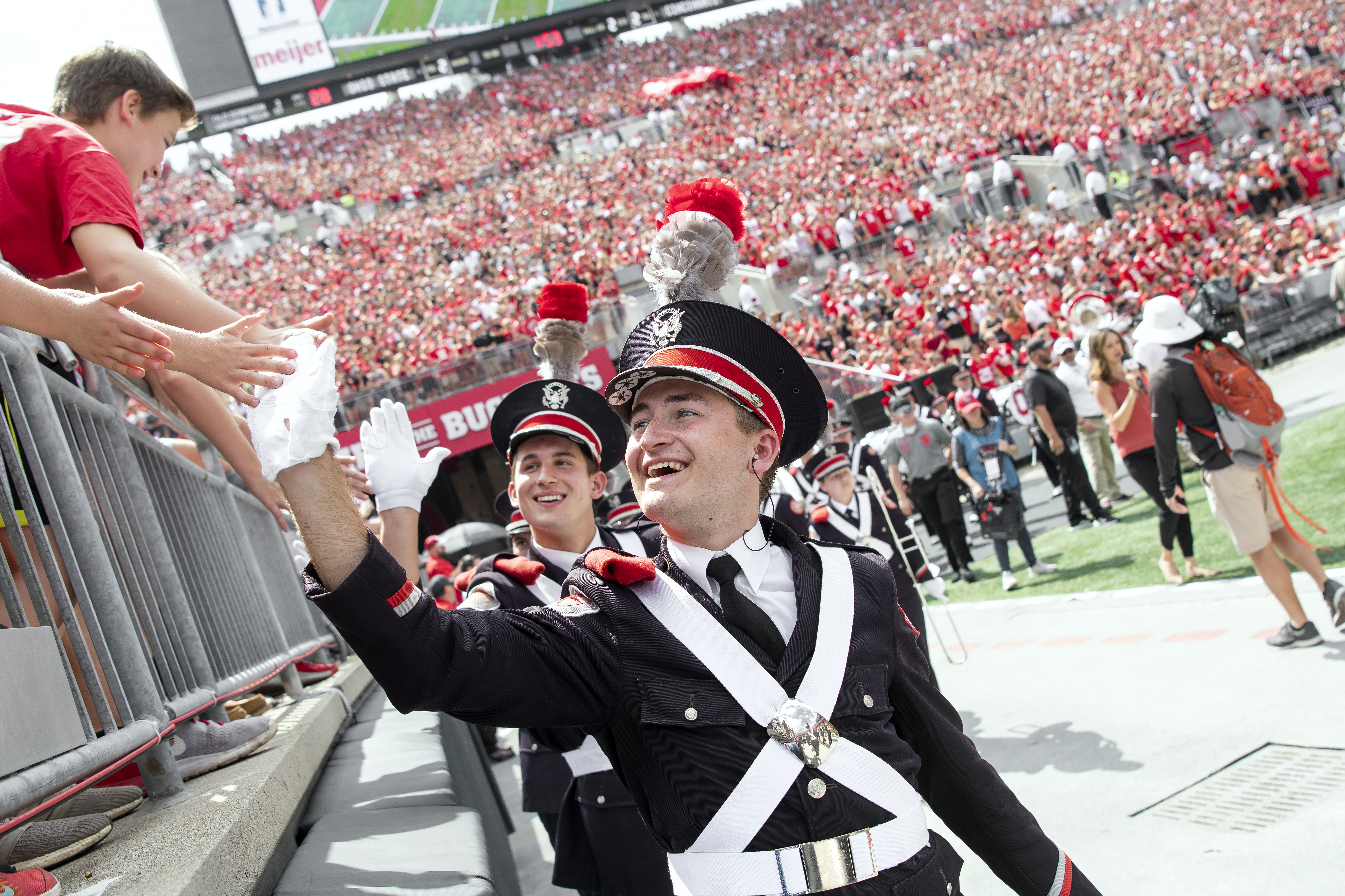
src="/images/placeholders/osu-bux-2.jpg"
alt="A marching band member high-fives a crowd"
height=""
width=""
/>
</div>
</div>
</div>
<div
id="bux-hero__carousel-1787180847-tab-3"
class="bux-hero__container"
role="tabpanel"
aria-label="3 of 3"
>
<div class="bux-hero__content">
<h2 class="bux-heading bux-hero__header">Headline 3 lorem ipsum</h2>
<div class="bux-hero__subheader">
<span>Subhead lorem ipsum dolor met</span>
</div>
<a class="bux-button bux-button--alt" href="#" rel="noopener">
<span class="bux-button__text bux-button--alt__text">
Call to Action
</span>
</a>
</div>
<div class="bux-hero__image-container">
<div class="bux-hero__image bux-hero__image--3x2">
<img
class="bux-image"
src="/images/placeholders/osu-bux-4.jpg"
alt="A person in a scarlet shirt poses for a photo"
height=""
width=""
/>
</div>
</div>
</div>
</div>
</section>
{#
Buckeye UX - version 1.6.0
Copyright (C) 2026 The Ohio State University
#}

{#

Hero

Available Variables:
  - background:           Optional. Sets the Hero background color: null, gray, scarlet.
  - card_orientation:     Sets the card orientation: card-left, card-right, card-full.
  - ratio:                Sets the hero's image ratio: null, 16x9, 3x2.
  - hero_heading_level:   Integer. Sets the heading level of the header.
  - cards:                Array containing the cards for the hero carousel: hero_header, hero_subheader, hero_image, hero_image_alt, button_text, button_url, hero_video_mp4, hero_aria_label.
  - carousel_aria_label:  Optional. String for the carousel aria-label.
  - carousel_id:          Unique ID for the carousel.

This DocBlock is auto-generated and any changes could be overwritten.
Use the component's corresponding *.config.ts to make changes to this file.

Last Updated: 05-06-2026 11:39:01
#}

{% import '@bux/_macros/attributes.twig' as Attributes %}

{% set random_seed = random() %}
{% set carousel_uniqueid = carousel_id ~ '-' ~ random_seed %}
{% set hero_heading_level = hero_heading_level|default(2) %}

{% set section_classes =
  [
    'bux-hero',
    background ? 'bux-hero--' ~ background : '',
    'bux-hero--' ~ card_orientation,
    (cards|length) > 1 ? 'bux-hero--carousel' : '',
    ratio ? 'bux-hero--' ~ ratio : ''
  ]
    |join(' ')
    |trim
%}

{% set section_attributes = {
  class: section_classes,
  'aria-roledescription': (cards|length) > 1 ? 'carousel' : null,
  'aria-label': (cards|length) > 1 ? carousel_aria_label : null
} %}

<section {{ Attributes.render(section_attributes) }}>
  {% if (cards|length) > 1 %}
    <div class="visually-hidden">
      Carousel of {{ cards|length }} slides. Use the Previous and Next buttons to navigate the slides.
    </div>
    <button
      class="bux-hero__button bux-hero__button--left"
      type="button"
      aria-controls="{{ carousel_uniqueid }}-items"
      aria-label="Previous Slide"
    >
      <span class="icon icon-chevron-left" aria-hidden="true"></span>
    </button>
    <button
      class="bux-hero__button bux-hero__button--right"
      type="button"
      aria-controls="{{ carousel_uniqueid }}-items"
      aria-label="Next Slide"
    >
      <span class="icon icon-chevron-right" aria-hidden="true"></span>
    </button>
  {% endif %}

  {% if (cards|length) > 1 %}
    <div class="bux-hero__tabs" role="tablist" aria-label="Slides">
      {% for card in cards %}
        {% set tab_attributes = {
          id: carousel_uniqueid ~ '-tabbutton-' ~ loop.index,
          class: 'bux-hero__tab' ~ (loop.index == 1 ? ' bux-hero__tab--active' : ''),
          type: 'button',
          role: 'tab',
          'aria-label': 'Slide ' ~ loop.index,
          'aria-controls': carousel_uniqueid ~ '-tab-' ~ loop.index,
          tabindex: '-1'
        } %}
        <button {{ Attributes.render(tab_attributes) }}>
          <span class="visually-hidden">Slide {{ loop.index }}</span>
        </button>
      {% endfor %}
    </div>
  {% endif %}

  <div id="{{ carousel_uniqueid }}-items" class="bux-hero__carousel-items">
    {% for card in cards %}
      {% set panel_attributes = {
        id: carousel_uniqueid ~ '-tab-' ~ loop.index,
        class: 'bux-hero__container' ~ (loop.index == 1 ? ' showing' : ''),
        role: (cards|length) > 1 ? 'tabpanel' : null,
        'aria-label': (cards|length) > 1 ? loop.index ~ ' of ' ~ (cards|length) : null
      } %}
      <div {{ Attributes.render(panel_attributes) }}>
        <div class="bux-hero__content">
          {% include '@bux/heading/heading.twig' with {
            heading_text: card.hero_header,
            heading_level: hero_heading_level,
            base_class: 'bux-hero__header'
          } only %}

          {% if card_orientation != 'card-full' %}
            <div class="bux-hero__subheader">
              <span>{{ card.hero_subheader }}</span>
            </div>
            {% include '@bux/link/link.twig' with {
              base_class: 'bux-button bux-button--alt',
              show_underline: false,
              link_url: card.button_url,
              link_text: card.button_text
            } only %}
          {% else %}
            {% include '@bux/text-link/text-link.twig' with {
              base_class: 'bux-hero__subheader bux-text-link',
              text_link_url: card.button_url,
              text_link_text: card.hero_subheader
            } only %}
          {% endif %}
        </div>

        <div class="bux-hero__image-container">
          {% if card.hero_image %}
            <div class="bux-hero__image bux-hero__image--{{ ratio }} ">
              {% set image_url = card.hero_image %}
              {% set image_alt_text = card.hero_image_alt %}
              {% include '@bux/image/image.twig' %}
            </div>
          {% elseif card.hero_video_mp4 %}
            <div class="bux-hero__image">
              {% set video_attributes = {
                'aria-label': card.hero_aria_label,
                tabindex: '-1',
                loop: true,
                autoplay: true,
                playsinline: true,
                muted: true,
                class: 'bux-hero__video'
              } %}
              <video {{ Attributes.render(video_attributes) }}>
                <source src="{{ card.hero_video_mp4 }}" type="video/mp4" />
              </video>
              <button type="button" class="bux-hero__video-button">
                <span class="visually-hidden">Pause video</span>
                <div class="bux-hero__video-button-icon bux-hero__video-button-icon--play" aria-hidden="true">
                  <span class="bux-icon icon-play-fill" aria-hidden="true"></span>
                </div>
                <div class="bux-hero__video-button-icon bux-hero__video-button-icon--pause" aria-hidden="true">
                  <span class="bux-icon icon-pause-fill" aria-hidden="true"></span>
                </div>
              </button>
            </div>
          {% endif %}
        </div>
      </div>
    {% endfor %}
  </div>
</section>
Image with Gray Text Box
Headline lorem ipsum
Subhead lorem ipsum dolor met
<section
  class="bux-hero bux-hero--gray bux-hero--card-full bux-hero--3x2"
  aria-roledescription="false"
  aria-label="false"
>
  <div id="bux-hero__carousel-268333234-items" class="bux-hero__carousel-items">
    <div
      id="bux-hero__carousel-268333234-tab-1"
      class="bux-hero__container showing"
      aria-label="false"
    >
      <div class="bux-hero__content">
        <h2 class="bux-heading bux-hero__header">Headline lorem ipsum</h2>

        <a class="bux-hero__subheader bux-text-link" href="#" rel="noopener">
          <span class="bux-hero__subheader__text bux-text-link__text">
            Subhead lorem ipsum dolor met
          </span>
        </a>
      </div>

      <div class="bux-hero__image-container">
        <div class="bux-hero__image bux-hero__image--3x2">
          <img
            class="bux-image"
            src="/images/placeholders/osu-bux-5.jpg"
            alt="Graduates performing the O-H-I-O pose"
            height=""
            width=""
          />
        </div>
      </div>
    </div>
  </div>
</section>
{#
Buckeye UX - version 1.6.0
Copyright (C) 2026 The Ohio State University
#}

{#

Hero

Available Variables:
  - background:           Optional. Sets the Hero background color: null, gray, scarlet.
  - card_orientation:     Sets the card orientation: card-left, card-right, card-full.
  - ratio:                Sets the hero's image ratio: null, 16x9, 3x2.
  - hero_heading_level:   Integer. Sets the heading level of the header.
  - cards:                Array containing the cards for the hero carousel: hero_header, hero_subheader, hero_image, hero_image_alt, button_text, button_url, hero_video_mp4, hero_aria_label.
  - carousel_aria_label:  Optional. String for the carousel aria-label.
  - carousel_id:          Unique ID for the carousel.

This DocBlock is auto-generated and any changes could be overwritten.
Use the component's corresponding *.config.ts to make changes to this file.

Last Updated: 05-06-2026 11:39:01
#}

{% import '@bux/_macros/attributes.twig' as Attributes %}

{% set random_seed = random() %}
{% set carousel_uniqueid = carousel_id ~ '-' ~ random_seed %}
{% set hero_heading_level = hero_heading_level|default(2) %}

{% set section_classes =
  [
    'bux-hero',
    background ? 'bux-hero--' ~ background : '',
    'bux-hero--' ~ card_orientation,
    (cards|length) > 1 ? 'bux-hero--carousel' : '',
    ratio ? 'bux-hero--' ~ ratio : ''
  ]
    |join(' ')
    |trim
%}

{% set section_attributes = {
  class: section_classes,
  'aria-roledescription': (cards|length) > 1 ? 'carousel' : null,
  'aria-label': (cards|length) > 1 ? carousel_aria_label : null
} %}

<section {{ Attributes.render(section_attributes) }}>
  {% if (cards|length) > 1 %}
    <div class="visually-hidden">
      Carousel of {{ cards|length }} slides. Use the Previous and Next buttons to navigate the slides.
    </div>
    <button
      class="bux-hero__button bux-hero__button--left"
      type="button"
      aria-controls="{{ carousel_uniqueid }}-items"
      aria-label="Previous Slide"
    >
      <span class="icon icon-chevron-left" aria-hidden="true"></span>
    </button>
    <button
      class="bux-hero__button bux-hero__button--right"
      type="button"
      aria-controls="{{ carousel_uniqueid }}-items"
      aria-label="Next Slide"
    >
      <span class="icon icon-chevron-right" aria-hidden="true"></span>
    </button>
  {% endif %}

  {% if (cards|length) > 1 %}
    <div class="bux-hero__tabs" role="tablist" aria-label="Slides">
      {% for card in cards %}
        {% set tab_attributes = {
          id: carousel_uniqueid ~ '-tabbutton-' ~ loop.index,
          class: 'bux-hero__tab' ~ (loop.index == 1 ? ' bux-hero__tab--active' : ''),
          type: 'button',
          role: 'tab',
          'aria-label': 'Slide ' ~ loop.index,
          'aria-controls': carousel_uniqueid ~ '-tab-' ~ loop.index,
          tabindex: '-1'
        } %}
        <button {{ Attributes.render(tab_attributes) }}>
          <span class="visually-hidden">Slide {{ loop.index }}</span>
        </button>
      {% endfor %}
    </div>
  {% endif %}

  <div id="{{ carousel_uniqueid }}-items" class="bux-hero__carousel-items">
    {% for card in cards %}
      {% set panel_attributes = {
        id: carousel_uniqueid ~ '-tab-' ~ loop.index,
        class: 'bux-hero__container' ~ (loop.index == 1 ? ' showing' : ''),
        role: (cards|length) > 1 ? 'tabpanel' : null,
        'aria-label': (cards|length) > 1 ? loop.index ~ ' of ' ~ (cards|length) : null
      } %}
      <div {{ Attributes.render(panel_attributes) }}>
        <div class="bux-hero__content">
          {% include '@bux/heading/heading.twig' with {
            heading_text: card.hero_header,
            heading_level: hero_heading_level,
            base_class: 'bux-hero__header'
          } only %}

          {% if card_orientation != 'card-full' %}
            <div class="bux-hero__subheader">
              <span>{{ card.hero_subheader }}</span>
            </div>
            {% include '@bux/link/link.twig' with {
              base_class: 'bux-button bux-button--alt',
              show_underline: false,
              link_url: card.button_url,
              link_text: card.button_text
            } only %}
          {% else %}
            {% include '@bux/text-link/text-link.twig' with {
              base_class: 'bux-hero__subheader bux-text-link',
              text_link_url: card.button_url,
              text_link_text: card.hero_subheader
            } only %}
          {% endif %}
        </div>

        <div class="bux-hero__image-container">
          {% if card.hero_image %}
            <div class="bux-hero__image bux-hero__image--{{ ratio }} ">
              {% set image_url = card.hero_image %}
              {% set image_alt_text = card.hero_image_alt %}
              {% include '@bux/image/image.twig' %}
            </div>
          {% elseif card.hero_video_mp4 %}
            <div class="bux-hero__image">
              {% set video_attributes = {
                'aria-label': card.hero_aria_label,
                tabindex: '-1',
                loop: true,
                autoplay: true,
                playsinline: true,
                muted: true,
                class: 'bux-hero__video'
              } %}
              <video {{ Attributes.render(video_attributes) }}>
                <source src="{{ card.hero_video_mp4 }}" type="video/mp4" />
              </video>
              <button type="button" class="bux-hero__video-button">
                <span class="visually-hidden">Pause video</span>
                <div class="bux-hero__video-button-icon bux-hero__video-button-icon--play" aria-hidden="true">
                  <span class="bux-icon icon-play-fill" aria-hidden="true"></span>
                </div>
                <div class="bux-hero__video-button-icon bux-hero__video-button-icon--pause" aria-hidden="true">
                  <span class="bux-icon icon-pause-fill" aria-hidden="true"></span>
                </div>
              </button>
            </div>
          {% endif %}
        </div>
      </div>
    {% endfor %}
  </div>
</section>
Image with White Text Box
Headline lorem ipsum
Subhead lorem ipsum dolor met
<section
  class="bux-hero bux-hero--white bux-hero--card-full bux-hero--3x2"
  aria-roledescription="false"
  aria-label="false"
>
  <div id="bux-hero__carousel-88507072-items" class="bux-hero__carousel-items">
    <div
      id="bux-hero__carousel-88507072-tab-1"
      class="bux-hero__container showing"
      aria-label="false"
    >
      <div class="bux-hero__content">
        <h2 class="bux-heading bux-hero__header">Headline lorem ipsum</h2>

        <a class="bux-hero__subheader bux-text-link" href="#" rel="noopener">
          <span class="bux-hero__subheader__text bux-text-link__text">
            Subhead lorem ipsum dolor met
          </span>
        </a>
      </div>

      <div class="bux-hero__image-container">
        <div class="bux-hero__image bux-hero__image--3x2">
          <img
            class="bux-image"
            src="/images/placeholders/osu-bux-5.jpg"
            alt="Graduates performing the O-H-I-O pose"
            height=""
            width=""
          />
        </div>
      </div>
    </div>
  </div>
</section>
{#
Buckeye UX - version 1.6.0
Copyright (C) 2026 The Ohio State University
#}

{#

Hero

Available Variables:
  - background:           Optional. Sets the Hero background color: null, gray, scarlet.
  - card_orientation:     Sets the card orientation: card-left, card-right, card-full.
  - ratio:                Sets the hero's image ratio: null, 16x9, 3x2.
  - hero_heading_level:   Integer. Sets the heading level of the header.
  - cards:                Array containing the cards for the hero carousel: hero_header, hero_subheader, hero_image, hero_image_alt, button_text, button_url, hero_video_mp4, hero_aria_label.
  - carousel_aria_label:  Optional. String for the carousel aria-label.
  - carousel_id:          Unique ID for the carousel.

This DocBlock is auto-generated and any changes could be overwritten.
Use the component's corresponding *.config.ts to make changes to this file.

Last Updated: 05-06-2026 11:39:01
#}

{% import '@bux/_macros/attributes.twig' as Attributes %}

{% set random_seed = random() %}
{% set carousel_uniqueid = carousel_id ~ '-' ~ random_seed %}
{% set hero_heading_level = hero_heading_level|default(2) %}

{% set section_classes =
  [
    'bux-hero',
    background ? 'bux-hero--' ~ background : '',
    'bux-hero--' ~ card_orientation,
    (cards|length) > 1 ? 'bux-hero--carousel' : '',
    ratio ? 'bux-hero--' ~ ratio : ''
  ]
    |join(' ')
    |trim
%}

{% set section_attributes = {
  class: section_classes,
  'aria-roledescription': (cards|length) > 1 ? 'carousel' : null,
  'aria-label': (cards|length) > 1 ? carousel_aria_label : null
} %}

<section {{ Attributes.render(section_attributes) }}>
  {% if (cards|length) > 1 %}
    <div class="visually-hidden">
      Carousel of {{ cards|length }} slides. Use the Previous and Next buttons to navigate the slides.
    </div>
    <button
      class="bux-hero__button bux-hero__button--left"
      type="button"
      aria-controls="{{ carousel_uniqueid }}-items"
      aria-label="Previous Slide"
    >
      <span class="icon icon-chevron-left" aria-hidden="true"></span>
    </button>
    <button
      class="bux-hero__button bux-hero__button--right"
      type="button"
      aria-controls="{{ carousel_uniqueid }}-items"
      aria-label="Next Slide"
    >
      <span class="icon icon-chevron-right" aria-hidden="true"></span>
    </button>
  {% endif %}

  {% if (cards|length) > 1 %}
    <div class="bux-hero__tabs" role="tablist" aria-label="Slides">
      {% for card in cards %}
        {% set tab_attributes = {
          id: carousel_uniqueid ~ '-tabbutton-' ~ loop.index,
          class: 'bux-hero__tab' ~ (loop.index == 1 ? ' bux-hero__tab--active' : ''),
          type: 'button',
          role: 'tab',
          'aria-label': 'Slide ' ~ loop.index,
          'aria-controls': carousel_uniqueid ~ '-tab-' ~ loop.index,
          tabindex: '-1'
        } %}
        <button {{ Attributes.render(tab_attributes) }}>
          <span class="visually-hidden">Slide {{ loop.index }}</span>
        </button>
      {% endfor %}
    </div>
  {% endif %}

  <div id="{{ carousel_uniqueid }}-items" class="bux-hero__carousel-items">
    {% for card in cards %}
      {% set panel_attributes = {
        id: carousel_uniqueid ~ '-tab-' ~ loop.index,
        class: 'bux-hero__container' ~ (loop.index == 1 ? ' showing' : ''),
        role: (cards|length) > 1 ? 'tabpanel' : null,
        'aria-label': (cards|length) > 1 ? loop.index ~ ' of ' ~ (cards|length) : null
      } %}
      <div {{ Attributes.render(panel_attributes) }}>
        <div class="bux-hero__content">
          {% include '@bux/heading/heading.twig' with {
            heading_text: card.hero_header,
            heading_level: hero_heading_level,
            base_class: 'bux-hero__header'
          } only %}

          {% if card_orientation != 'card-full' %}
            <div class="bux-hero__subheader">
              <span>{{ card.hero_subheader }}</span>
            </div>
            {% include '@bux/link/link.twig' with {
              base_class: 'bux-button bux-button--alt',
              show_underline: false,
              link_url: card.button_url,
              link_text: card.button_text
            } only %}
          {% else %}
            {% include '@bux/text-link/text-link.twig' with {
              base_class: 'bux-hero__subheader bux-text-link',
              text_link_url: card.button_url,
              text_link_text: card.hero_subheader
            } only %}
          {% endif %}
        </div>

        <div class="bux-hero__image-container">
          {% if card.hero_image %}
            <div class="bux-hero__image bux-hero__image--{{ ratio }} ">
              {% set image_url = card.hero_image %}
              {% set image_alt_text = card.hero_image_alt %}
              {% include '@bux/image/image.twig' %}
            </div>
          {% elseif card.hero_video_mp4 %}
            <div class="bux-hero__image">
              {% set video_attributes = {
                'aria-label': card.hero_aria_label,
                tabindex: '-1',
                loop: true,
                autoplay: true,
                playsinline: true,
                muted: true,
                class: 'bux-hero__video'
              } %}
              <video {{ Attributes.render(video_attributes) }}>
                <source src="{{ card.hero_video_mp4 }}" type="video/mp4" />
              </video>
              <button type="button" class="bux-hero__video-button">
                <span class="visually-hidden">Pause video</span>
                <div class="bux-hero__video-button-icon bux-hero__video-button-icon--play" aria-hidden="true">
                  <span class="bux-icon icon-play-fill" aria-hidden="true"></span>
                </div>
                <div class="bux-hero__video-button-icon bux-hero__video-button-icon--pause" aria-hidden="true">
                  <span class="bux-icon icon-pause-fill" aria-hidden="true"></span>
                </div>
              </button>
            </div>
          {% endif %}
        </div>
      </div>
    {% endfor %}
  </div>
</section>
Video with Gray Text Box
Headline lorem ipsum
Subhead lorem ipsum dolor met<section
class="bux-hero bux-hero--gray bux-hero--card-full bux-hero--3x2"
aria-roledescription="false"
aria-label="false"
>
<div id="bux-hero__carousel-803092554-items" class="bux-hero__carousel-items">
<div
id="bux-hero__carousel-803092554-tab-1"
class="bux-hero__container showing"
aria-label="false"
>
<div class="bux-hero__content">
<h2 class="bux-heading bux-hero__header">Headline lorem ipsum</h2>
<a class="bux-hero__subheader bux-text-link" rel="noopener">
<span class="bux-hero__subheader__text bux-text-link__text">
Subhead lorem ipsum dolor met
</span>
</a>
</div>
<div class="bux-hero__image-container">
<div class="bux-hero__image">
<video
aria-label="Background Video"
tabindex="-1"
loop
autoplay
playsinline
muted
class="bux-hero__video"
>
<source
src="/images/placeholders/hero-video-clip.mp4"
type="video/mp4"
/>
</video>
<button type="button" class="bux-hero__video-button">
<span class="visually-hidden">Pause video</span>
<div
class="bux-hero__video-button-icon bux-hero__video-button-icon--play"
aria-hidden="true"
>
<span class="bux-icon icon-play-fill" aria-hidden="true"></span>
</div>
<div
class="bux-hero__video-button-icon bux-hero__video-button-icon--pause"
aria-hidden="true"
>
<span class="bux-icon icon-pause-fill" aria-hidden="true"></span>
</div>
</button>
</div>
</div>
</div>
</div>
</section>
{#
Buckeye UX - version 1.6.0
Copyright (C) 2026 The Ohio State University
#}

{#

Hero

Available Variables:
  - background:           Optional. Sets the Hero background color: null, gray, scarlet.
  - card_orientation:     Sets the card orientation: card-left, card-right, card-full.
  - ratio:                Sets the hero's image ratio: null, 16x9, 3x2.
  - hero_heading_level:   Integer. Sets the heading level of the header.
  - cards:                Array containing the cards for the hero carousel: hero_header, hero_subheader, hero_image, hero_image_alt, button_text, button_url, hero_video_mp4, hero_aria_label.
  - carousel_aria_label:  Optional. String for the carousel aria-label.
  - carousel_id:          Unique ID for the carousel.

This DocBlock is auto-generated and any changes could be overwritten.
Use the component's corresponding *.config.ts to make changes to this file.

Last Updated: 05-06-2026 11:39:01
#}

{% import '@bux/_macros/attributes.twig' as Attributes %}

{% set random_seed = random() %}
{% set carousel_uniqueid = carousel_id ~ '-' ~ random_seed %}
{% set hero_heading_level = hero_heading_level|default(2) %}

{% set section_classes =
  [
    'bux-hero',
    background ? 'bux-hero--' ~ background : '',
    'bux-hero--' ~ card_orientation,
    (cards|length) > 1 ? 'bux-hero--carousel' : '',
    ratio ? 'bux-hero--' ~ ratio : ''
  ]
    |join(' ')
    |trim
%}

{% set section_attributes = {
  class: section_classes,
  'aria-roledescription': (cards|length) > 1 ? 'carousel' : null,
  'aria-label': (cards|length) > 1 ? carousel_aria_label : null
} %}

<section {{ Attributes.render(section_attributes) }}>
  {% if (cards|length) > 1 %}
    <div class="visually-hidden">
      Carousel of {{ cards|length }} slides. Use the Previous and Next buttons to navigate the slides.
    </div>
    <button
      class="bux-hero__button bux-hero__button--left"
      type="button"
      aria-controls="{{ carousel_uniqueid }}-items"
      aria-label="Previous Slide"
    >
      <span class="icon icon-chevron-left" aria-hidden="true"></span>
    </button>
    <button
      class="bux-hero__button bux-hero__button--right"
      type="button"
      aria-controls="{{ carousel_uniqueid }}-items"
      aria-label="Next Slide"
    >
      <span class="icon icon-chevron-right" aria-hidden="true"></span>
    </button>
  {% endif %}

  {% if (cards|length) > 1 %}
    <div class="bux-hero__tabs" role="tablist" aria-label="Slides">
      {% for card in cards %}
        {% set tab_attributes = {
          id: carousel_uniqueid ~ '-tabbutton-' ~ loop.index,
          class: 'bux-hero__tab' ~ (loop.index == 1 ? ' bux-hero__tab--active' : ''),
          type: 'button',
          role: 'tab',
          'aria-label': 'Slide ' ~ loop.index,
          'aria-controls': carousel_uniqueid ~ '-tab-' ~ loop.index,
          tabindex: '-1'
        } %}
        <button {{ Attributes.render(tab_attributes) }}>
          <span class="visually-hidden">Slide {{ loop.index }}</span>
        </button>
      {% endfor %}
    </div>
  {% endif %}

  <div id="{{ carousel_uniqueid }}-items" class="bux-hero__carousel-items">
    {% for card in cards %}
      {% set panel_attributes = {
        id: carousel_uniqueid ~ '-tab-' ~ loop.index,
        class: 'bux-hero__container' ~ (loop.index == 1 ? ' showing' : ''),
        role: (cards|length) > 1 ? 'tabpanel' : null,
        'aria-label': (cards|length) > 1 ? loop.index ~ ' of ' ~ (cards|length) : null
      } %}
      <div {{ Attributes.render(panel_attributes) }}>
        <div class="bux-hero__content">
          {% include '@bux/heading/heading.twig' with {
            heading_text: card.hero_header,
            heading_level: hero_heading_level,
            base_class: 'bux-hero__header'
          } only %}

          {% if card_orientation != 'card-full' %}
            <div class="bux-hero__subheader">
              <span>{{ card.hero_subheader }}</span>
            </div>
            {% include '@bux/link/link.twig' with {
              base_class: 'bux-button bux-button--alt',
              show_underline: false,
              link_url: card.button_url,
              link_text: card.button_text
            } only %}
          {% else %}
            {% include '@bux/text-link/text-link.twig' with {
              base_class: 'bux-hero__subheader bux-text-link',
              text_link_url: card.button_url,
              text_link_text: card.hero_subheader
            } only %}
          {% endif %}
        </div>

        <div class="bux-hero__image-container">
          {% if card.hero_image %}
            <div class="bux-hero__image bux-hero__image--{{ ratio }} ">
              {% set image_url = card.hero_image %}
              {% set image_alt_text = card.hero_image_alt %}
              {% include '@bux/image/image.twig' %}
            </div>
          {% elseif card.hero_video_mp4 %}
            <div class="bux-hero__image">
              {% set video_attributes = {
                'aria-label': card.hero_aria_label,
                tabindex: '-1',
                loop: true,
                autoplay: true,
                playsinline: true,
                muted: true,
                class: 'bux-hero__video'
              } %}
              <video {{ Attributes.render(video_attributes) }}>
                <source src="{{ card.hero_video_mp4 }}" type="video/mp4" />
              </video>
              <button type="button" class="bux-hero__video-button">
                <span class="visually-hidden">Pause video</span>
                <div class="bux-hero__video-button-icon bux-hero__video-button-icon--play" aria-hidden="true">
                  <span class="bux-icon icon-play-fill" aria-hidden="true"></span>
                </div>
                <div class="bux-hero__video-button-icon bux-hero__video-button-icon--pause" aria-hidden="true">
                  <span class="bux-icon icon-pause-fill" aria-hidden="true"></span>
                </div>
              </button>
            </div>
          {% endif %}
        </div>
      </div>
    {% endfor %}
  </div>
</section>
Video with White Text Box
Headline lorem ipsum
Subhead lorem ipsum dolor met<section
class="bux-hero bux-hero--white bux-hero--card-full bux-hero--3x2"
aria-roledescription="false"
aria-label="false"
>
<div id="bux-hero__carousel-694231815-items" class="bux-hero__carousel-items">
<div
id="bux-hero__carousel-694231815-tab-1"
class="bux-hero__container showing"
aria-label="false"
>
<div class="bux-hero__content">
<h2 class="bux-heading bux-hero__header">Headline lorem ipsum</h2>
<a class="bux-hero__subheader bux-text-link" rel="noopener">
<span class="bux-hero__subheader__text bux-text-link__text">
Subhead lorem ipsum dolor met
</span>
</a>
</div>
<div class="bux-hero__image-container">
<div class="bux-hero__image">
<video
aria-label="Background Video"
tabindex="-1"
loop
autoplay
playsinline
muted
class="bux-hero__video"
>
<source
src="/images/placeholders/hero-video-clip.mp4"
type="video/mp4"
/>
</video>
<button type="button" class="bux-hero__video-button">
<span class="visually-hidden">Pause video</span>
<div
class="bux-hero__video-button-icon bux-hero__video-button-icon--play"
aria-hidden="true"
>
<span class="bux-icon icon-play-fill" aria-hidden="true"></span>
</div>
<div
class="bux-hero__video-button-icon bux-hero__video-button-icon--pause"
aria-hidden="true"
>
<span class="bux-icon icon-pause-fill" aria-hidden="true"></span>
</div>
</button>
</div>
</div>
</div>
</div>
</section>
{#
Buckeye UX - version 1.6.0
Copyright (C) 2026 The Ohio State University
#}

{#

Hero

Available Variables:
  - background:           Optional. Sets the Hero background color: null, gray, scarlet.
  - card_orientation:     Sets the card orientation: card-left, card-right, card-full.
  - ratio:                Sets the hero's image ratio: null, 16x9, 3x2.
  - hero_heading_level:   Integer. Sets the heading level of the header.
  - cards:                Array containing the cards for the hero carousel: hero_header, hero_subheader, hero_image, hero_image_alt, button_text, button_url, hero_video_mp4, hero_aria_label.
  - carousel_aria_label:  Optional. String for the carousel aria-label.
  - carousel_id:          Unique ID for the carousel.

This DocBlock is auto-generated and any changes could be overwritten.
Use the component's corresponding *.config.ts to make changes to this file.

Last Updated: 05-06-2026 11:39:01
#}

{% import '@bux/_macros/attributes.twig' as Attributes %}

{% set random_seed = random() %}
{% set carousel_uniqueid = carousel_id ~ '-' ~ random_seed %}
{% set hero_heading_level = hero_heading_level|default(2) %}

{% set section_classes =
  [
    'bux-hero',
    background ? 'bux-hero--' ~ background : '',
    'bux-hero--' ~ card_orientation,
    (cards|length) > 1 ? 'bux-hero--carousel' : '',
    ratio ? 'bux-hero--' ~ ratio : ''
  ]
    |join(' ')
    |trim
%}

{% set section_attributes = {
  class: section_classes,
  'aria-roledescription': (cards|length) > 1 ? 'carousel' : null,
  'aria-label': (cards|length) > 1 ? carousel_aria_label : null
} %}

<section {{ Attributes.render(section_attributes) }}>
  {% if (cards|length) > 1 %}
    <div class="visually-hidden">
      Carousel of {{ cards|length }} slides. Use the Previous and Next buttons to navigate the slides.
    </div>
    <button
      class="bux-hero__button bux-hero__button--left"
      type="button"
      aria-controls="{{ carousel_uniqueid }}-items"
      aria-label="Previous Slide"
    >
      <span class="icon icon-chevron-left" aria-hidden="true"></span>
    </button>
    <button
      class="bux-hero__button bux-hero__button--right"
      type="button"
      aria-controls="{{ carousel_uniqueid }}-items"
      aria-label="Next Slide"
    >
      <span class="icon icon-chevron-right" aria-hidden="true"></span>
    </button>
  {% endif %}

  {% if (cards|length) > 1 %}
    <div class="bux-hero__tabs" role="tablist" aria-label="Slides">
      {% for card in cards %}
        {% set tab_attributes = {
          id: carousel_uniqueid ~ '-tabbutton-' ~ loop.index,
          class: 'bux-hero__tab' ~ (loop.index == 1 ? ' bux-hero__tab--active' : ''),
          type: 'button',
          role: 'tab',
          'aria-label': 'Slide ' ~ loop.index,
          'aria-controls': carousel_uniqueid ~ '-tab-' ~ loop.index,
          tabindex: '-1'
        } %}
        <button {{ Attributes.render(tab_attributes) }}>
          <span class="visually-hidden">Slide {{ loop.index }}</span>
        </button>
      {% endfor %}
    </div>
  {% endif %}

  <div id="{{ carousel_uniqueid }}-items" class="bux-hero__carousel-items">
    {% for card in cards %}
      {% set panel_attributes = {
        id: carousel_uniqueid ~ '-tab-' ~ loop.index,
        class: 'bux-hero__container' ~ (loop.index == 1 ? ' showing' : ''),
        role: (cards|length) > 1 ? 'tabpanel' : null,
        'aria-label': (cards|length) > 1 ? loop.index ~ ' of ' ~ (cards|length) : null
      } %}
      <div {{ Attributes.render(panel_attributes) }}>
        <div class="bux-hero__content">
          {% include '@bux/heading/heading.twig' with {
            heading_text: card.hero_header,
            heading_level: hero_heading_level,
            base_class: 'bux-hero__header'
          } only %}

          {% if card_orientation != 'card-full' %}
            <div class="bux-hero__subheader">
              <span>{{ card.hero_subheader }}</span>
            </div>
            {% include '@bux/link/link.twig' with {
              base_class: 'bux-button bux-button--alt',
              show_underline: false,
              link_url: card.button_url,
              link_text: card.button_text
            } only %}
          {% else %}
            {% include '@bux/text-link/text-link.twig' with {
              base_class: 'bux-hero__subheader bux-text-link',
              text_link_url: card.button_url,
              text_link_text: card.hero_subheader
            } only %}
          {% endif %}
        </div>

        <div class="bux-hero__image-container">
          {% if card.hero_image %}
            <div class="bux-hero__image bux-hero__image--{{ ratio }} ">
              {% set image_url = card.hero_image %}
              {% set image_alt_text = card.hero_image_alt %}
              {% include '@bux/image/image.twig' %}
            </div>
          {% elseif card.hero_video_mp4 %}
            <div class="bux-hero__image">
              {% set video_attributes = {
                'aria-label': card.hero_aria_label,
                tabindex: '-1',
                loop: true,
                autoplay: true,
                playsinline: true,
                muted: true,
                class: 'bux-hero__video'
              } %}
              <video {{ Attributes.render(video_attributes) }}>
                <source src="{{ card.hero_video_mp4 }}" type="video/mp4" />
              </video>
              <button type="button" class="bux-hero__video-button">
                <span class="visually-hidden">Pause video</span>
                <div class="bux-hero__video-button-icon bux-hero__video-button-icon--play" aria-hidden="true">
                  <span class="bux-icon icon-play-fill" aria-hidden="true"></span>
                </div>
                <div class="bux-hero__video-button-icon bux-hero__video-button-icon--pause" aria-hidden="true">
                  <span class="bux-icon icon-pause-fill" aria-hidden="true"></span>
                </div>
              </button>
            </div>
          {% endif %}
        </div>
      </div>
    {% endfor %}
  </div>
</section>
Usage
Dos
- Use to call attention to the highest-priority among all content, such as a campaign, story or other call-to-action
- Limit to one per page
- Include a high-quality image
- Strongly consider using the included Button as a call-to-action
- Use the variant with scarlet background to convey a bold and energetic feel for a less formal audience
- Use the variant with image on the right if the subject of the image faces left
- Use the variant with image on the left if the subject of the image faces right
Don’ts
- Don’t autoplay the slides when using a Carousel
- Don’t use a Hero on a page that is not the homepage; If a high visual emphasis is needed, consider a Featured Card instead
Accessibility
- Make sure to write quality alternative text for the image in the Hero component