
When most people think of the humble website accordion—for those that ruminate on web design at all—it’s often dismissed as a space-saver or filler component. Ideal for hiding away content you don’t want seen when users first land on your site, but by itself nothing impressive or noteworthy. But the accordion deserves more credit. With thoughtful use, it becomes a versatile, user-friendly tool that supports both content organization and accessibility.
The BUX Accordion component looks like many others across the web: a horizontal bar (ours is denoted with top and bottom borders) with a title on the left and some kind of expand/collapse icon — often a chevron. When clicked, the accordion opens to reveal information between the two horizontal borders, and the chevron icon rotates to indicate the open state.
 BUX Accordion
When to use an accordion
There are two best times to utilize an accordion:
- When a user only needs some information: In the case of several FAQs, they may only need one or two answers, so they can click and reveal those without expanding every question.
- When pages start getting too long for mobile: If a page gets extraordinarily long, we recommend splitting the content between multiple pages. But if you’re not quite to that point yet, using accordions can break a long page into more consumable pieces of content for users, which is essential for mobile visitors.
When not to use an accordion
There are times when an accordion should be avoided:
- When users need to see most or all of the content: If it’s understood that most users come to a certain page to see specific information (like a phone number on a contact page). Do not hide that within an accordion.
- When content is complex and requires multiple levels of detail: Long content on a mobile device can be problematic because the user must scroll far to either close the accordion or open another accordion. If faced with this, either break out the information into headings or other pages.
Potential use cases
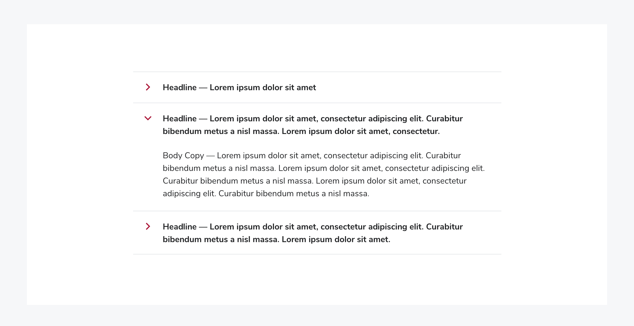
The most well-known use for accordions is in FAQ sections, already mentioned above. Users can easily scan questions and expand only the ones that are relevant to them, reducing cognitive load and visual clutter. We highly encourage this use of accordions! But it’s not the only answer and question format you can use.
 FAQs displayed as accordions
Accordions can help establish visual and informational hierarchy on a webpage by grouping related content under expandable headings, allowing users to scan high-level topics before diving into specific details. They can also become accessory components to a section where not every user will need the additional information.
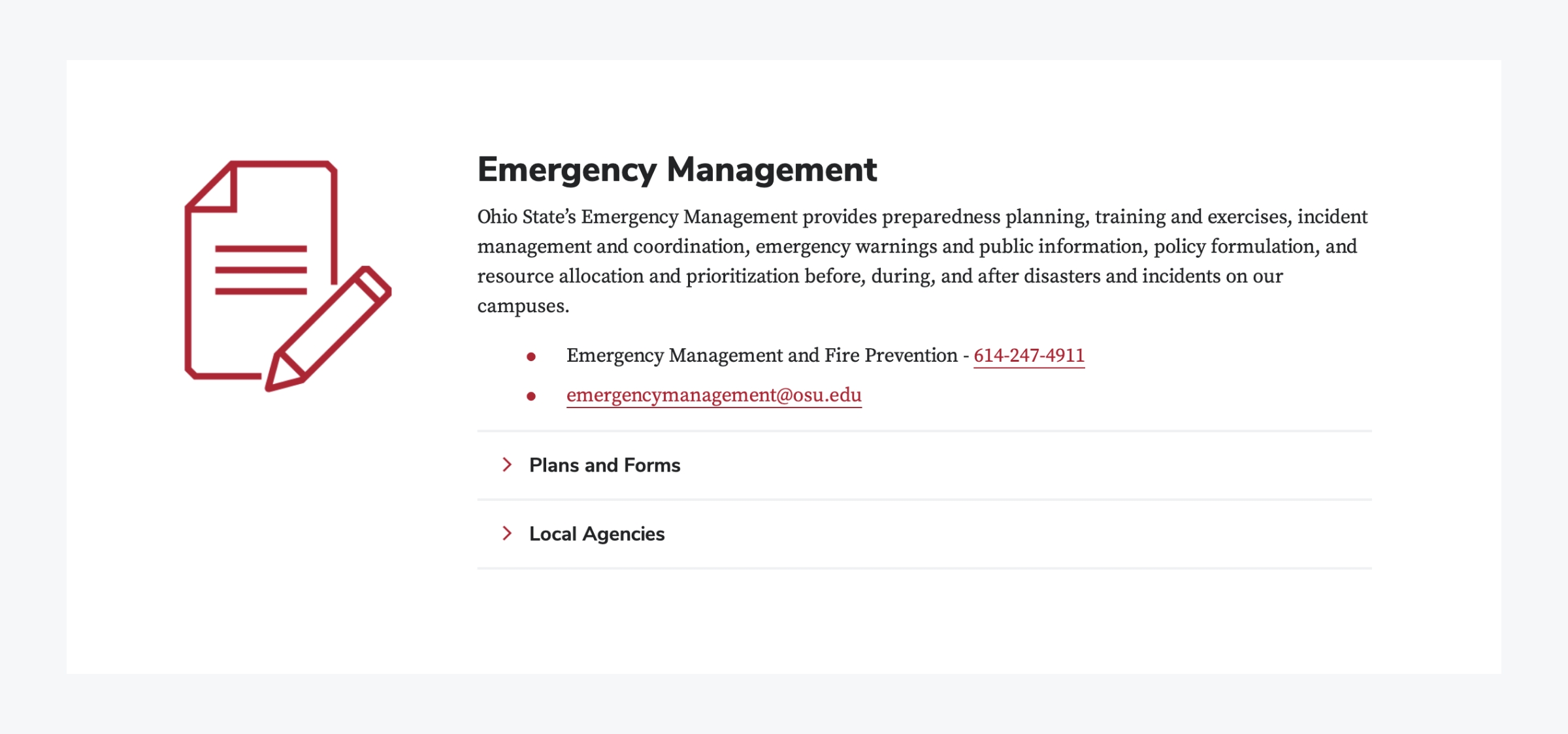 A heading and paragraph with two accordions below
Another accessibility-focused use of accordions is for presenting live text equivalents of graphic content. In many cases — such as charts or infographics — important information is visually styled or embedded in an image, but accessibility guidelines require that the same content be available as selectable, screen-reader-friendly text. Placing that equivalent text in an accordion allows screen reader users and others who rely on live text to access the content, while keeping the page visually clean for sighted users who have already received the information through the graphic. This approach maintains compliance without overwhelming the visual design, and is also ideal for sighted users when an image doesn’t load.
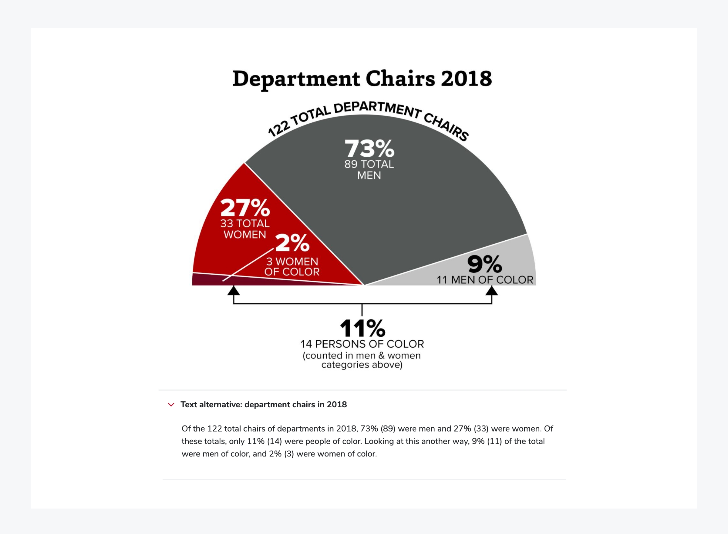 An accessible description is displayed below a graphic
If you want to get adventurous with your coding, you could create a mobile-friendly form divided into parts with accordions. Breaking a longer form into sections can make the process feel more approachable. As each section is completed, the next accordion opens while the previous one collapses — potentially with a visual indicator such as a checkmark to reinforce progress. This is especially appealing to Type A users who can’t resist the satisfying allure of checking off a list.
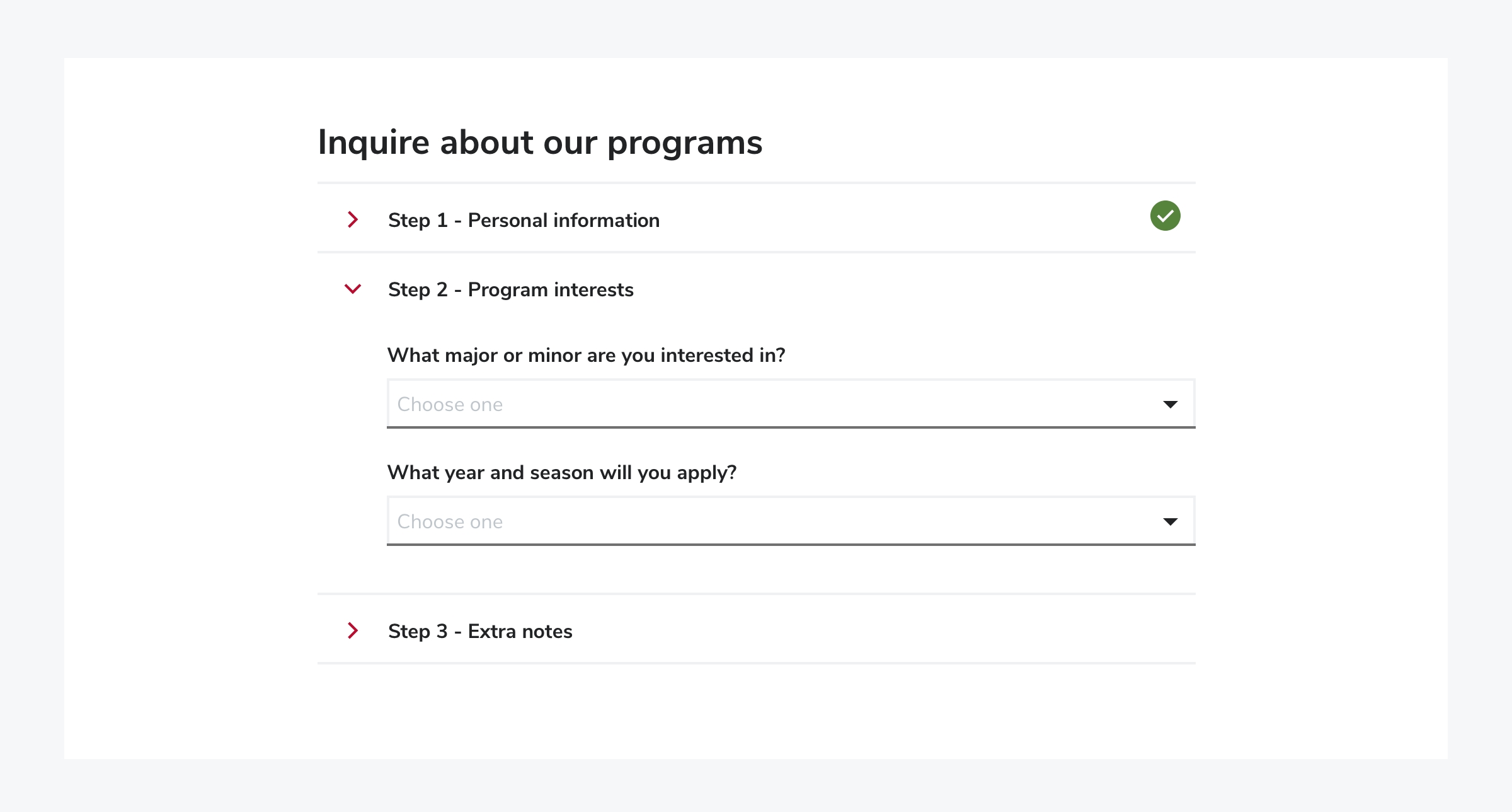 Form steps displayed as Accordions
There are also opportunities to use accordions to delight a user. For example, a single accordion might display a rotating fun fact each time it’s opened — an unobtrusive way to highlight stories, achievements, or trivia related to your organization. These can be standalone or offer a link to the relevant page. Similarly, team member bio pages could include an optional accordion with personal, humanizing details that enrich the content without adding to visual noise. Meanwhile, users who aren’t interested can simply skip over it without unnecessary scrolling.
In conclusion
The accordion is a powerful little tool in the UX/UI arsenal — practical, flexible, and capable of a lot more than just holding FAQs. When used with care and creativity, it enhances clarity, supports accessibility, and even invites moments of delight. So next time you're structuring a web page, give the accordion a second look. You might just uncover something worth expanding.