
In the College of Arts and Sciences, we embarked on a journey to align our websites to the Ohio State brand standards by integrating the Buckeye UX (BUX) Design System. We used an iterative process to allow us to gradually adopt the BUX look and feel across our extensive portfolio of sites, ensuring a seamless transition without the need for a complete redesign.
The integration process began with the goal of making our sites "BUX enough." Phase 1 began with identifying areas where we could easily incorporate BUX elements. The focus was on look and feel — updating fonts, colors, the OSU Navbar and the menu colors to reflect the BUX design system. With these changes, we were able to enhance the visual consistency across our websites while maintaining the existing structure.
In Phase 2 we looked more at the functionality and accessibility of the sites by updating our menus. This was more complicated from a development standpoint, doing a lot of work behind the scenes to improve navigation for people with disabilities.
Phase 3 was another level of updating the look and feel of our site components and updating our CSS naming conventions, making it easier to update BUX when new versions become available. We added UI icons to our event cards to align with the BUX standard for event times and event locations and adopted the Hero component, which was one of the more challenging aspects of BUX integration so far.
Throughout this iterative process, we were able to gradually incorporate the BUX look, feel, and digital accessibility into our Drupal template used across 130+ websites. This approach not only improved the user experience but also ensured that our sites remained up to date with the latest design standards. As we move forward, we look for opportunities to continue updating our existing components and add new components from BUX. By adopting an iterative approach, we achieved our goals without disrupting the existing functionality of our websites.
Three phases of changes on the homepage
These screenshots show before, phase 1, phase 2, and phase 3 on our current main college website. Phase 1 was just adding the new navbar, header, menu coloring, fonts, and brand colors. In phase 2, we fully updated the menus. Then in phase 3, our current version, we added the new Hero component and tweaked the event cards and other areas of the website to bring them closer to the look of BUX.
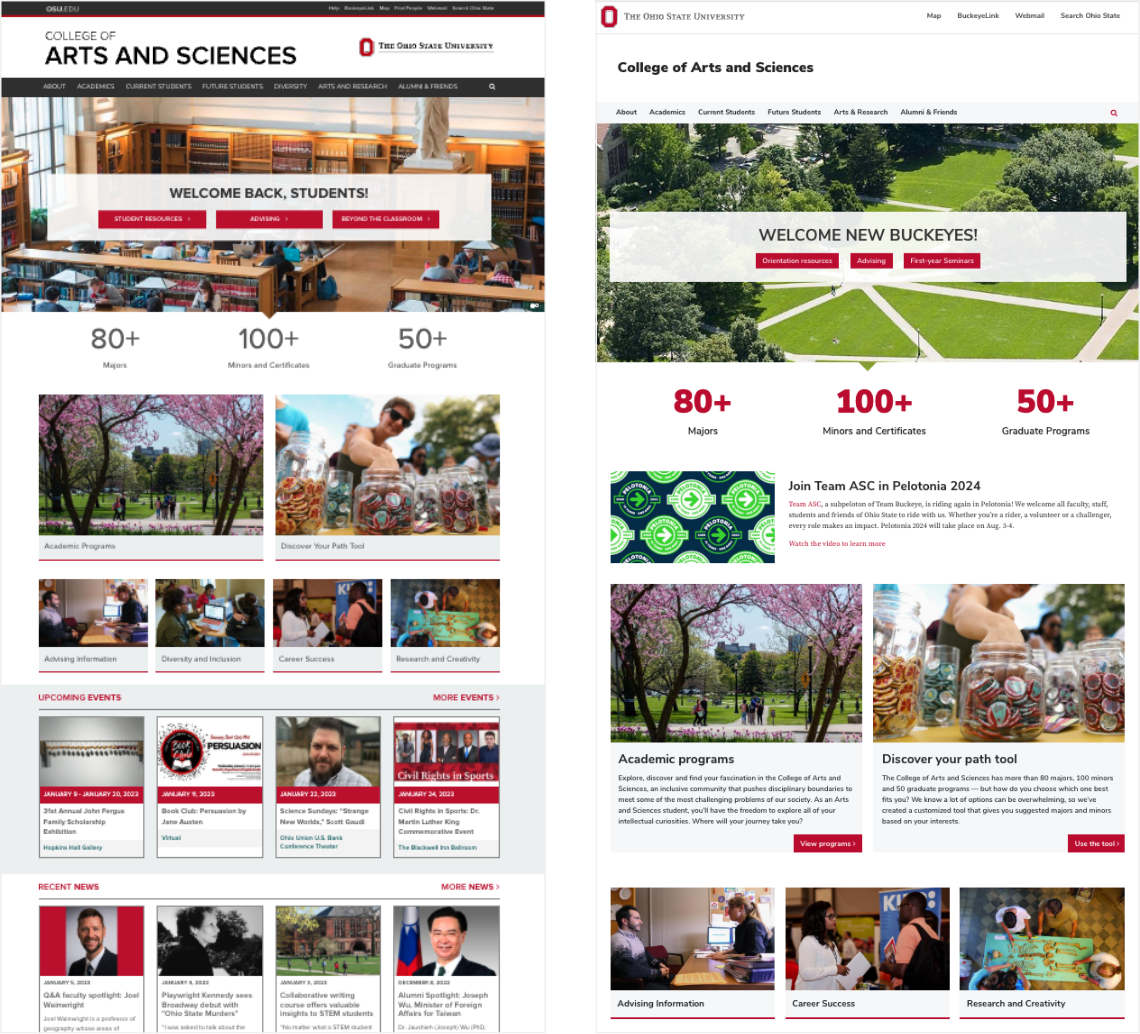 Previous homepage (left) and Phase 1 (right) of homepage with BUX integration
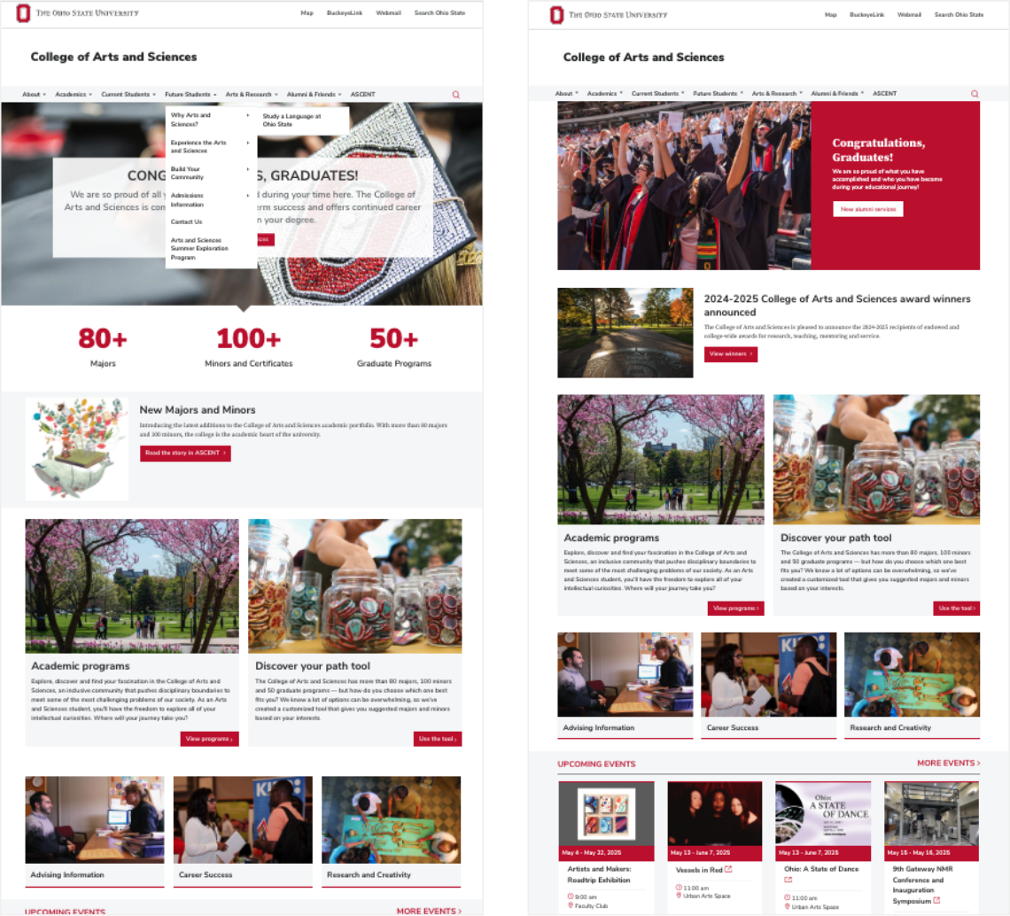 Phase 2 (right) and Phase 3 (right) of homepage with BUX integration
Changes on the event cards
Below, you see the changes to our event cards. We started by updating the fonts and colors. Then we added the brand UI icons for time and location to bring the look and feel closer to BUX.
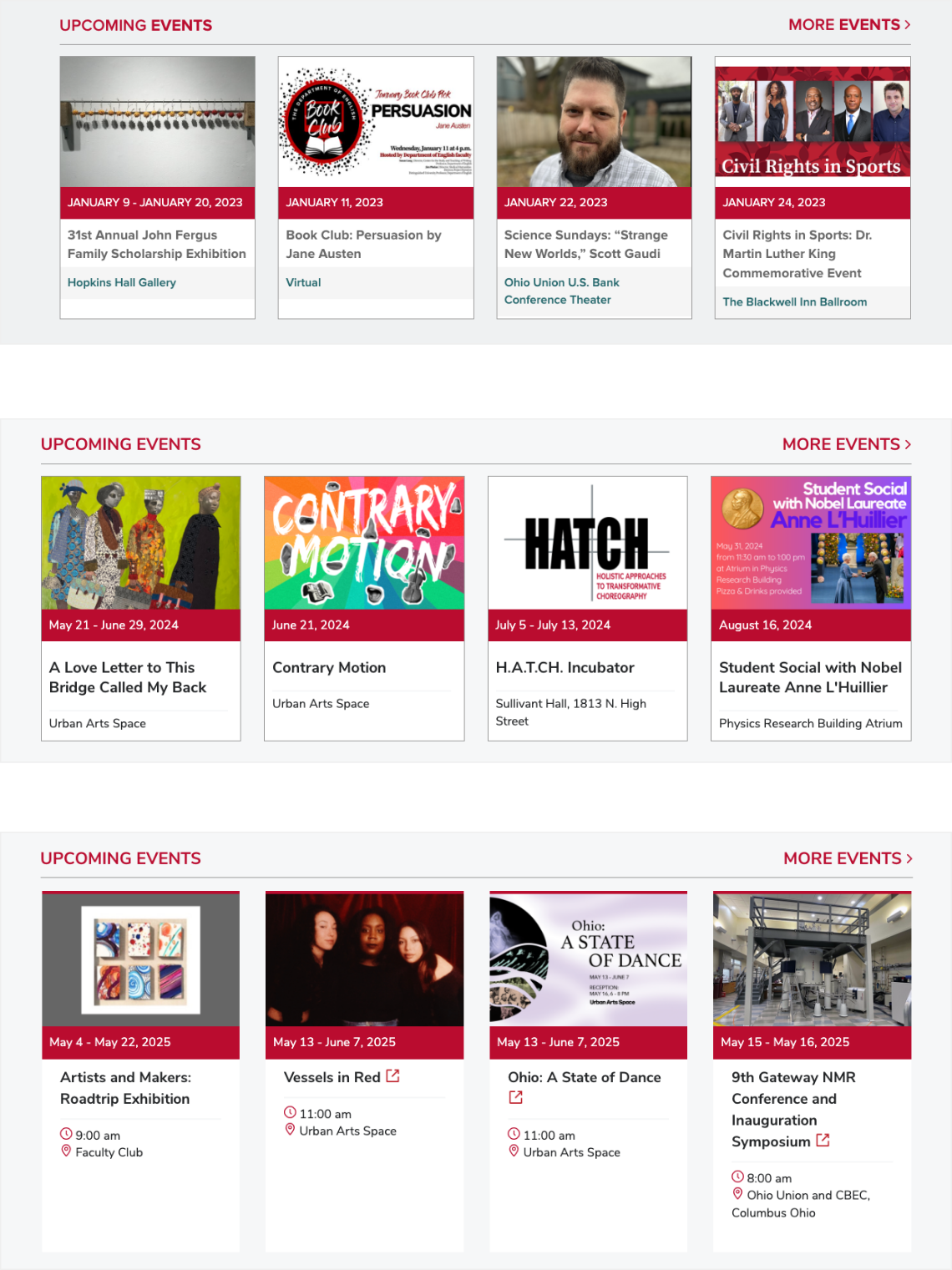 Previous event cards (top) were adjusted in phases to achieve the current BUX-aligned event cards (bottom)
Before and after of our interior pages
For our interior pages, we updated fonts, colors, menus and block quotes to follow the BUX look and feel.
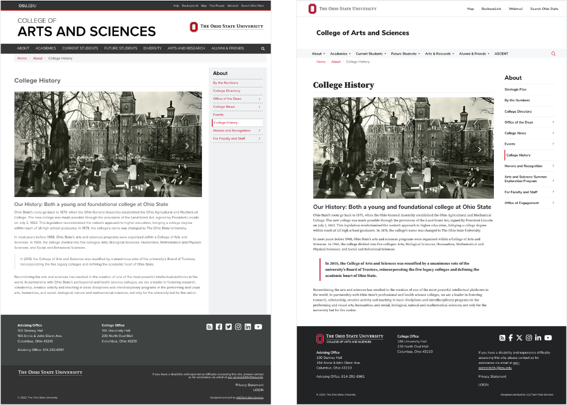 Previous interior page example (left) and current BUX-aligned interior webpage example (right)