Our websites have started shifting from disparate solutions to cohesive, user-friendly experiences that feel like our scarlet-and-gray home. How we use visual elements is important to us because we want our audiences’ experiences to look and feel like Ohio State, no matter how they interact with us.
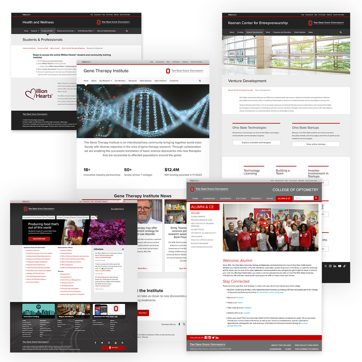
To start, let’s look at a selection of sites from the past. Some have dark headers and footers; some utilize gradients, unique image treatments or rounded corners. As an ecosystem, many websites have varying visual elements and interaction patterns, resulting in inconsistent user experiences.
Next, let’s dive into a few page before and afters.
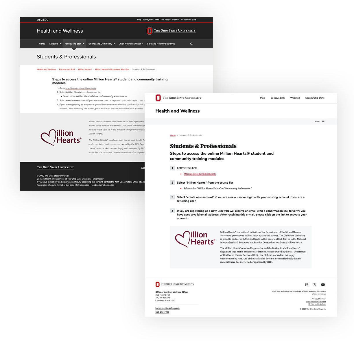
First, this Health and Wellness page gets the “light and bright” header and footer treatment that reflects the Ohio State brand. The title of the page is moved down into the body of the page so it isn’t skipped over while skimming and information on the page has a clear visual hierarchy. A Listicle is used to help make each step more visually distinct. Finally, the Million Hearts paragraphs are no longer italicized. Because it is contained in a Panel, the background color provides visual hierarchy from the Listicle above, and the additional font style is no longer necessary.
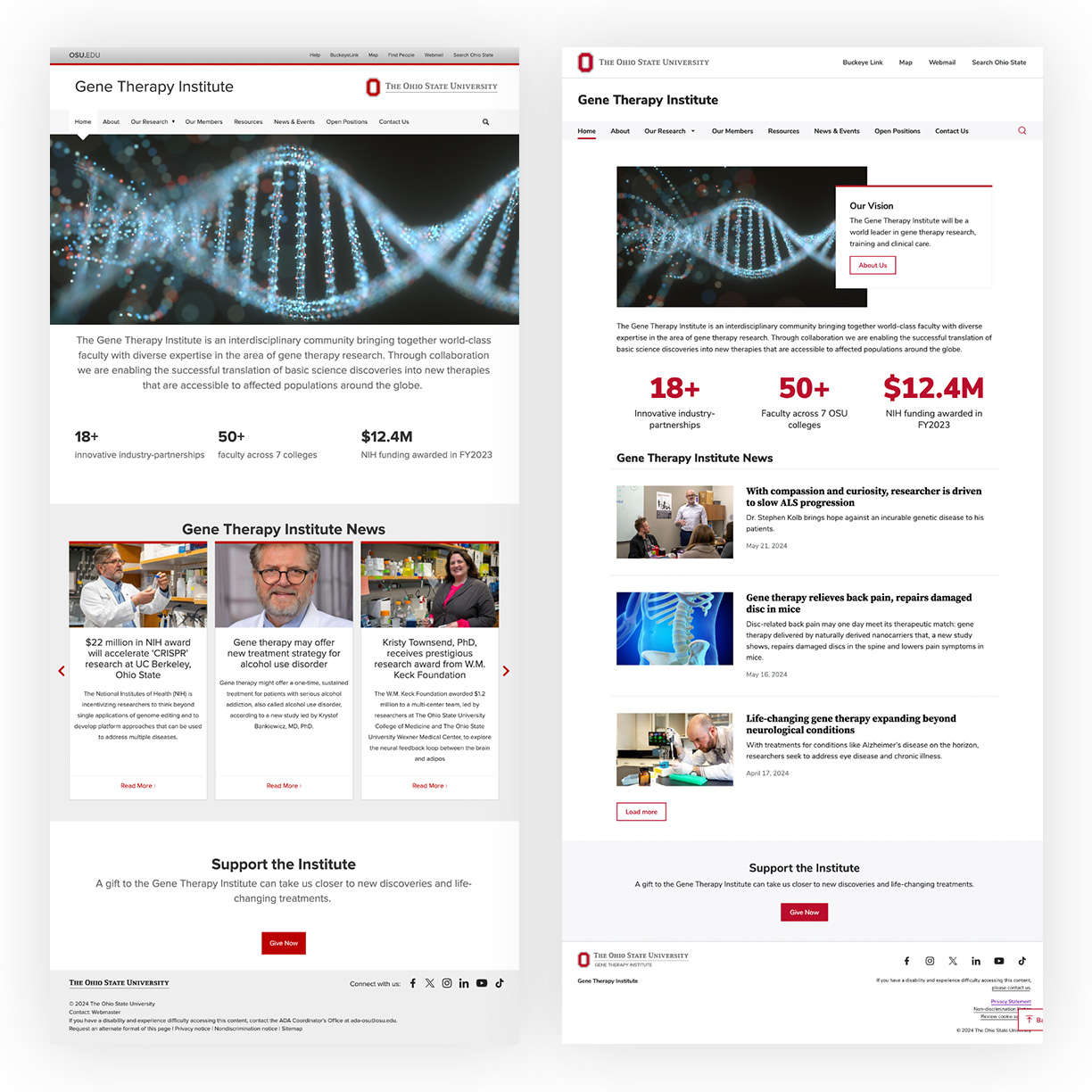
Second, we have a homepage for the Gene Therapy Institute. Before, the majority of text was center-aligned. Now, long-format text is left-aligned (which is also aligned to accessibility!), the numerical facts are more visually compelling as Factoids, and the support section is given a hierarchy boost as a Panel.
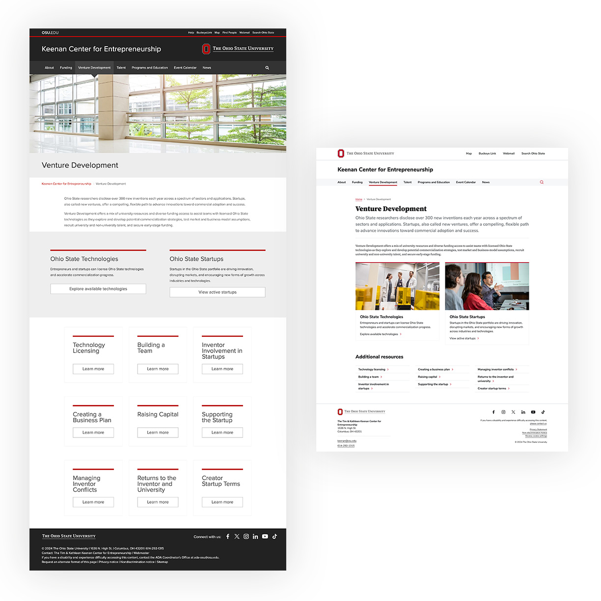
Next up is an interior page for the Keenan Center for Entrepreneurship. Before, they had a large header image that was devoid of people. Instead, two images that focus on the interactions and activity among people have been used for the two most important links on the page. A list of links that all had “learn more” buttons took up a lot of room on the page, and the buttons were too repetitive. Instead, we’ve used a three column Link List which is much more skimmable — especially for mobile users! The page is now significantly shorter and easier to navigate, all while retaining the same information and using images on the page for a visual impact.
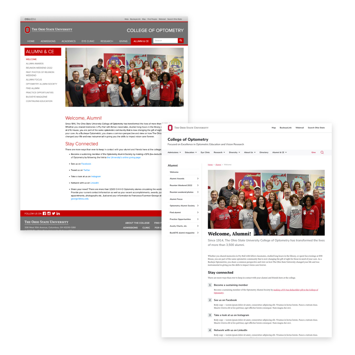
The College of Optometry was one of the first adopters of BUX and we’re proud of the strides their website has made since BUX has been socialized. Their old Alumni page had gray headers and footers, which have been swapped for a white Site Header and Site Footer. The sidebar menu on the left has been streamlined. The previous unordered list has been replaced with a Listicle for better defined hierarchy and a better visual impact.
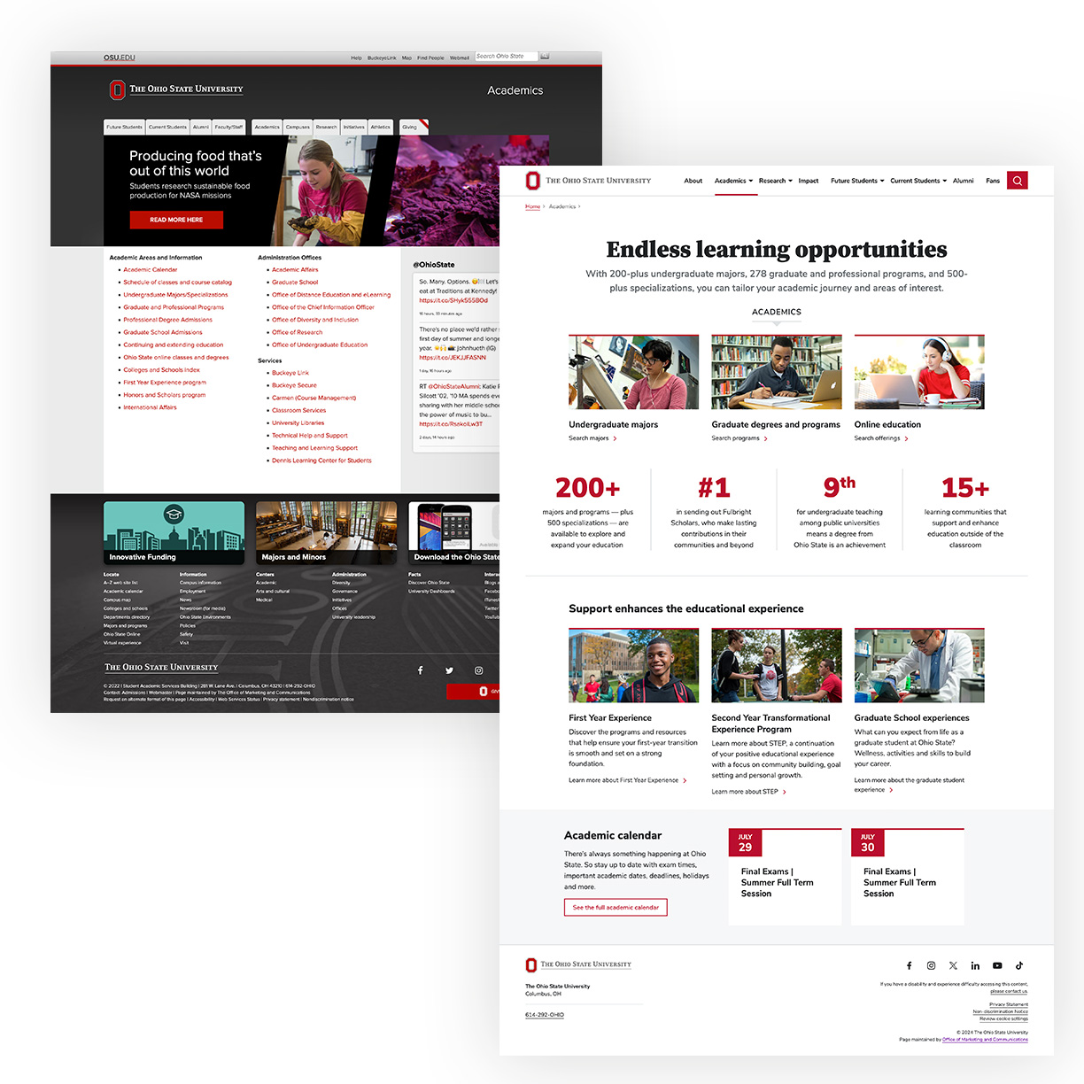
Last but certainly not least, let’s look at the Academics landing page for the university. Users may only look at these index pages for a few seconds, so we are being much more intentional with the space. There has been a major shift from dark to light and bright, less text and more imagery of what is happening on campus. Rather than a bulleted list of links, we’ve established hierarchy. We are drawing attention to the most important links at the top, while providing supporting information.
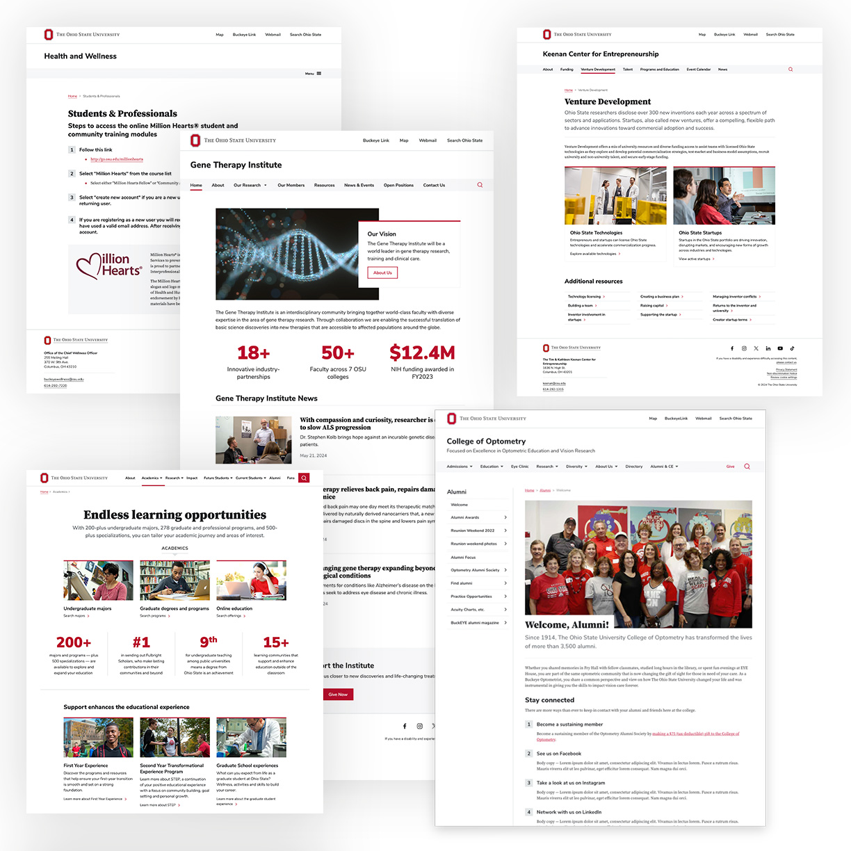
The power of the BUX design system is evident! When we compare past iterations of webpages to those that have adopted BUX, we see visual elements that better reflect the essence of our brand. As we look at a collection of websites that have adopted BUX, we are shaping the way people think, feel and respond when they explore Ohio State websites.
