Card Carousel
JSThis component requires JavaScript.
The Card Carousel displays a set of related Cards that users can navigate through horizontally.
The Card Carousel component organizes multiple cards into a horizontally navigable container. It displays related content such as articles, programs or promotional items without overwhelming the page layout.
Examples
Default
Carousel of 5 cards. Use the Previous and Next buttons to navigate the
cards.

Explore your musical passion
Join ensembles and discover opportunities to perform, collaborate, and
grow as a musician at Ohio State Mansfield.
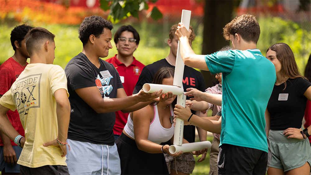
Build leadership through teamwork
Engage in team-building activities that strengthen communication,
problem-solving, and leadership skills for your future career.
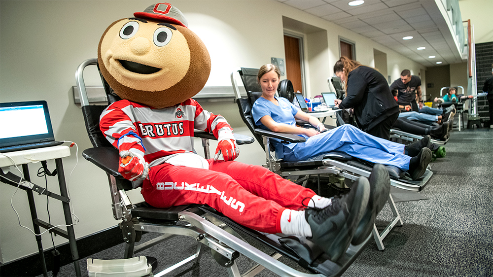
Make a difference today
Participate in campus blood drives and help save lives while
connecting with a caring, service-driven community.

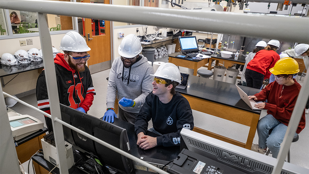
Hands-on engineering experience
Gain practical skills in engineering technology labs, just like
Zachary Ernest, and prepare for real-world innovation.
Dive into scientific discovery
Work in state-of-the-art labs, conducting experiments that build your
knowledge and open doors to exciting careers.
<div
  class="bux-card-carousel bux-card-collection-carousel"
  role="group"
  aria-label="Stories"
  aria-roledescription="carousel"
>
  <div class="visually-hidden">
    Carousel of 5 cards. Use the Previous and Next buttons to navigate the
    cards.
  </div>
  <div class="bux-card-carousel__nav bux-card-carousel__nav--left-column">
    <button
      class="bux-card-carousel__nav--left"
      type="button"
      tabindex="0"
      aria-label="Go to previous card"
    ></button>
  </div>
  <div class="bux-card-carousel__container">
    <div
      class="bux-card"
      role="group"
      aria-roledescription="Card"
      aria-label="Explore your musical passion"
    >
      <div class="bux-card__image">
        <img
          class="bux-image"
          src="/images/template-images/cards4_22_4004240_0118.jpg"
          alt=""
          height=""
          width=""
        />
      </div>

      <div class="bux-card__content">
        <h2 class="bux-heading bux-card__heading">
          <span>Explore your musical passion</span>
          <span class="bux-card__heading-icon" aria-hidden="true"></span>
        </h2>

        <div class="bux-card__body">
          Join ensembles and discover opportunities to perform, collaborate, and
          grow as a musician at Ohio State Mansfield.
        </div>

        <div class="bux-card__cta">
          <a class="bux-card__link" href="#" rel="noopener">
            <span class="bux-card__link__text">
              Learn about music opportunities
            </span>
          </a>
        </div>
      </div>
    </div>

    <div
      class="bux-card"
      role="group"
      aria-roledescription="Card"
      aria-label="Build leadership through teamwork"
    >
      <div class="bux-card__image">
        <img
          class="bux-image"
          src="/images/template-images/story-card5_22_3861899-3571.jpg"
          alt=""
          height=""
          width=""
        />
      </div>

      <div class="bux-card__content">
        <h2 class="bux-heading bux-card__heading">
          <span>Build leadership through teamwork</span>
          <span class="bux-card__heading-icon" aria-hidden="true"></span>
        </h2>

        <div class="bux-card__body">
          Engage in team-building activities that strengthen communication,
          problem-solving, and leadership skills for your future career.
        </div>

        <div class="bux-card__cta">
          <a class="bux-card__link" href="#" rel="noopener">
            <span class="bux-card__link__text">Discover student life</span>
          </a>
        </div>
      </div>
    </div>

    <div
      class="bux-card"
      role="group"
      aria-roledescription="Card"
      aria-label="Make a difference today"
    >
      <div class="bux-card__image">
        <img
          class="bux-image"
          src="/images/template-images/story-card3_22_4156707_6683.jpg"
          alt=""
          height=""
          width=""
        />
      </div>

      <div class="bux-card__content">
        <h2 class="bux-heading bux-card__heading">
          <span>Make a difference today</span>
          <span class="bux-card__heading-icon" aria-hidden="true"></span>
        </h2>

        <div class="bux-card__body">
          Participate in campus blood drives and help save lives while
          connecting with a caring, service-driven community.
        </div>

        <div class="bux-card__cta">
          <a class="bux-card__link" href="#" rel="noopener">
            <span class="bux-card__link__text">
              Volunteer for a blood drive
            </span>
          </a>
        </div>
      </div>
    </div>

    <div
      class="bux-card"
      role="group"
      aria-roledescription="Card"
      aria-label="Hands-on engineering experience"
    >
      <div class="bux-card__image">
        <img
          class="bux-image"
          src="/images/template-images/story-card2_23_4491381_20698.jpg"
          alt=""
          height=""
          width=""
        />
      </div>

      <div class="bux-card__content">
        <h2 class="bux-heading bux-card__heading">
          <span>Hands-on engineering experience</span>
          <span class="bux-card__heading-icon" aria-hidden="true"></span>
        </h2>

        <div class="bux-card__body">
          Gain practical skills in engineering technology labs, just like
          Zachary Ernest, and prepare for real-world innovation.
        </div>

        <div class="bux-card__cta">
          <a class="bux-card__link" href="#" rel="noopener">
            <span class="bux-card__link__text">
              Explore engineering programs
            </span>
          </a>
        </div>
      </div>
    </div>

    <div
      class="bux-card"
      role="group"
      aria-roledescription="Card"
      aria-label="Dive into scientific discovery"
    >
      <div class="bux-card__image">
        <img
          class="bux-image"
          src="/images/template-images/story-card4_23_4317692_2015.jpg"
          alt=""
          height=""
          width=""
        />
      </div>

      <div class="bux-card__content">
        <h2 class="bux-heading bux-card__heading">
          <span>Dive into scientific discovery</span>
          <span class="bux-card__heading-icon" aria-hidden="true"></span>
        </h2>

        <div class="bux-card__body">
          Work in state-of-the-art labs, conducting experiments that build your
          knowledge and open doors to exciting careers.
        </div>

        <div class="bux-card__cta">
          <a class="bux-card__link" href="#" rel="noopener">
            <span class="bux-card__link__text">
              Learn about lab opportunities
            </span>
          </a>
        </div>
      </div>
    </div>
  </div>
  <div class="bux-card-carousel__nav bux-card-carousel__nav--right-column">
    <button
      class="bux-card-carousel__nav--right"
      tabindex="0"
      aria-label="Go to next card"
    ></button>
  </div>
</div>
{#
Buckeye UX - version 1.6.0
Copyright (C) 2026 The Ohio State University
#}

{#

Card Collection Carousel

Available Variables:
  - name:   Name of the collection.
  - items:  Array of cards: card_image, card_image_alt, card_heading_level, card_heading, card_body, card_url, card_cta.

This DocBlock is auto-generated and any changes could be overwritten.
Use the component's corresponding *.config.ts to make changes to this file.

Last Updated: 07-01-2026 08:32:16
#}

<div
  class="bux-card-carousel bux-card-collection-carousel"
  role="group"
  aria-label="{{ name }}"
  aria-roledescription="carousel"
>
  <div class="visually-hidden">
    Carousel of {{ items|length }} cards. Use the Previous and Next buttons to navigate the cards.
  </div>
  <div class="bux-card-carousel__nav bux-card-carousel__nav--left-column">
    <button class="bux-card-carousel__nav--left" type="button" tabindex="0" aria-label="Go to previous card"></button>
  </div>
  <div class="bux-card-carousel__container">
    {% for item in items %}
      {% include '@bux/card/card.twig' with {
        card_image: true,
        image_url: item.card_image,
        card_image_alt: item.card_image_alt,
        card_heading_level: item.card_heading_level,
        card_heading: item.card_heading,
        card_body: item.card_body,
        card_url: item.card_url,
        card_cta: item.card_cta
      } only %}
    {% endfor %}
  </div>
  <div class="bux-card-carousel__nav bux-card-carousel__nav--right-column">
    <button class="bux-card-carousel__nav--right" tabindex="0" aria-label="Go to next card"></button>
  </div>
</div>
Usage
Dos
- Use with 5 or more Cards
- Limit the number of Cards to a manageable set (e.g. 5-8 items).
- Establish consistency among the Cards by including the same elements within each Card (e.g. If one Card has an image, all Cards should include an image.)
- Group cards in a carousel by related content.
- Write copy within Cards to maintain similar, concise lengths. Card heights are similar within the set.
Don'ts
- Do not use carousels to navigate to crucial calls-to-action. A user may not discover all items in the carousel and therefore overlook crucial options.
- Do not overload the carousel with an excessive amount of Cards.
- Do not overload Cards with excessive text.
- Do not auto-rotate content in the carousel; this takes away control from the user.
Implementation notes
Because the carousel is a collection of Card components, all Card implementation notes apply to the items within the carousel.
The carousel fills the width of its container and uses breakpoints to determine the number of cards displayed:
- Small: 1 card
- Medium: 3 cards
- Large: 4 cards
Accessibility
- No Auto-Play: The carousel does not move on its own. This is a big help for accessibility because sliding content can be really distracting for people with cognitive disabilities, low vision, or those who use screen readers.
- Semantic Structure and Clear Labels for Screen Readers: The code uses special labels to tell assistive tools exactly what this part of the page is. By labeling each slide as a "group," it helps screen reader users stay oriented while they move through the list. A
role="region"with anaria-roledescription="carousel"and anaria-labelis used to identify the component clearly. Each slide is wrapped in arole="group"with anaria-roledescription="slide", providing a clear map for assistive technologies. - The Peek Effect: You can see the edges of the next and previous cards. This "peek" is a great visual hint that there is more to see, which makes it much easier for everyone to find more content.
- Easy to Click Buttons: This design uses large navigation arrows instead of tiny dots. These are much easier to click for people who have trouble with fine motor skills or anyone using a phone.
- Logical Headings: To keep things organized, the headings inside the cards should follow a logical order. For example, if the section title is a level two heading, the card titles should be level three so the page structure makes sense.