Imagine for a moment that assembling a webpage is like cooking. Our BUX design system provides all the ingredients, but it’s up to content creators to use those ingredients in the best order to create a final culinary masterpiece. This blog goes over four core tenets for assembling a webpage with BUX components that clearly communicates to (and directs) site users.
Incorporate visual hierarchy
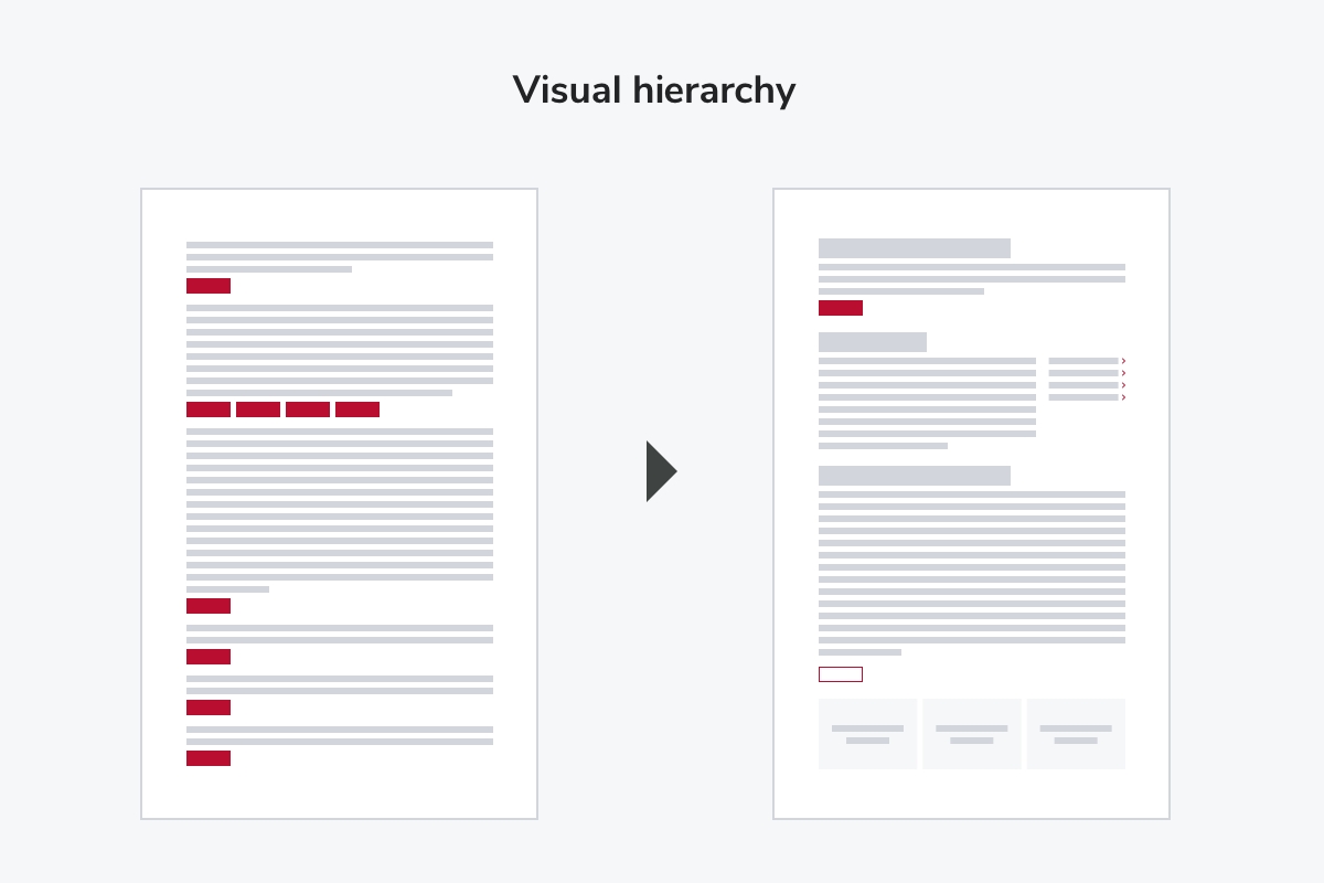
The term “visual hierarchy” may seem confusing, but all we’re trying to accomplish is guiding a user’s eye to what is most important on the page. If there’s only one spotlight, where will it be intentionally directed? Even if you have multiple CTAs (calls to action) on a page, there should only ever be one scarlet Button — the primary action we want users to take. For example, the “Apply” button on a major program page. All other CTAs should be alternate buttons, text links, or inline links.
Another way to show hierarchy is using nested headings (those H1 tags, H2 tags, paragraph tags and more). The bonus in doing this is breaking up content in scannable ways. Your final page will be more digestible for human users, Google SEO crawlers, and accessible page readers alike.

Utilize photography
When confronted with a very stark, text-heavy page, most content editors start looking for some spices to add. The first place most look is at graphics and images, and while these can be a wonderful way to express brand and tell a story, it’s best to proceed with caution.
Obviously posed stock images, randomly colored graphics, and pixelated or blurry photos lower the quality and trust factor of your webpage. Instead, use branded, high-quality photography where possible — the Signature Gallery in the DAM is a great place to start! And if no relevant, high-quality photography is available, don’t be afraid to have a page without images. If you’re using a unique collection of components, your users will still find the page interesting. Don’t fear that white space or attempt to fill it at any cost. No images are better than irrelevant or low-quality images.
Stir in words
When it comes to web content, the goal is to be concise. Even when confronted with a giant Word doc needing translation to a website, resist the urge to plop it into a single text box and be done. Studies have shown how users will react to this: by skimming the content, skipping the content, or just straight up leaving the page. Instead, find different ways to break up the text into readable, meaningful chunks.
Start with concise intro text at the top to give users an immediate understanding of what this page offers. Perhaps your top three interior page links get the Tile treatment with relevant icons. Can those bullet points be a Listicle? Utilize Tabs and Accordions when there are several pieces of content related to a single topic, but the user only needs to read some of them, like an FAQ section. Perhaps pull out a short, compelling line of text with a Quote, or highlight some compelling statistics with a Factoid. Get accustomed to all your component options and wield them with confidence.
Also don’t be afraid to refine any content you’re adding to the site, because if a paragraph can be shortened to a sentence and still convey the same meaning, do it!
Think mobile
Statistics may vary site to site, but websites are primarily visited via mobile phones. While content creators may be assembling page layouts on a desktop computer, we need to keep mobile users top of mind. Ideally even test it on a phone before calling it done.
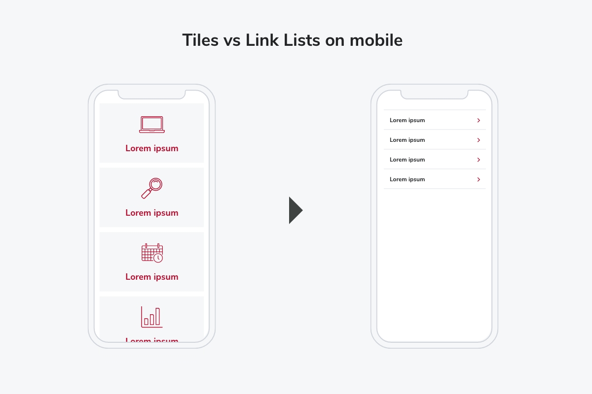
For example, consider different ways links can be displayed: Cards, Tiles, Link Lists, individual Buttons, Text Links, etc. On mobile, Tiles take up quite a bit of real estate compared to a Link List, so if you have over a dozen links to display, avoid putting them all in Tiles. Instead, perhaps the top 2-3 most sought-after links can be Tiles, and the rest relegated to a Link List right below. A ton of mobile scroll space will be saved!

There may even come a time when you start entering content onto a page only to realize that on mobile, it’s just way too long. When that happens, consider not just Accordions or Tabs to hide a bit of word count, but even dividing that content up into new pages that can all be linked from this one. Content buried at the end of a long mobile scroll might as well not even be there, since no one will ever read it — so truly contemplate where it will be easiest for users to find.
Putting it all together
There we have it — four basic strategies needed to craft the finest online experience for your users, all comprised of BUX components. Still feeling a bit intimidated? Take a look at some before and after examples to get some ideas of how to change up what you already have to make a compelling page layout. You can also consult with our BUX User Experience Design team if more help is needed. Get started by shooting us an email at BUX@osu.edu and explaining your project.
