
BUX 1.6 updates Ohio State's digital typography recommendations, making Buckeye Sans the default font for most digital body copy. The change is based on evolving accessibility guidance and industry research.
At times, digital accessibility can feel like a moving target in UX/UI design. Standards evolve, research advances and best practices are often subject to interpretation.
When we launched the Buckeye fonts in 2022, we asked designers across the university to follow a consistent typographic system across print, digital and environmental design:
- Headlines (H1s) should use Buckeye Serif in Bold or Black.
- Subheads and secondary headings should use Buckeye Sans.
- Body copy should use Buckeye Serif.
At the time, conventional design wisdom suggested that serif fonts were easier to read in longer passages of text. After all, books, newspapers and magazines had relied on serif typography for generations. The logic was simple: if readers struggled to consume the content, publishers would have abandoned the approach long ago.
 Books like A Tale of Two Cities are a familiar example of how serif fonts have traditionally been used in print for long-form reading.
Digital typography evolved along a different path.
In the early days of the web, screen resolutions were much lower than they are today. At small sizes, serif fonts could appear pixelated and difficult to read. As a result, designers increasingly favored sans serif typefaces for websites and other digital experiences.
When we launched BUX, we intentionally took a consistent approach across both digital and print channels to create a sense of familiarity in how Ohio State uses typography. Our goal was for audiences to recognize a piece as distinctly Ohio State based on its fonts and color palette alone. A great example of this kind of brand recognition is Verizon: a large headline set in Helvetica immediately signals the Verizon brand, even before any logo appears.
That was 2022.
Today, thinking around accessibility and typography continues to evolve. The U.S. General Services Administration (GSA) recommends sans serif fonts as a preferred option for digital content, noting that they can be easier to read for some people with low vision.
As a result, BUX 1.6 updates our typography guidance for digital experiences. For most body copy, we are now recommending Buckeye Sans to better align with current accessibility guidance.
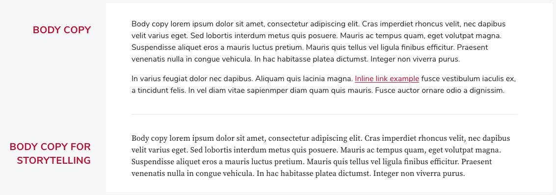 Buckeye Sans is recommended for most body copy, while Buckeye Serif remains a key typeface for storytelling.
However, Buckeye Serif will continue to have an important role in storytelling environments.
Why make an exception for storytelling?
Because this approach aligns with the practices of many leading digital publishers, including The New York Times, The Guardian, NPR and ProPublica. These organizations continue to use serif typography for long-form stories and in-depth journalism.
In storytelling contexts, serif fonts can help create a visual experience that audiences already associate with thoughtful, credible and immersive reading. By following industry conventions, we can signal that Ohio State's storytelling content offers the same depth and substance readers expect from trusted news and feature-writing platforms.
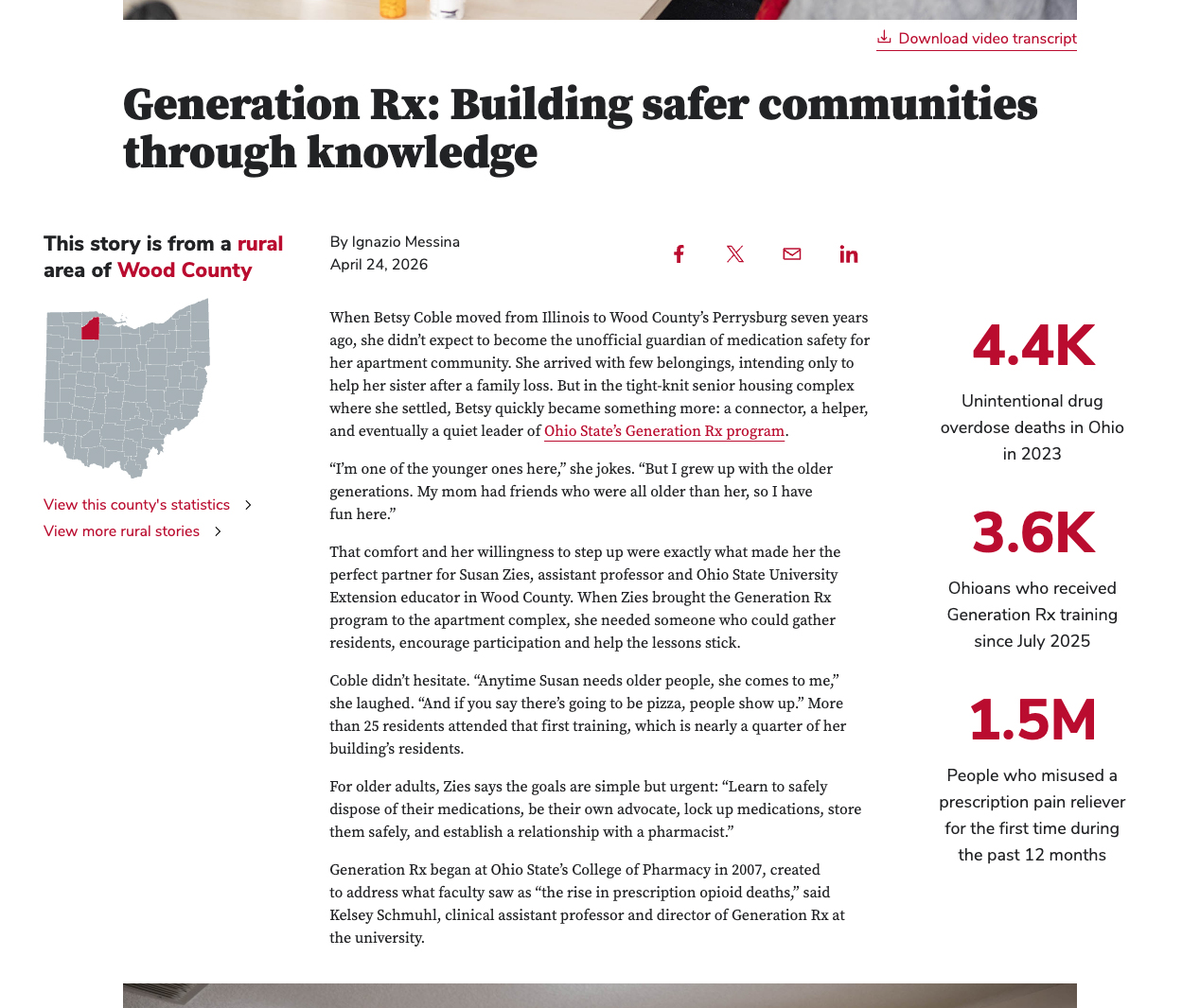 As seen in this For Ohioans story, Buckeye Serif continues to play an important role in storytelling, serving as the primary typeface for headlines and body text.
Ultimately, typography decisions involve balancing brand consistency, readability, accessibility and audience expectations.
That's where we are in 2026. The BUX team remains committed to advancing digital accessibility and will continue refining the design system as new research, guidance and best practices emerge.
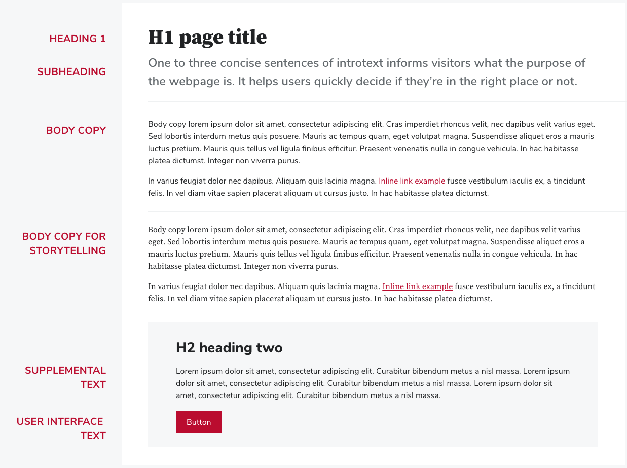 The updated digital typography system continues to balance brand consistency, readability, accessibility and audience expectations while transitioning body copy from serif to sans serif.
What this means in practice
- For body copy, use Buckeye Sans instead of Buckeye Serif.
- For long-form storytelling and storytelling headlines, continue using Buckeye Serif.
- For H1 headlines, continue using Buckeye Serif in Bold or Black.
- For subheads and secondary headings, continue using Buckeye Sans.