Take a look back at how BUX evolved over the past year to support the teams who rely on the design system every day, with a focus on usability, accessibility and more consistent digital experiences across Ohio State websites.
With another fiscal year behind us, we're taking a moment to look back on how the BUX design system has continued to evolve. Our focus remains on making the system more useful and accessible for the units who rely on it every day. In case you missed them, here are some of the notable updates from the past year.
BUX now includes microinteractions — subtle animations on hover, click, or load within components. You may have noticed them when a button subtly fades from one background color to another as you hover over it or when a chevron icon shifts from left to right to indicate the link is clickable. While they're easy to overlook, these small movements guide attention, smooth transitions and add a touch of delight to our website experiences.
BUX buttons include a microinteraction, a subtle fade between button states, that adds polish and reinforces interactivity.
2Published design principles
Which font family should I use for my heading? When should I use motion to emphasize content? We introduced digital design principles within the Brand Center website to answer these kinds of questions. They create a common ground for making design decisions, whether teams are combining existing BUX components onto a webpage or creating their own customized components. The principles offer clear guidance, visual examples and practical dos and don'ts across key areas such as color, fonts, webpage layout and more.
3Implemented dark mode
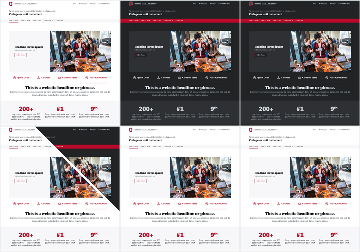
Dark mode gives people the option to view Ohio State websites with a darker color palette, making content more comfortable to read, especially in low-light environments. To meet growing user expectations, the BUX team carefully considered everything from color mapping to component behavior, creating a fully supported dark theme that works across the design system. Now, users can have an alternative viewing experience that is easier on the eyes while maintaining accessibility standards, usability and brand recognition.
Whether viewing websites in light or dark mode, BUX retains visual hierarchy and brand recognition, while still meeting accessibility and usability standards.
4Moved to Storybook
We migrated BUX to Storybook, an industry-standard platform for building and testing design systems. It gives teams a central place to view, build and test components in isolation, making collaboration between designers and developers more seamless. With a more streamlined workflow, teams can create and refine components faster, helping bring new digital experiences to Ohio State websites more efficiently.
5Changed body copy from serif to sans
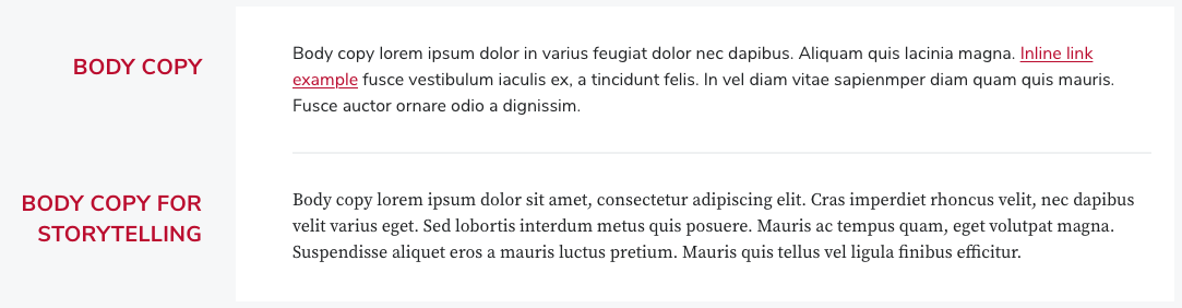
BUX updated its typography standards by replacing Buckeye Serif with Buckeye Sans as the default font for most digital body copy. The change was driven by evolving accessibility guidance and industry best practices which show that sans serif fonts are often easier to read on screens. While Buckeye Serif continues to play an important role in storytelling and long-form content, the change helps make Ohio State websites easier to read and more accessible without sacrificing brand consistency.
Buckeye Sans is recommended for most body copy, while Buckeye Serif remains a key typeface for storytelling.
6Created new UI icons, components and templates
When it comes to system assets, this past year was one of our most productive yet. We added a wide range of new UI icons, components and templates to help teams build better digital experiences faster. Our icon library has expanded to more than 130 icons and is now organized into functional categories, helping users better understand where and how icons can be used.
Some of the most popular component additions are image-based, including Gallery and Sliding Selector, both with multiple variants, which offer increased user interaction and support more robust storytelling opportunities.
We also introduced practical templates, such as Search Results and Error (404) Page, and all templates are now available as downloadable HTML files. Our design templates continue to be some of the most frequently referenced assets in the design system, giving teams a starting point for how component combinations can be put together into a functional webpage and are a great starting point for prototyping.
As we look ahead to our BUX project roadmap, we're focused on making BUX even easier to use and integrate into your work.
One of our biggest initiatives for the coming year is the transition from Adobe XD to Figma as our primary UX/UI design tool. Figma's library capabilities will give users easy access to shared assets maintained by the core BUX team, making it easier to design and prototype digital experiences.
In addition, we're planning an updated BUX web environment with an enhanced visual experience for browsing design and development guides, tools, and resources to help teams implement the BUX design system.
We're excited about what's ahead and look forward to continuing to evolve BUX alongside our community.