Gallery
The Gallery displays a group of images in a carousel layout, allowing users to browse and view images in larger detail. It is ideal for displaying images that have a common theme, such as campus life, academic programs, research, and facilities.
The Gallery includes the Gallery Lightbox experience, allowing users to click an image to view it full-screen.
Examples
Gallery
-
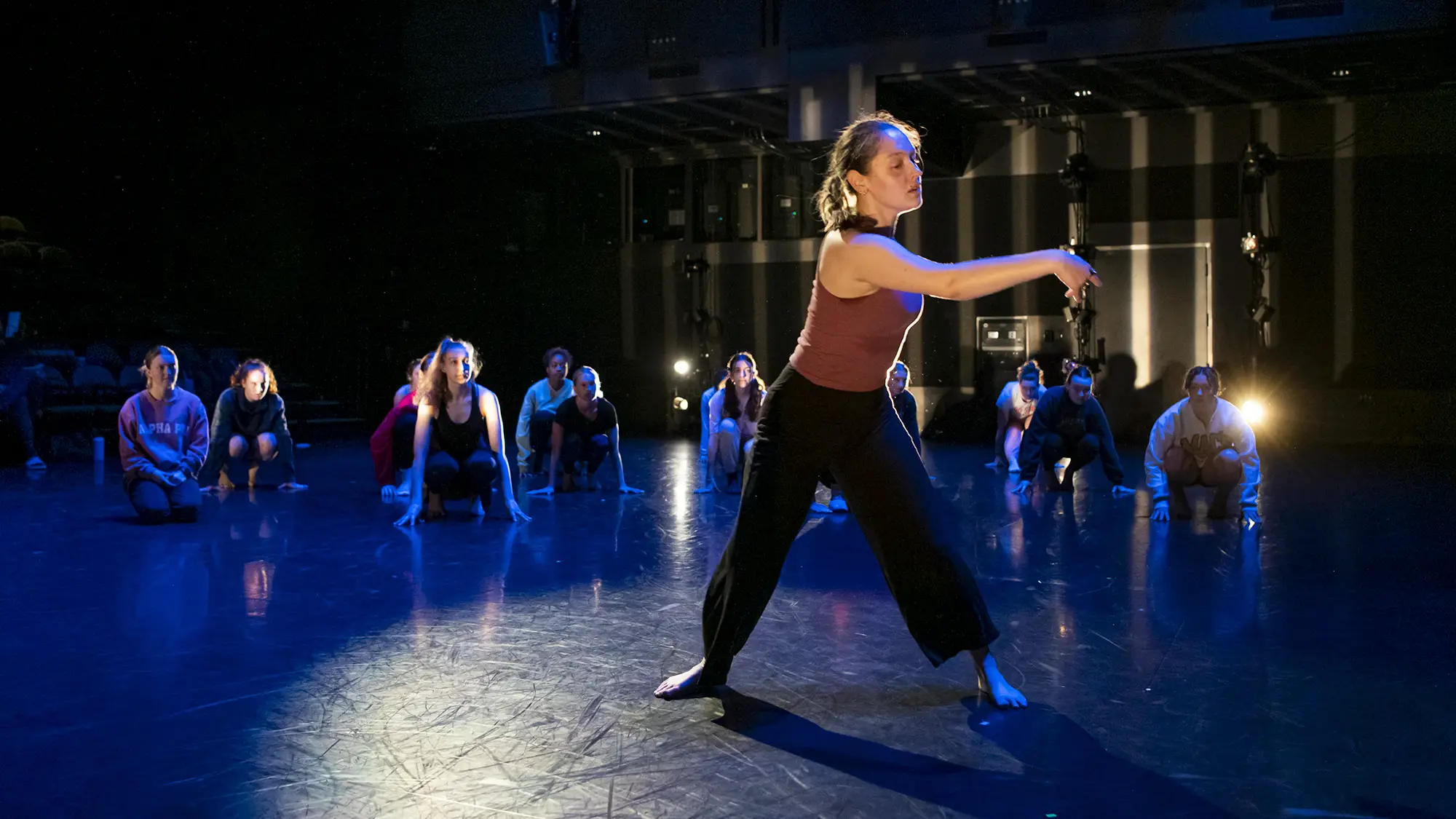 Dance Denmark student group rehearsing for an upcoming performance.
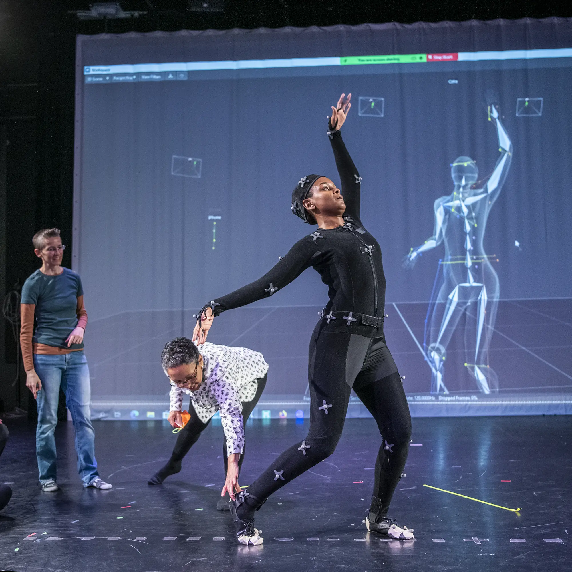 Recording movement in the Arts and Sciences Motion Lab—an innovative classroom and learning space
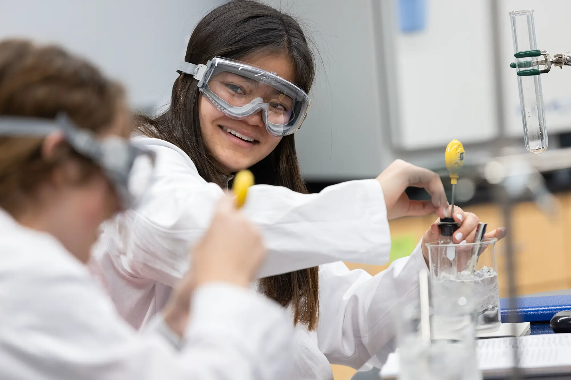 Kaitlin Herman and lab partner Katherine Seaman work to discover how different salts affect the freezing point of pure water. 1620 General Chemistry for Majors room 350 Celeste Laboratory of Chemistry.
 -
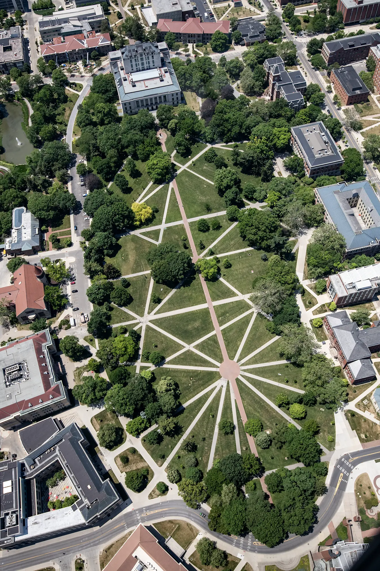 Campus aerial as seen during flight on the Goodyear Blimp.
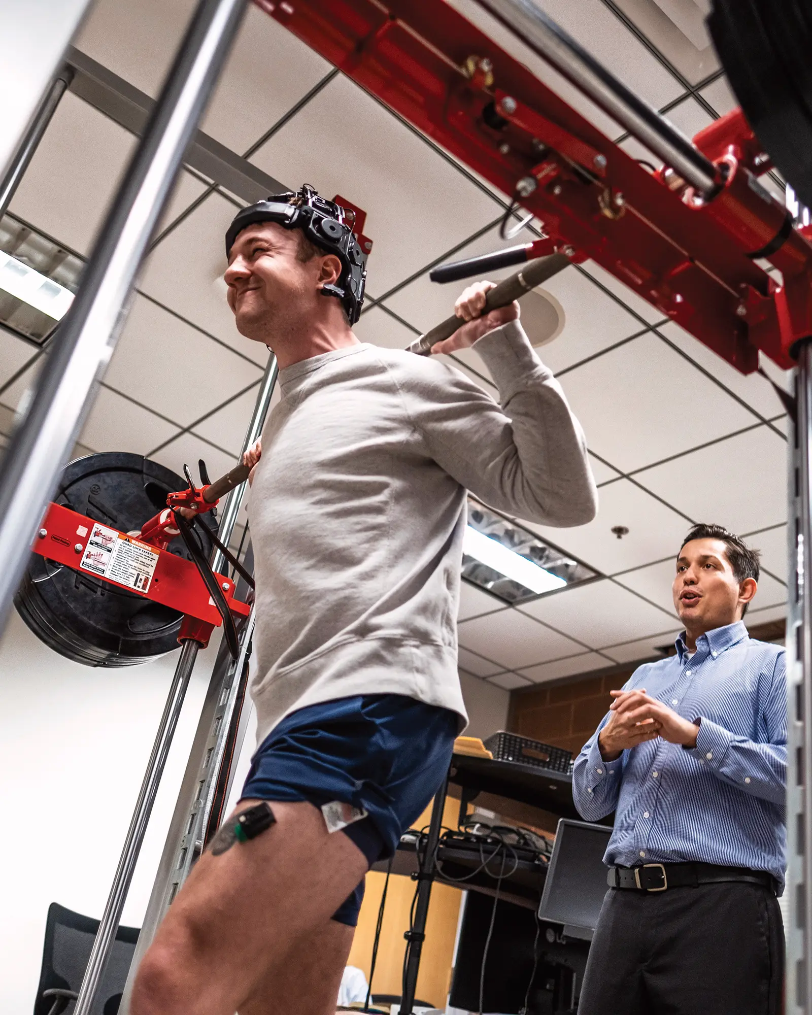 Matt Soileau, left, wearing sensors, pushes upward on the weighted bar for about five continuous seconds as JP Anders (blue shirt) monitors in the Neuroscience Exercise Research Laboratory (Room A06).
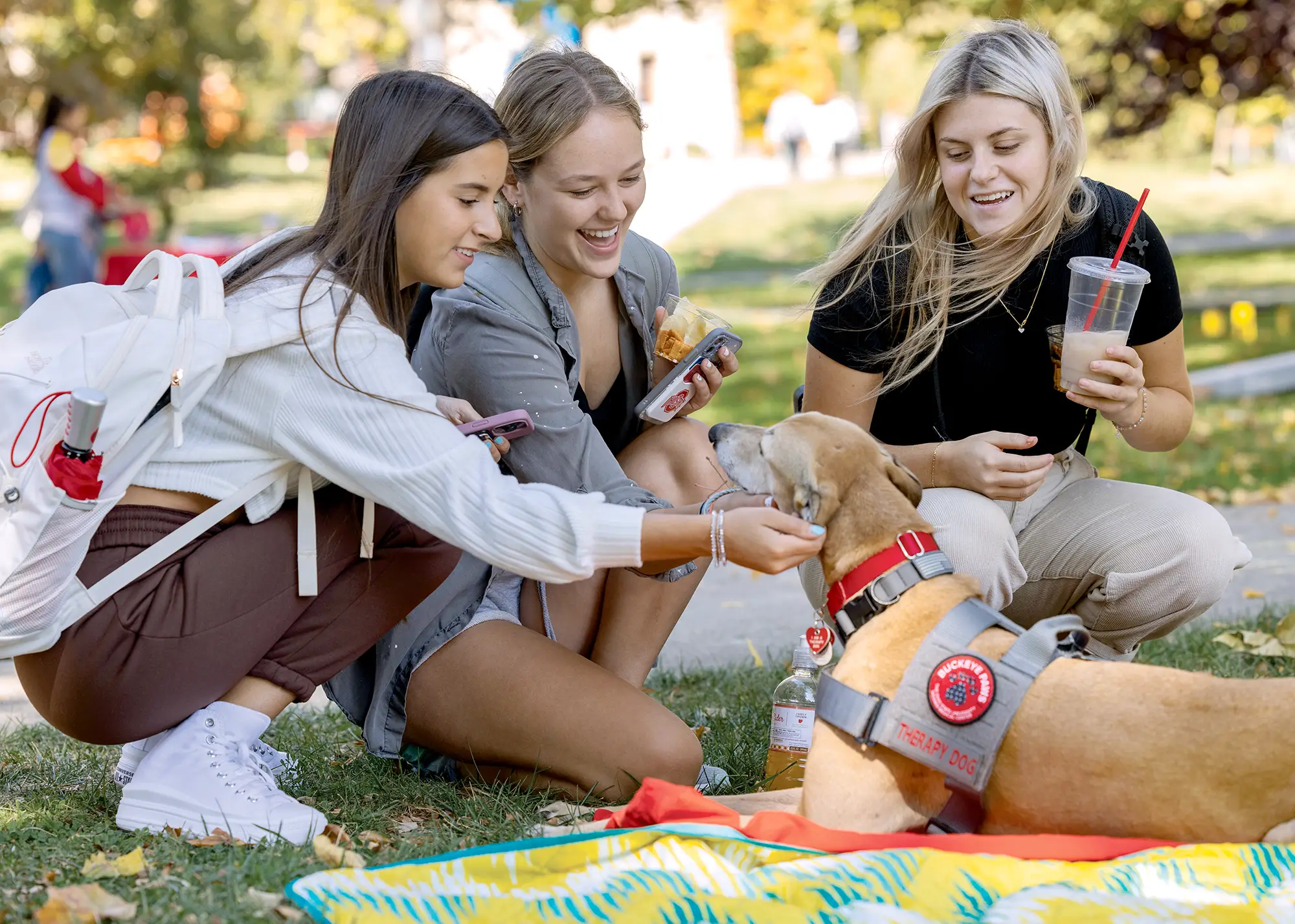 Ava Parose, Sarah Grohovsky and Gianna DelGarbino pet PAWS dog Cascade during the Student Life RECESS event on the south oval.
 -
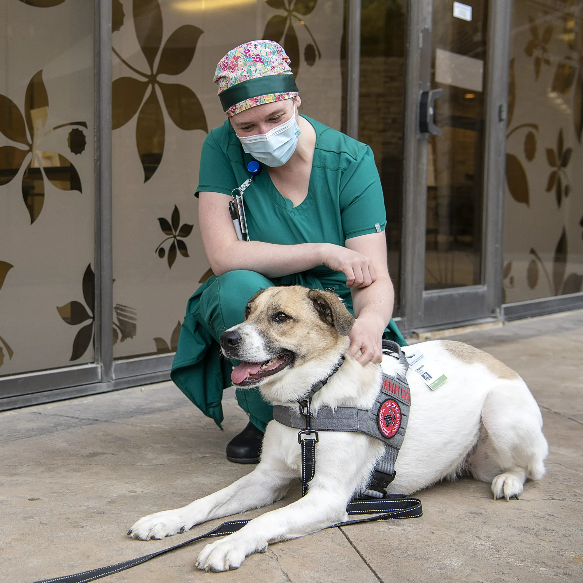 Dogs With Dogs, PAWS Therapy Dogs, East Hospital
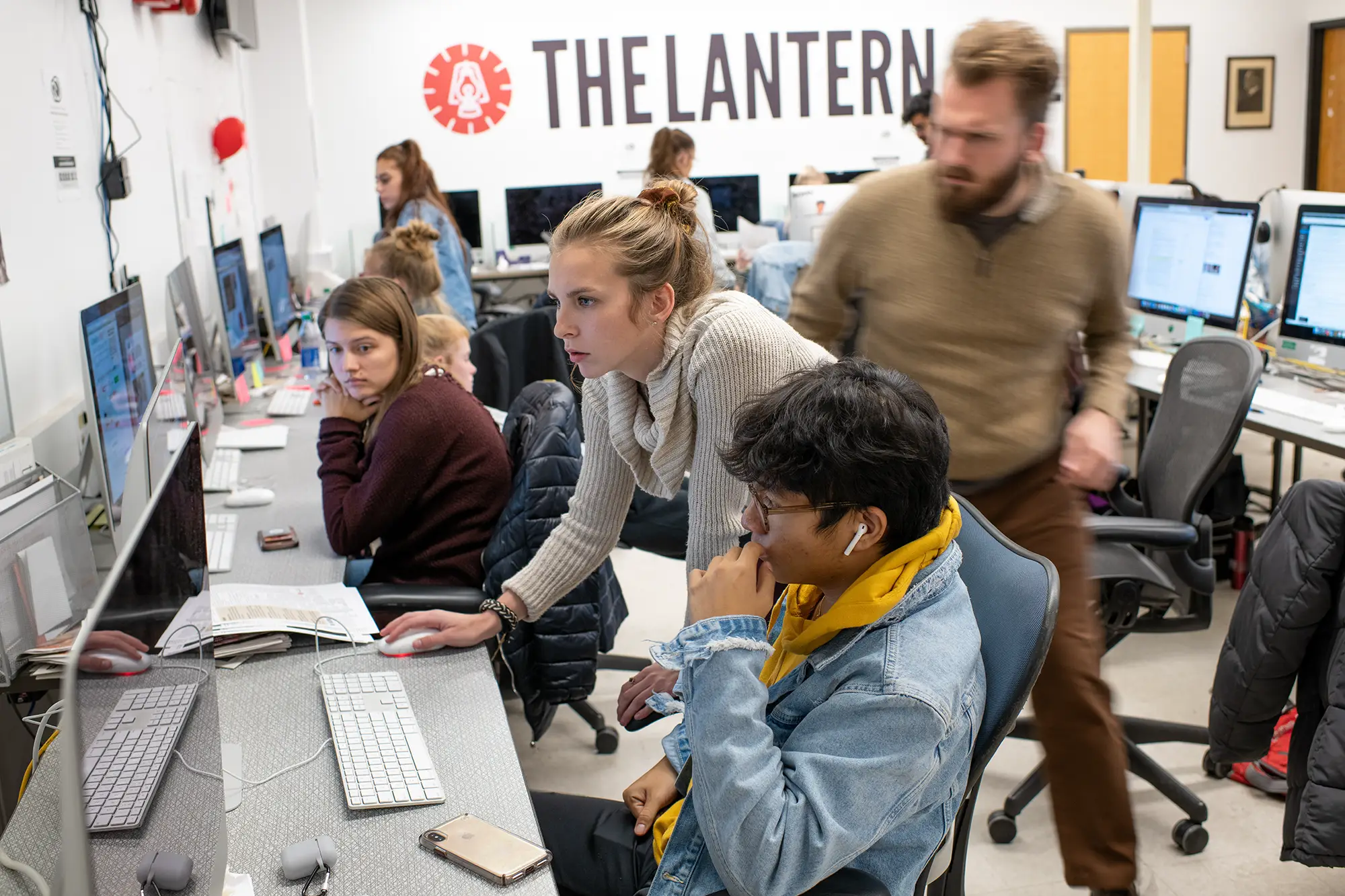 The Lantern is an independent daily newspaper published by students. One of the largest campus newspapers in the United States, it reaches a circulation of 15,000. Copies are free and available on campus and throughout Columbus.
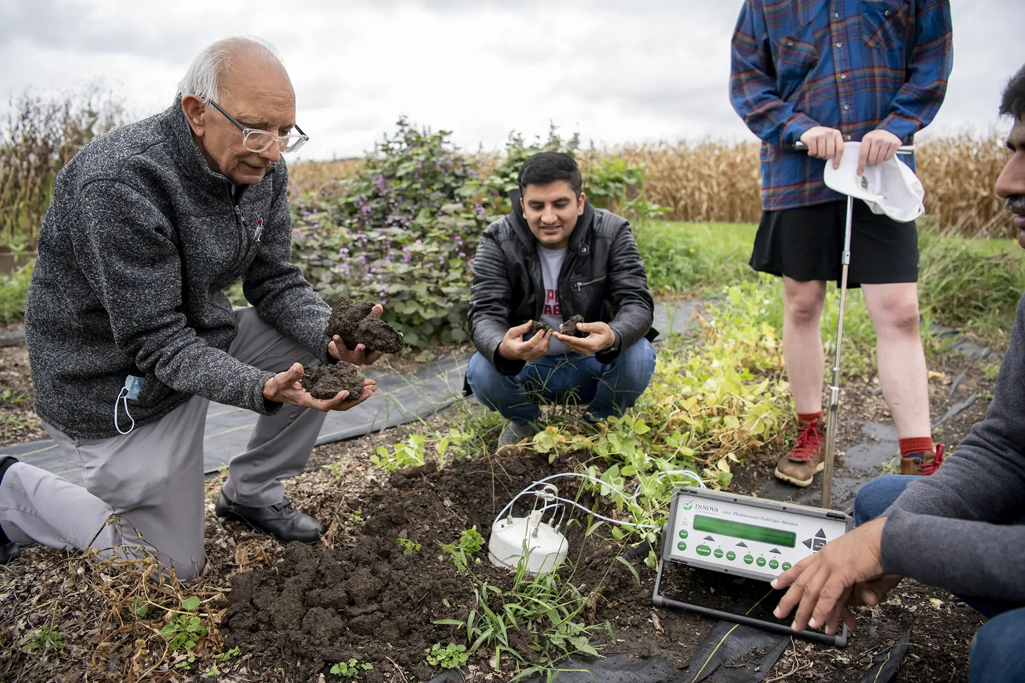 School of Environment and Natural Resources professor Rattan Lal, whose research involves soil, at Waterman Farm with team members.
 -

-

<section class="bux-gallery-controller">
<div
class="bux-carousel-controls"
aria-label="carousel navigation"
role="group"
>
<button
class="bux-carousel-controls__previous bux-carousel-controls__btn"
type="button"
aria-label="previous"
>
<span class="icon icon-chevron-left" aria-hidden="true"></span>
</button>
<button
class="bux-carousel-controls__next bux-carousel-controls__btn"
type="button"
aria-label="next"
>
<span class="icon icon-chevron-right" aria-hidden="true"></span>
</button>
</div>
<section
class="bux-slider bux-slider--gallery"
role="group"
aria-roledescription="carousel"
aria-live="polite"
>
<ul class="bux-slider__slides">
<li class="bux-slider__slide" aria-roledescription="slide">
<div
class="slide__content-wrapper"
data-grid-column-start="1"
data-grid-column-end="8"
data-grid-row-start="1"
data-grid-row-end="7"
data-full-size-url="/images/placeholders/gallery/16x9-01.webp"
>
<button class="slide__image-lightbox-trigger" type="button">
<span class="visually-hidden">Open image in lightbox</span>
</button>
<img
class="slide__image slide__content"
src="/images/placeholders/gallery/16x9-01.webp"
alt="A barefoot dancer performs in the foreground of a dark stage, while a group of dancers crouch in the background under blue lighting."
/>
<div class="bux-gallery-image-tooltip">
<button class="bux-gallery-image-tooltip__trigger">
<span class="trigger__visible-button">
<span class="bux-icon icon-info" aria-hidden="true"></span>
<span class="visually-hidden">Toggle caption</span>
</span>
</button>
<div class="bux-gallery-image-tooltip__container">
Dance Denmark student group rehearsing for an upcoming
performance.
</div>
</div>
</div>
<div
class="slide__content-wrapper"
data-grid-column-start="8"
data-grid-column-end="13"
data-grid-row-start="1"
data-grid-row-end="4"
data-full-size-url="/images/placeholders/gallery/1x1-01.webp"
>
<button class="slide__image-lightbox-trigger" type="button">
<span class="visually-hidden">Open image in lightbox</span>
</button>
<img
class="slide__image slide__content"
src="/images/placeholders/gallery/1x1-01.webp"
alt="A performer in a black motion capture suit strikes a pose in a studio, mirrored exactly by a digital skeletal avatar on a large projection screen behind them, while two people observe and assist."
/>
<div class="bux-gallery-image-tooltip">
<button class="bux-gallery-image-tooltip__trigger">
<span class="trigger__visible-button">
<span class="bux-icon icon-info" aria-hidden="true"></span>
<span class="visually-hidden">Toggle caption</span>
</span>
</button>
<div class="bux-gallery-image-tooltip__container">
Recording movement in the Arts and Sciences Motion Lab—an
innovative classroom and learning space
</div>
</div>
</div>
<div
class="slide__content-wrapper"
data-grid-column-start="8"
data-grid-column-end="13"
data-grid-row-start="4"
data-grid-row-end="7"
data-full-size-url="/images/placeholders/gallery/3x2-01.webp"
>
<button class="slide__image-lightbox-trigger" type="button">
<span class="visually-hidden">Open image in lightbox</span>
</button>
<img
class="slide__image slide__content"
src="/images/placeholders/gallery/3x2-01.webp"
alt="A smiling student wearing safety goggles and a lab coat adjusts a thermometer in an ice bath during a science experiment with a classmate."
/>
<div class="bux-gallery-image-tooltip">
<button class="bux-gallery-image-tooltip__trigger">
<span class="trigger__visible-button">
<span class="bux-icon icon-info" aria-hidden="true"></span>
<span class="visually-hidden">Toggle caption</span>
</span>
</button>
<div class="bux-gallery-image-tooltip__container">
Kaitlin Herman and lab partner Katherine Seaman work to discover
how different salts affect the freezing point of pure water. 1620
General Chemistry for Majors room 350 Celeste Laboratory of
Chemistry.
</div>
</div>
</div>
</li>
<li class="bux-slider__slide" aria-roledescription="slide">
<div
class="slide__content-wrapper"
data-grid-column-start="1"
data-grid-column-end="8"
data-grid-row-start="1"
data-grid-row-end="7"
data-full-size-url="/images/placeholders/gallery/2x3-01.webp"
>
<button class="slide__image-lightbox-trigger" type="button">
<span class="visually-hidden">Open image in lightbox</span>
</button>
<img
class="slide__image slide__content"
src="/images/placeholders/gallery/2x3-01.webp"
alt="Aerial view of a large, grassy university campus quadrangle crisscrossed by a complex network of intersecting geometric pathways, surrounded by trees and academic buildings."
/>
<div class="bux-gallery-image-tooltip">
<button class="bux-gallery-image-tooltip__trigger">
<span class="trigger__visible-button">
<span class="bux-icon icon-info" aria-hidden="true"></span>
<span class="visually-hidden">Toggle caption</span>
</span>
</button>
<div class="bux-gallery-image-tooltip__container">
Campus aerial as seen during flight on the Goodyear Blimp.
</div>
</div>
</div>
<div
class="slide__content-wrapper"
data-grid-column-start="8"
data-grid-column-end="13"
data-grid-row-start="1"
data-grid-row-end="4"
data-full-size-url="/images/placeholders/gallery/4x5-01.webp"
>
<button class="slide__image-lightbox-trigger" type="button">
<span class="visually-hidden">Open image in lightbox</span>
</button>
<img
class="slide__image slide__content"
src="/images/placeholders/gallery/4x5-01.webp"
alt="A man wearing a head-mounted sensor cap and a thigh sensor performs a barbell squat on a machine while another man observes him in a lab setting."
/>
<div class="bux-gallery-image-tooltip">
<button class="bux-gallery-image-tooltip__trigger">
<span class="trigger__visible-button">
<span class="bux-icon icon-info" aria-hidden="true"></span>
<span class="visually-hidden">Toggle caption</span>
</span>
</button>
<div class="bux-gallery-image-tooltip__container">
Matt Soileau, left, wearing sensors, pushes upward on the weighted
bar for about five continuous seconds as JP Anders (blue shirt)
monitors in the Neuroscience Exercise Research Laboratory (Room
A06).
</div>
</div>
</div>
<div
class="slide__content-wrapper"
data-grid-column-start="8"
data-grid-column-end="13"
data-grid-row-start="4"
data-grid-row-end="7"
data-full-size-url="/images/placeholders/gallery/7x5-01.webp"
>
<button class="slide__image-lightbox-trigger" type="button">
<span class="visually-hidden">Open image in lightbox</span>
</button>
<img
class="slide__image slide__content"
src="/images/placeholders/gallery/7x5-01.webp"
alt="Three smiling young women crouch on the grass outdoors, petting a light brown therapy dog wearing a grey harness."
/>
<div class="bux-gallery-image-tooltip">
<button class="bux-gallery-image-tooltip__trigger">
<span class="trigger__visible-button">
<span class="bux-icon icon-info" aria-hidden="true"></span>
<span class="visually-hidden">Toggle caption</span>
</span>
</button>
<div class="bux-gallery-image-tooltip__container">
Ava Parose, Sarah Grohovsky and Gianna DelGarbino pet PAWS dog
Cascade during the Student Life RECESS event on the south oval.
</div>
</div>
</div>
</li>
<li class="bux-slider__slide" aria-roledescription="slide">
<div
class="slide__content-wrapper"
data-grid-column-start="1"
data-grid-column-end="8"
data-grid-row-start="1"
data-grid-row-end="7"
data-full-size-url="/images/placeholders/gallery/1x1-02.webp"
>
<button class="slide__image-lightbox-trigger" type="button">
<span class="visually-hidden">Open image in lightbox</span>
</button>
<img
class="slide__image slide__content"
src="/images/placeholders/gallery/1x1-02.webp"
alt="A woman in scrubs kneels to pet a medium-sized white and tan dog that is wearing a service animal harness and vest and laying on the ground."
/>
<div class="bux-gallery-image-tooltip">
<button class="bux-gallery-image-tooltip__trigger">
<span class="trigger__visible-button">
<span class="bux-icon icon-info" aria-hidden="true"></span>
<span class="visually-hidden">Toggle caption</span>
</span>
</button>
<div class="bux-gallery-image-tooltip__container">
Dogs With Dogs, PAWS Therapy Dogs, East Hospital
</div>
</div>
</div>
<div
class="slide__content-wrapper"
data-grid-column-start="8"
data-grid-column-end="13"
data-grid-row-start="1"
data-grid-row-end="4"
data-full-size-url="/images/placeholders/gallery/3x2-02.webp"
>
<button class="slide__image-lightbox-trigger" type="button">
<span class="visually-hidden">Open image in lightbox</span>
</button>
<img
class="slide__image slide__content"
src="/images/placeholders/gallery/3x2-02.webp"
alt="Several students and an advisor gather around a computer in The Lantern's office."
/>
<div class="bux-gallery-image-tooltip">
<button class="bux-gallery-image-tooltip__trigger">
<span class="trigger__visible-button">
<span class="bux-icon icon-info" aria-hidden="true"></span>
<span class="visually-hidden">Toggle caption</span>
</span>
</button>
<div class="bux-gallery-image-tooltip__container">
The Lantern is an independent daily newspaper published by
students. One of the largest campus newspapers in the United
States, it reaches a circulation of 15,000. Copies are free and
available on campus and throughout Columbus.
</div>
</div>
</div>
<div
class="slide__content-wrapper"
data-grid-column-start="8"
data-grid-column-end="13"
data-grid-row-start="4"
data-grid-row-end="7"
data-full-size-url="/images/placeholders/gallery/3x2-03.webp"
>
<button class="slide__image-lightbox-trigger" type="button">
<span class="visually-hidden">Open image in lightbox</span>
</button>
<img
class="slide__image slide__content"
src="/images/placeholders/gallery/3x2-03.webp"
alt="Professor Rattan Lal kneels in an agricultural field alongside three students and soil testing equipment."
/>
<div class="bux-gallery-image-tooltip">
<button class="bux-gallery-image-tooltip__trigger">
<span class="trigger__visible-button">
<span class="bux-icon icon-info" aria-hidden="true"></span>
<span class="visually-hidden">Toggle caption</span>
</span>
</button>
<div class="bux-gallery-image-tooltip__container">
School of Environment and Natural Resources professor Rattan Lal,
whose research involves soil, at Waterman Farm with team members.
</div>
</div>
</div>
</li>
<li class="bux-slider__slide" aria-roledescription="slide">
<div
class="slide__content-wrapper"
data-grid-column-start="1"
data-grid-column-end="8"
data-grid-row-start="1"
data-grid-row-end="7"
data-full-size-url="/images/placeholders/gallery/5x7-01.webp"
>
<button class="slide__image-lightbox-trigger" type="button">
<span class="visually-hidden">Open image in lightbox</span>
</button>
<img
class="slide__image slide__content"
src="/images/placeholders/gallery/5x7-01.webp"
alt=""
/>
</div>
<div
class="slide__content-wrapper"
data-grid-column-start="8"
data-grid-column-end="13"
data-grid-row-start="1"
data-grid-row-end="4"
data-full-size-url="/images/placeholders/gallery/5x4-01.webp"
>
<button class="slide__image-lightbox-trigger" type="button">
<span class="visually-hidden">Open image in lightbox</span>
</button>
<img
class="slide__image slide__content"
src="/images/placeholders/gallery/5x4-01.webp"
alt=""
/>
</div>
<div
class="slide__content-wrapper"
data-grid-column-start="8"
data-grid-column-end="13"
data-grid-row-start="4"
data-grid-row-end="7"
data-full-size-url="/images/placeholders/gallery/6x4-01.webp"
>
<button class="slide__image-lightbox-trigger" type="button">
<span class="visually-hidden">Open image in lightbox</span>
</button>
<img
class="slide__image slide__content"
src="/images/placeholders/gallery/6x4-01.webp"
alt=""
/>
</div>
</li>
<li class="bux-slider__slide" aria-roledescription="slide">
<div
class="slide__content-wrapper"
data-grid-column-start="1"
data-grid-column-end="8"
data-grid-row-start="1"
data-grid-row-end="7"
data-full-size-url="/images/placeholders/gallery/9x16-01.webp"
>
<button class="slide__image-lightbox-trigger" type="button">
<span class="visually-hidden">Open image in lightbox</span>
</button>
<img
class="slide__image slide__content"
src="/images/placeholders/gallery/9x16-01.webp"
alt=""
/>
</div>
<div
class="slide__content-wrapper"
data-grid-column-start="8"
data-grid-column-end="13"
data-grid-row-start="1"
data-grid-row-end="4"
data-full-size-url="/images/placeholders/gallery/16x9-02.webp"
>
<button class="slide__image-lightbox-trigger" type="button">
<span class="visually-hidden">Open image in lightbox</span>
</button>
<img
class="slide__image slide__content"
src="/images/placeholders/gallery/16x9-02.webp"
alt=""
/>
</div>
<div
class="slide__content-wrapper"
data-grid-column-start="8"
data-grid-column-end="13"
data-grid-row-start="4"
data-grid-row-end="7"
data-full-size-url="/images/placeholders/gallery/5x4-02.webp"
>
<button class="slide__image-lightbox-trigger" type="button">
<span class="visually-hidden">Open image in lightbox</span>
</button>
<img
class="slide__image slide__content"
src="/images/placeholders/gallery/5x4-02.webp"
alt=""
/>
</div>
</li>
</ul>
</section>
<dialog class="bux-gallery-lightbox">
<div class="bux-gallery-lightbox__backdrop"></div>
<div class="bux-gallery-lightbox__wrapper">
<div class="bux-gallery-lightbox__close-button">
<button class="close-button__button" type="button">
<span class="visually-hidden">Close this gallery</span>
<span class="icon icon-xmark" aria-hidden="true"></span>
</button>
</div>
<div
class="bux-carousel-controls"
aria-label="carousel navigation"
role="group"
>
<button
class="bux-carousel-controls__previous bux-carousel-controls__btn"
type="button"
aria-label="previous"
>
<span class="icon icon-chevron-left" aria-hidden="true"></span>
</button>
<button
class="bux-carousel-controls__next bux-carousel-controls__btn"
type="button"
aria-label="next"
>
<span class="icon icon-chevron-right" aria-hidden="true"></span>
</button>
</div>
<div class="bux-slider bux-slider--lightbox">
<ul class="bux-slider__slides">
<li class="bux-slider__slide">
<figure class="slide__content slide__content-wrapper">
<div class="figure__image-wrapper slide__content">
<img
class="figure__image"
src="/images/placeholders/gallery/16x9-01.webp"
alt="A barefoot dancer performs in the foreground of a dark stage, while a group of dancers crouch in the background under blue lighting."
/>
</div>
<figcaption class="image__caption">
<div class="caption__image-counter">Image 1 of 15</div>
<div class="caption__text">
<span class="text__description">
Dance Denmark student group rehearsing for an upcoming
performance.
</span>
</div>
</figcaption>
</figure>
</li>
<li class="bux-slider__slide">
<figure class="slide__content slide__content-wrapper">
<div class="figure__image-wrapper slide__content">
<img
class="figure__image"
src="/images/placeholders/gallery/1x1-01.webp"
alt="A performer in a black motion capture suit strikes a pose in a studio, mirrored exactly by a digital skeletal avatar on a large projection screen behind them, while two people observe and assist."
/>
</div>
<figcaption class="image__caption">
<div class="caption__image-counter">Image 2 of 15</div>
<div class="caption__text">
<span class="text__description">
Recording movement in the Arts and Sciences Motion Lab—an
innovative classroom and learning space
</span>
</div>
</figcaption>
</figure>
</li>
<li class="bux-slider__slide">
<figure class="slide__content slide__content-wrapper">
<div class="figure__image-wrapper slide__content">
<img
class="figure__image"
src="/images/placeholders/gallery/3x2-01.webp"
alt="A smiling student wearing safety goggles and a lab coat adjusts a thermometer in an ice bath during a science experiment with a classmate."
/>
</div>
<figcaption class="image__caption">
<div class="caption__image-counter">Image 3 of 15</div>
<div class="caption__text">
<span class="text__description">
Kaitlin Herman and lab partner Katherine Seaman work to
discover how different salts affect the freezing point of
pure water. 1620 General Chemistry for Majors room 350
Celeste Laboratory of Chemistry.
</span>
</div>
</figcaption>
</figure>
</li>
<li class="bux-slider__slide">
<figure class="slide__content slide__content-wrapper">
<div class="figure__image-wrapper slide__content">
<img
class="figure__image"
src="/images/placeholders/gallery/2x3-01.webp"
alt="Aerial view of a large, grassy university campus quadrangle crisscrossed by a complex network of intersecting geometric pathways, surrounded by trees and academic buildings."
/>
</div>
<figcaption class="image__caption">
<div class="caption__image-counter">Image 4 of 15</div>
<div class="caption__text">
<span class="text__description">
Campus aerial as seen during flight on the Goodyear Blimp.
</span>
</div>
</figcaption>
</figure>
</li>
<li class="bux-slider__slide">
<figure class="slide__content slide__content-wrapper">
<div class="figure__image-wrapper slide__content">
<img
class="figure__image"
src="/images/placeholders/gallery/4x5-01.webp"
alt="A man wearing a head-mounted sensor cap and a thigh sensor performs a barbell squat on a machine while another man observes him in a lab setting."
/>
</div>
<figcaption class="image__caption">
<div class="caption__image-counter">Image 5 of 15</div>
<div class="caption__text">
<span class="text__description">
Matt Soileau, left, wearing sensors, pushes upward on the
weighted bar for about five continuous seconds as JP Anders
(blue shirt) monitors in the Neuroscience Exercise Research
Laboratory (Room A06).
</span>
</div>
</figcaption>
</figure>
</li>
<li class="bux-slider__slide">
<figure class="slide__content slide__content-wrapper">
<div class="figure__image-wrapper slide__content">
<img
class="figure__image"
src="/images/placeholders/gallery/7x5-01.webp"
alt="Three smiling young women crouch on the grass outdoors, petting a light brown therapy dog wearing a grey harness."
/>
</div>
<figcaption class="image__caption">
<div class="caption__image-counter">Image 6 of 15</div>
<div class="caption__text">
<span class="text__description">
Ava Parose, Sarah Grohovsky and Gianna DelGarbino pet PAWS
dog Cascade during the Student Life RECESS event on the
south oval.
</span>
</div>
</figcaption>
</figure>
</li>
<li class="bux-slider__slide">
<figure class="slide__content slide__content-wrapper">
<div class="figure__image-wrapper slide__content">
<img
class="figure__image"
src="/images/placeholders/gallery/1x1-02.webp"
alt="A woman in scrubs kneels to pet a medium-sized white and tan dog that is wearing a service animal harness and vest and laying on the ground."
/>
</div>
<figcaption class="image__caption">
<div class="caption__image-counter">Image 7 of 15</div>
<div class="caption__text">
<span class="text__description">
Dogs With Dogs, PAWS Therapy Dogs, East Hospital
</span>
</div>
</figcaption>
</figure>
</li>
<li class="bux-slider__slide">
<figure class="slide__content slide__content-wrapper">
<div class="figure__image-wrapper slide__content">
<img
class="figure__image"
src="/images/placeholders/gallery/3x2-02.webp"
alt="Several students and an advisor gather around a computer in The Lantern's office."
/>
</div>
<figcaption class="image__caption">
<div class="caption__image-counter">Image 8 of 15</div>
<div class="caption__text">
<span class="text__description">
The Lantern is an independent daily newspaper published by
students. One of the largest campus newspapers in the United
States, it reaches a circulation of 15,000. Copies are free
and available on campus and throughout Columbus.
</span>
</div>
</figcaption>
</figure>
</li>
<li class="bux-slider__slide">
<figure class="slide__content slide__content-wrapper">
<div class="figure__image-wrapper slide__content">
<img
class="figure__image"
src="/images/placeholders/gallery/3x2-03.webp"
alt="Professor Rattan Lal kneels in an agricultural field alongside three students and soil testing equipment."
/>
</div>
<figcaption class="image__caption">
<div class="caption__image-counter">Image 9 of 15</div>
<div class="caption__text">
<span class="text__description">
School of Environment and Natural Resources professor Rattan
Lal, whose research involves soil, at Waterman Farm with
team members.
</span>
</div>
</figcaption>
</figure>
</li>
<li class="bux-slider__slide">
<figure class="slide__content slide__content-wrapper">
<div class="figure__image-wrapper slide__content">
<img
class="figure__image"
src="/images/placeholders/gallery/5x7-01.webp"
alt=""
/>
</div>
<figcaption class="image__caption">
<div class="caption__image-counter">Image 10 of 15</div>
<div class="caption__text">
<span class="text__description"></span>
</div>
</figcaption>
</figure>
</li>
<li class="bux-slider__slide">
<figure class="slide__content slide__content-wrapper">
<div class="figure__image-wrapper slide__content">
<img
class="figure__image"
src="/images/placeholders/gallery/5x4-01.webp"
alt=""
/>
</div>
<figcaption class="image__caption">
<div class="caption__image-counter">Image 11 of 15</div>
<div class="caption__text">
<span class="text__description"></span>
</div>
</figcaption>
</figure>
</li>
<li class="bux-slider__slide">
<figure class="slide__content slide__content-wrapper">
<div class="figure__image-wrapper slide__content">
<img
class="figure__image"
src="/images/placeholders/gallery/6x4-01.webp"
alt=""
/>
</div>
<figcaption class="image__caption">
<div class="caption__image-counter">Image 12 of 15</div>
<div class="caption__text">
<span class="text__description"></span>
</div>
</figcaption>
</figure>
</li>
<li class="bux-slider__slide">
<figure class="slide__content slide__content-wrapper">
<div class="figure__image-wrapper slide__content">
<img
class="figure__image"
src="/images/placeholders/gallery/9x16-01.webp"
alt=""
/>
</div>
<figcaption class="image__caption">
<div class="caption__image-counter">Image 13 of 15</div>
<div class="caption__text">
<span class="text__description"></span>
</div>
</figcaption>
</figure>
</li>
<li class="bux-slider__slide">
<figure class="slide__content slide__content-wrapper">
<div class="figure__image-wrapper slide__content">
<img
class="figure__image"
src="/images/placeholders/gallery/16x9-02.webp"
alt=""
/>
</div>
<figcaption class="image__caption">
<div class="caption__image-counter">Image 14 of 15</div>
<div class="caption__text">
<span class="text__description"></span>
</div>
</figcaption>
</figure>
</li>
<li class="bux-slider__slide">
<figure class="slide__content slide__content-wrapper">
<div class="figure__image-wrapper slide__content">
<img
class="figure__image"
src="/images/placeholders/gallery/5x4-02.webp"
alt=""
/>
</div>
<figcaption class="image__caption">
<div class="caption__image-counter">Image 15 of 15</div>
<div class="caption__text">
<span class="text__description"></span>
</div>
</figcaption>
</figure>
</li>
</ul>
<div
class="visually-hidden bux-gallery-lightbox__announcer"
aria-live="polite"
></div>
</div>
</div>
</dialog>
</section>
{#
Buckeye UX - version 1.7.0
Copyright (C) 2026 The Ohio State University
#}

{#

Gallery Controller

Available Variables:
  - heading:        H2-sized heading for the whole gallery
  - heading_level:  Semantic HTML heading tag level for overall gallery heading. Defaults to 2.
  - slides:         Array of gallery slides, with each slide containing an array of images
  - with_lightbox:  Whether to include a click-to-open gallery lightbox

This DocBlock is auto-generated and any changes could be overwritten.
Use the component's corresponding *.config.ts to make changes to this file.

Last Updated: 08-10-2026 13:37:47
#}

<section class="bux-gallery-controller">
  {% include '@bux/carousel-controls/carousel-controls.twig' only %}

  {% include '@bux/gallery/gallery-base/gallery-base.twig' with {
    slides,
    with_lightbox
  } only %}
</section>
Gallery Selector
The Gallery Selector displays multiple groups of images with titles and descriptions in a carousel layout. It is ideal for displaying images that have a common theme, such as campus life, academic programs, research, and facilities. Each item is a gallery, and the component lets users move between galleries — on narrow viewports, item selection collapses into a dropdown.
With Links
Each gallery item can include a title, a description, and a link.
Explore campus
-
Columbus
The Buckeye heart of The Ohio State University, located right in the heart of Ohio
Visit website -
Lima
Developing leaders with the resources and strength of the state’s top university
Visit website -
Marion
Bringing higher education opportunities to a broader community, throughout Ohio and beyond
Visit website -
Mansfield
Smaller campus, smaller class sizes but big opportunities to leverage the strength of Ohio State
Visit website -
Newark
Excellence in academics and innovative research opportunities paired with a supportive community
Visit website -
Wooster
A critical component of our state-wide research enterprise with boundless opportunities
Visit website
-
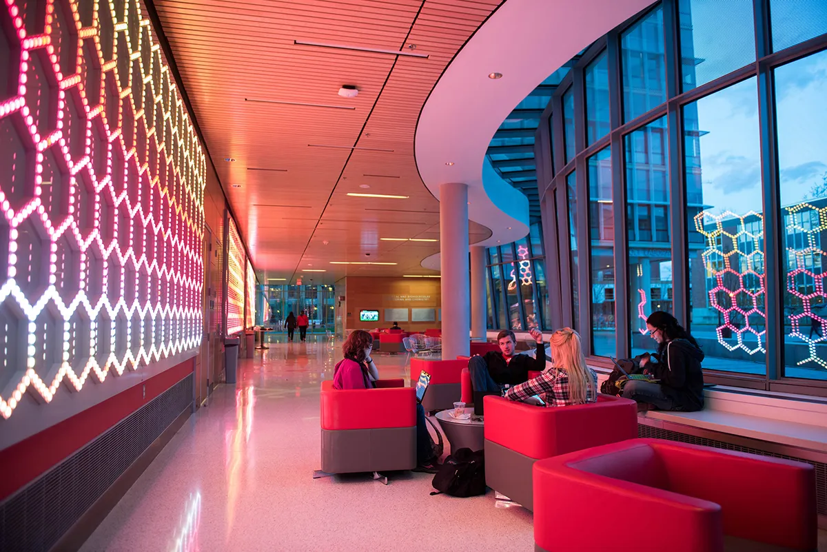 A popular study spot is creatively illuminated at the Chemical and Biomolecular Engineering and Chemistry building.
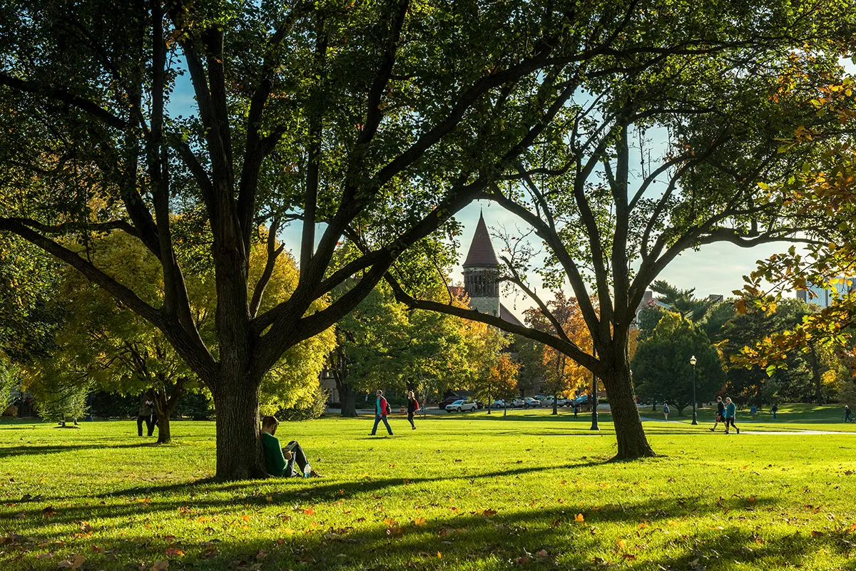 Orton Hall stands proudly in the distance, framed by the beautiful and famed Oval lawn.
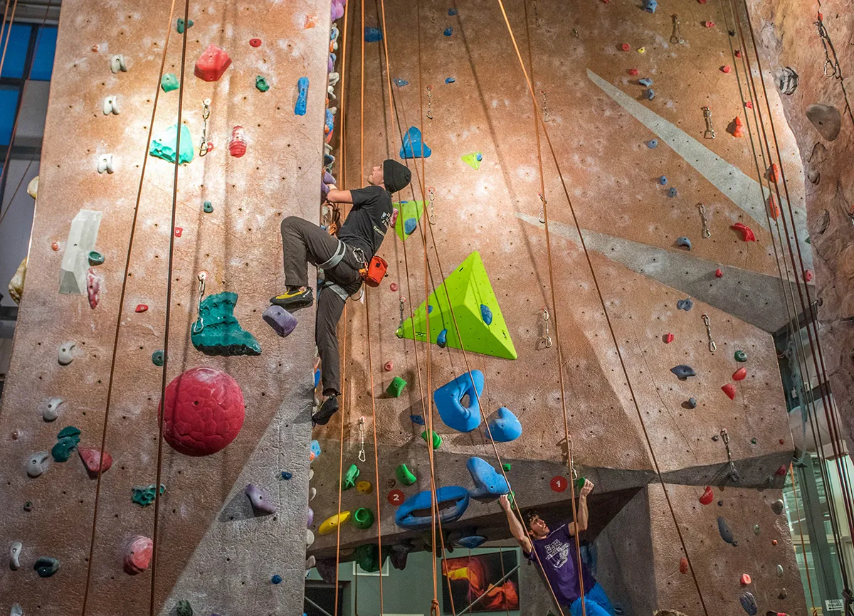 A student takes advantage of the climbing facilities at the Outdoor Adventure Center.
 -
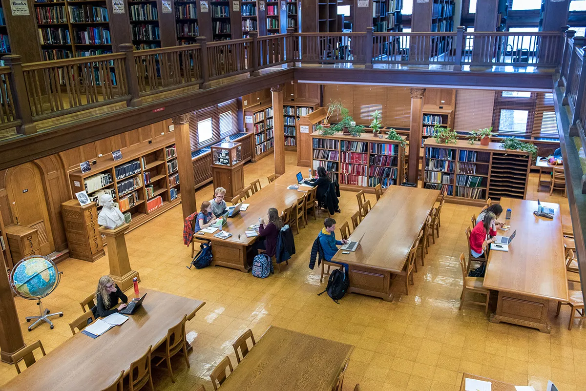 Surrounded by knowledge and famed architecture, Orton Hall is a popular study spot.
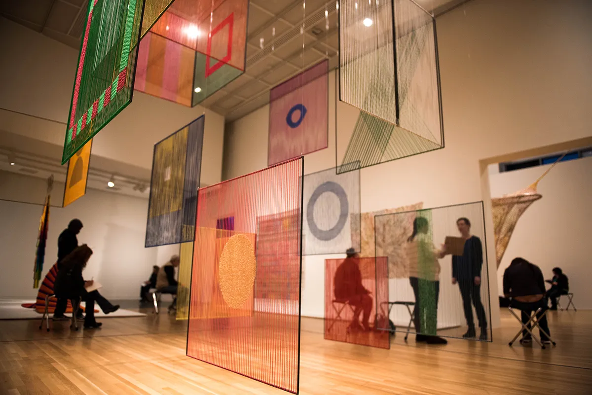 Tracie McCambridge leads the Art on the Brain program at the Wexner Center for the Arts.
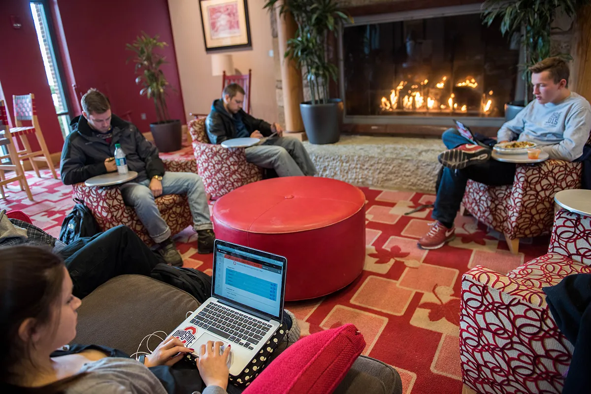 A cozy fire, comfy seats and warm surroundings help students study at the Ohio Union.
 -
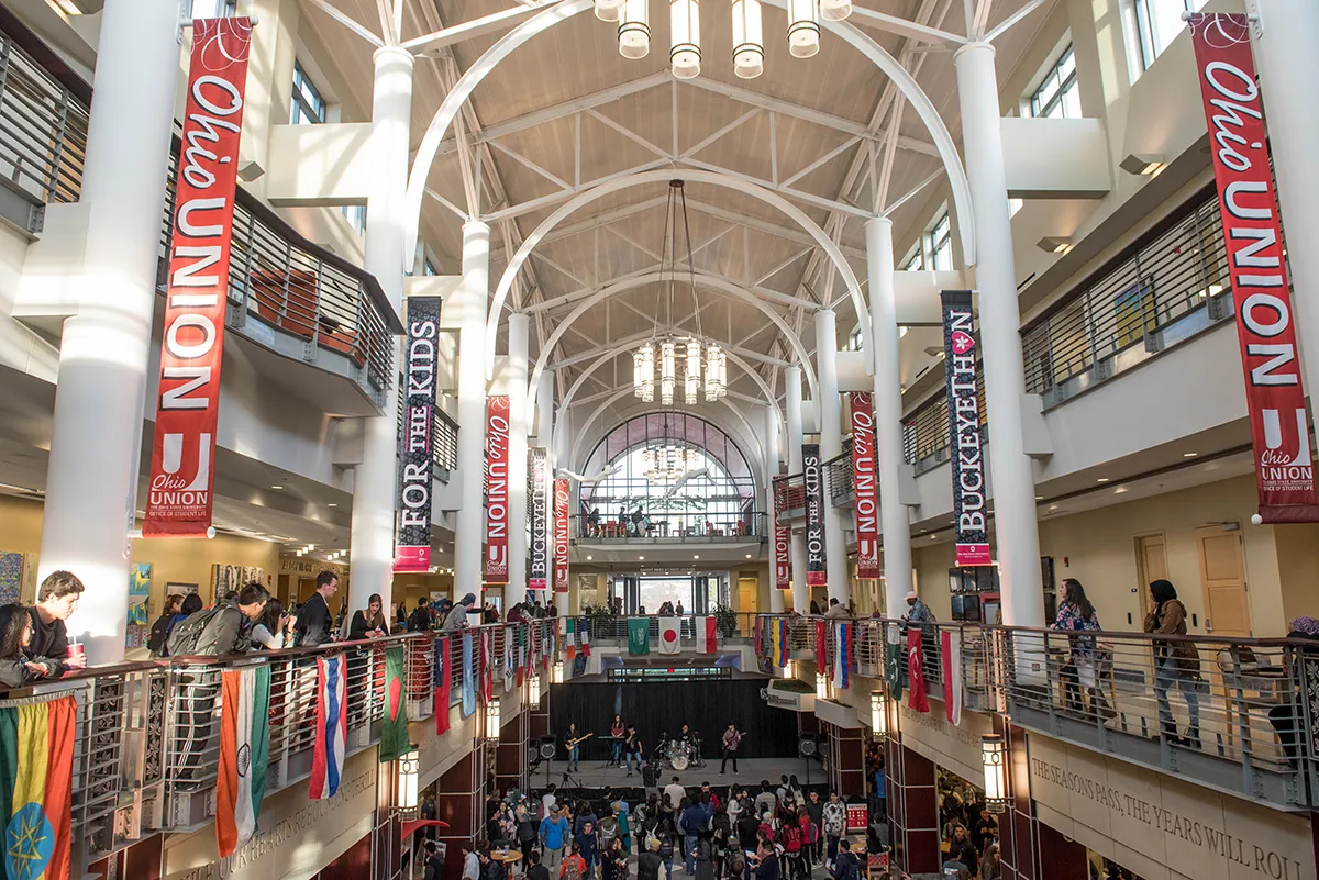 Students sample foods from around the world in the Union during the Taste of OSU event.
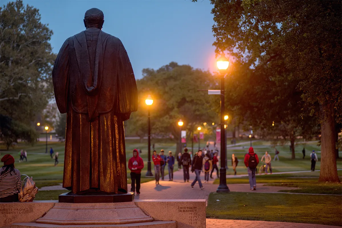 The statue of William Oxley Thompson watches over students walking across the Oval.
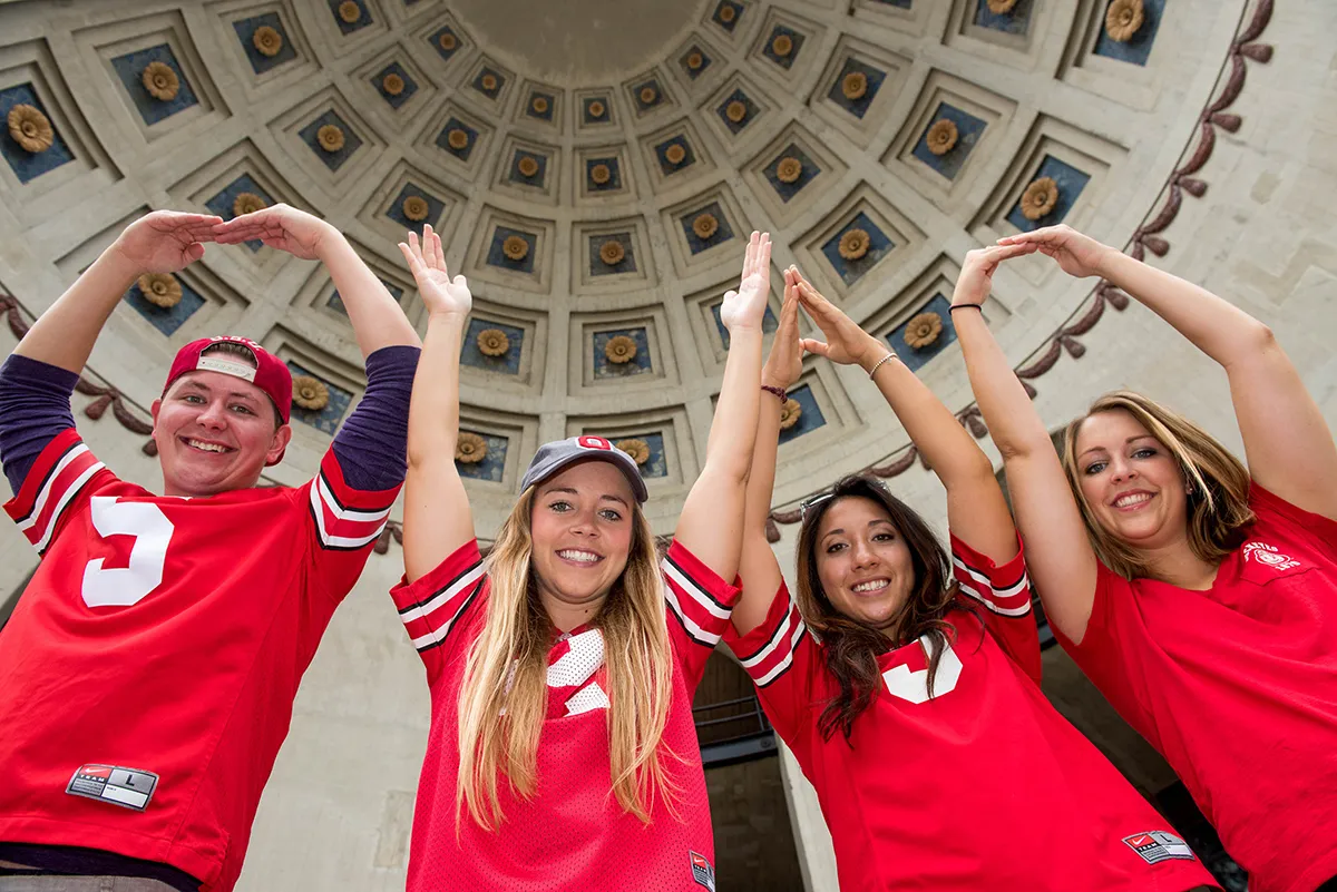 Students perform the iconic O-H-I-O inside the Shoe’s beautiful and renowned rotunda.
 -
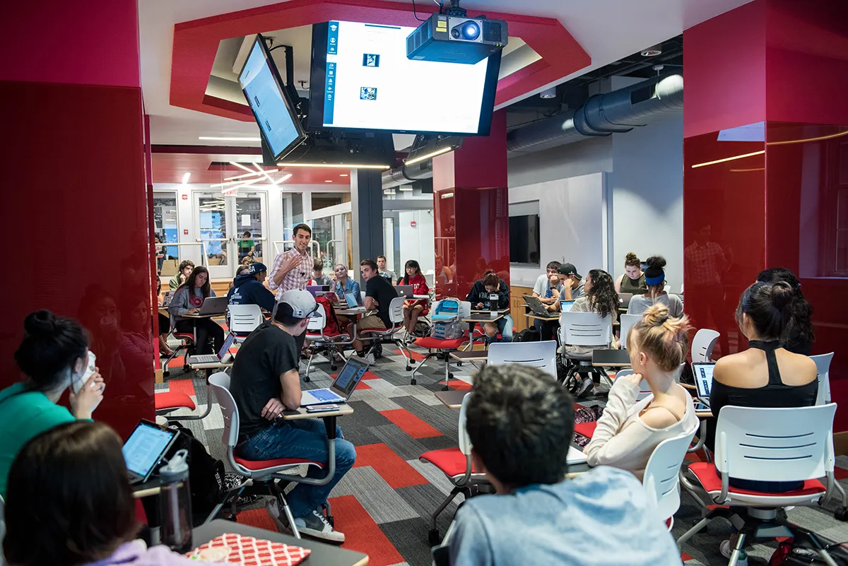 Ziv Bell teaches a class of students in the Innovation Space located in Campbell Hall.
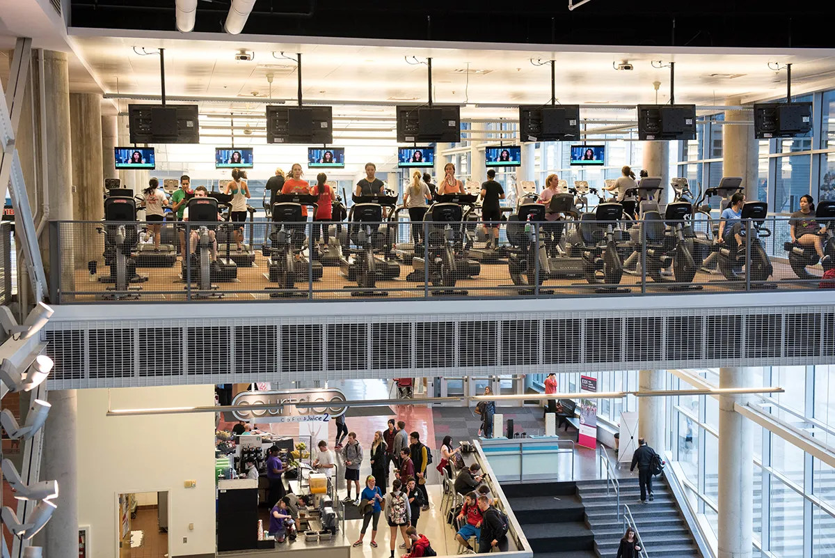 Students exercising and eating healthy at the popular Recreation and Physical Activity Center.
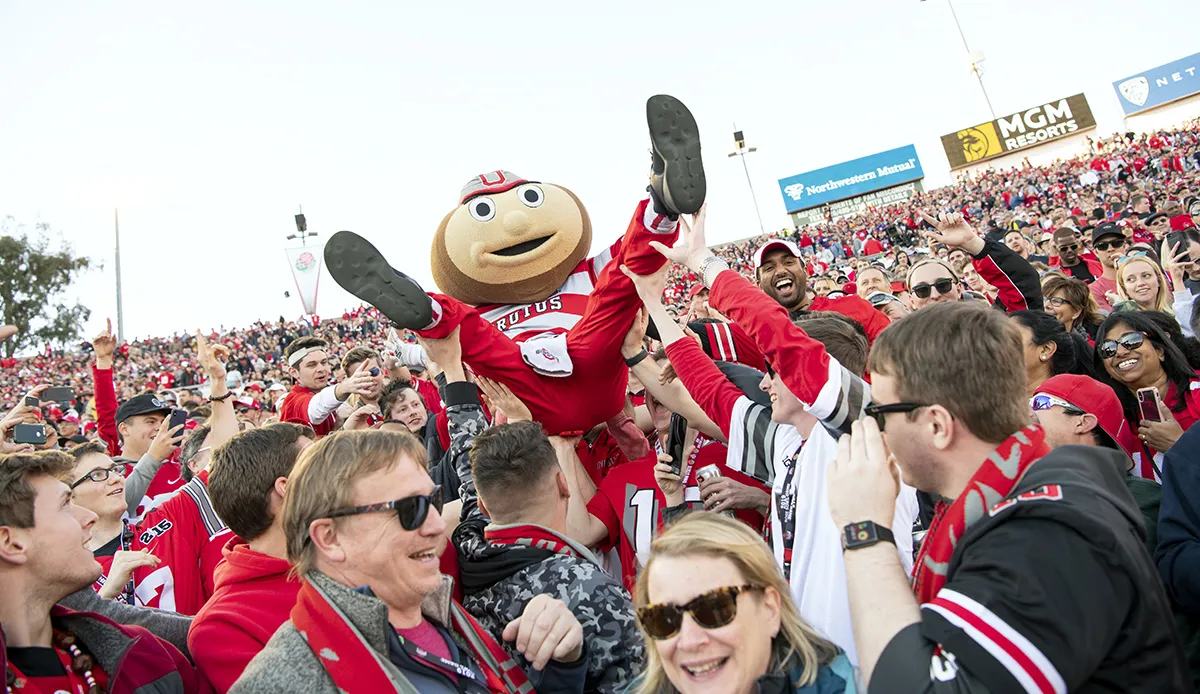 Brutus doing what Brutus does best: celebrating another Ohio State Buckeyes victory.
 -
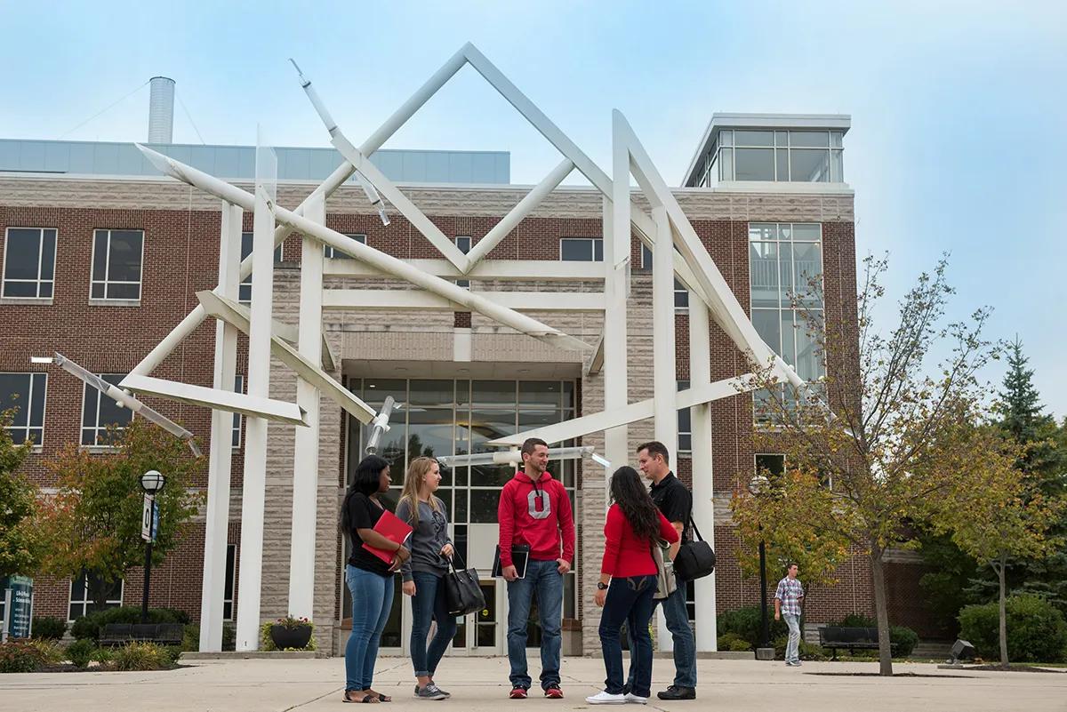 Students gather and chat in front of the Life and Physical Sciences building at Ohio State Lima.
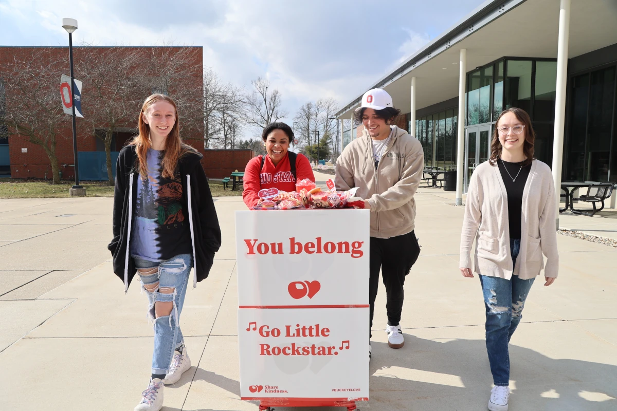 Ohio State Lima students engaged the entire campus during the annual Share Kindness event.
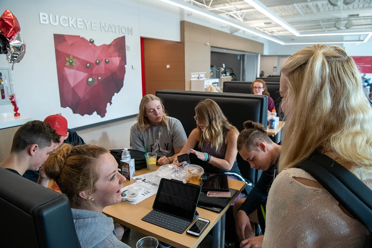 The Perry Webb Student Life building at Ohio State Lima is a popular place to study and chat.
 -
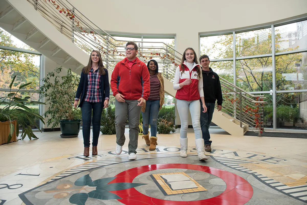 Inside Maynard Hall, Ohio State Marion students walk across The Ohio State University seal.
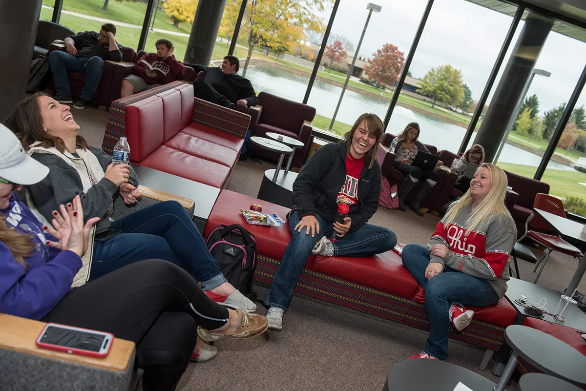 Everyone needs a break from studying, like these Marion students inside the Alber Student Center.
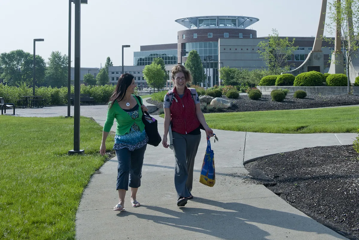 Students enjoying the beautiful weather, strolling in front of the Library Classroom Building.
 -
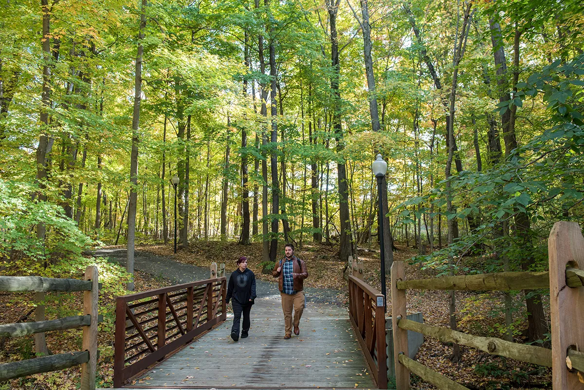 Students enjoying one of many scenic pathways found on Ohio State’s Mansfield campus.
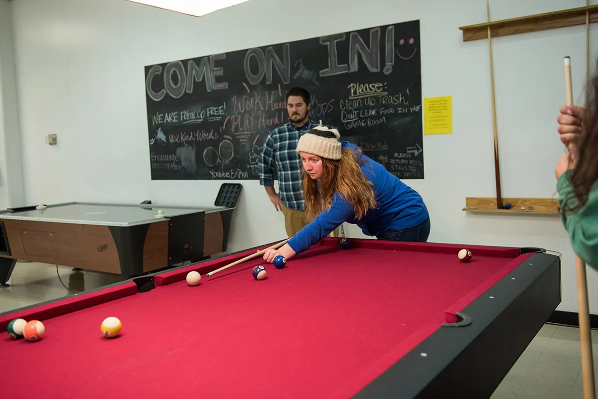 How about a quick game before class? A student lines up a shot at the Eisenhower Student Union.
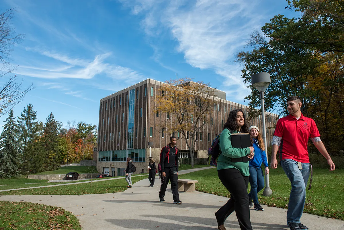 When one class ends, another begins. Students stroll from one to another in front of Ovalwood Hall.
 -
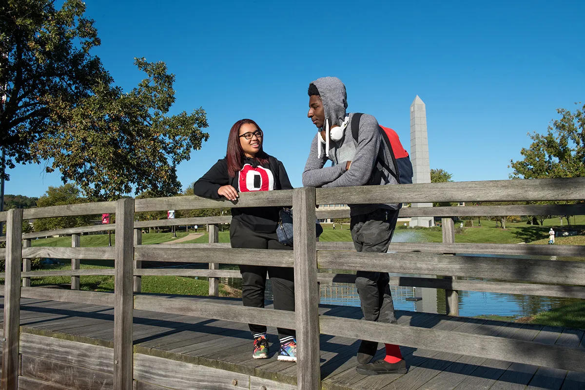 Stop and enjoy one of the 2,000 musical pieces played from the Everett D. Reese Carillon bell tower.
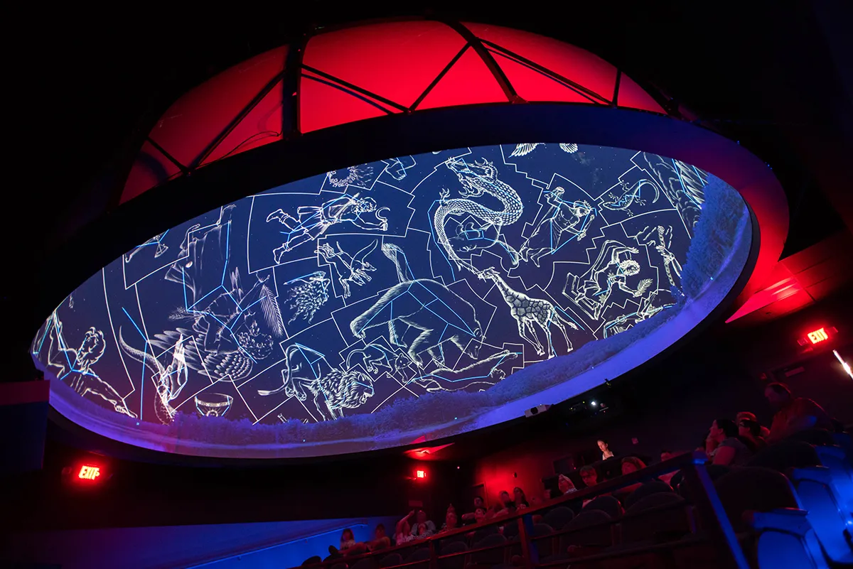 Look to the stars at the SciDome Planetarium at The Works on the Newark campus.
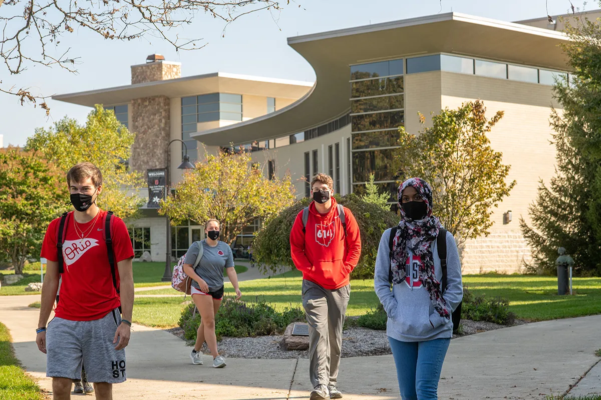 Three students walk on Ohio State’s Newark campus outside of the McConnell Residence Hall.
 -
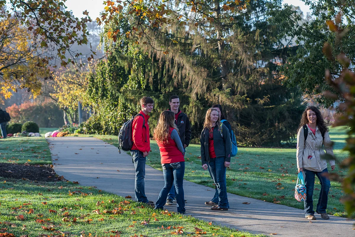 Ohio State ATI students enjoying a brisk and bright fall day on the CFAES Wooster campus.
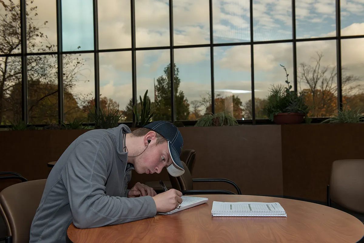 Sometimes you have to head down and power through like this student as CFAES Wooster.
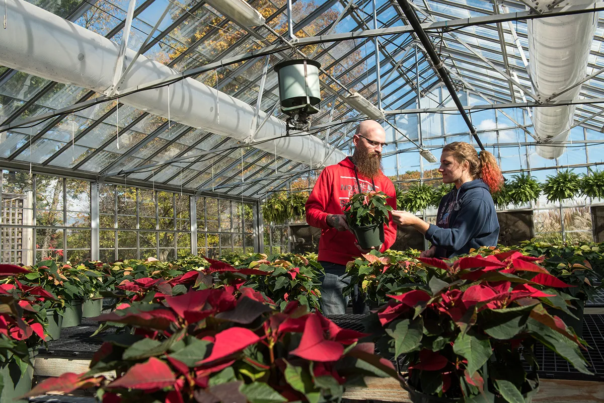 One of seven greenhouses at the Greenhouse Complex at Ohio State ATI on the CFAES Wooster campus.
<section
class="bux-selector bux-selector--gallery"
data-slide-item-map="[[0,1,2,3],[4],[5],[6],[7],[8]]"
aria-label="Explore Ohio State campuses"
>
<div class="bux-selector__heading">
<h2 class="bux-heading bux-h2">Explore campus</h2>
</div>
<div class="bux-selector__titles" role="group" aria-label="Campuses">
<div class="bux-selector--gallery__announcer visually-hidden"></div>
<div class="titles__indicator" aria-hidden="true">
<div class="indicator__track"></div>
<div class="indicator__active-line"></div>
</div>
<ul class="titles__item-titles">
<li class="item-titles__title">
<button type="button" class="title__text">Columbus</button>
<span class="title__text--mobile">Columbus</span>
<div class="title__description">
<p class="description__text">
The Buckeye heart of The Ohio State University, located right in the
heart of Ohio
</p>
<a
aria-label="Visit Columbus campus website"
class="bux-text-link description__link"
href="#"
rel="noopener"
>
<span
class="bux-text-link__text description__link__text bux-link__text--underline"
>
Visit website
</span>
</a>
</div>
</li>
<li class="item-titles__title">
<button type="button" class="title__text">Lima</button>
<span class="title__text--mobile">Lima</span>
<div class="title__description">
<p class="description__text">
Developing leaders with the resources and strength of the state’s
top university
</p>
<a
aria-label="Visit Lima campus website"
class="bux-text-link description__link"
href="#"
rel="noopener"
>
<span
class="bux-text-link__text description__link__text bux-link__text--underline"
>
Visit website
</span>
</a>
</div>
</li>
<li class="item-titles__title">
<button type="button" class="title__text">Marion</button>
<span class="title__text--mobile">Marion</span>
<div class="title__description">
<p class="description__text">
Bringing higher education opportunities to a broader community,
throughout Ohio and beyond
</p>
<a
aria-label="Visit Marion campus website"
class="bux-text-link description__link"
href="#"
rel="noopener"
>
<span
class="bux-text-link__text description__link__text bux-link__text--underline"
>
Visit website
</span>
</a>
</div>
</li>
<li class="item-titles__title">
<button type="button" class="title__text">Mansfield</button>
<span class="title__text--mobile">Mansfield</span>
<div class="title__description">
<p class="description__text">
Smaller campus, smaller class sizes but big opportunities to
leverage the strength of Ohio State
</p>
<a
aria-label="Visit Mansfield campus website"
class="bux-text-link description__link"
href="#"
rel="noopener"
>
<span
class="bux-text-link__text description__link__text bux-link__text--underline"
>
Visit website
</span>
</a>
</div>
</li>
<li class="item-titles__title">
<button type="button" class="title__text">Newark</button>
<span class="title__text--mobile">Newark</span>
<div class="title__description">
<p class="description__text">
Excellence in academics and innovative research opportunities paired
with a supportive community
</p>
<a
aria-label="Visit Newark campus website"
class="bux-text-link description__link"
href="#"
rel="noopener"
>
<span
class="bux-text-link__text description__link__text bux-link__text--underline"
>
Visit website
</span>
</a>
</div>
</li>
<li class="item-titles__title">
<button type="button" class="title__text">Wooster</button>
<span class="title__text--mobile">Wooster</span>
<div class="title__description">
<p class="description__text">
A critical component of our state-wide research enterprise with
boundless opportunities
</p>
<a
aria-label="Visit Wooster campus website"
class="bux-text-link description__link"
href="#"
rel="noopener"
>
<span
class="bux-text-link__text description__link__text bux-link__text--underline"
>
Visit website
</span>
</a>
</div>
</li>
</ul>
</div>
<div
class="bux-carousel-controls"
aria-label="carousel navigation"
role="group"
>
<button
class="bux-carousel-controls__previous bux-carousel-controls__btn"
type="button"
aria-label="previous"
>
<span class="icon icon-chevron-left" aria-hidden="true"></span>
</button>
<button
class="bux-carousel-controls__next bux-carousel-controls__btn"
type="button"
aria-label="next"
>
<span class="icon icon-chevron-right" aria-hidden="true"></span>
</button>
</div>
<div class="bux-selector--gallery__item-controls bux-selection-dropdown">
<label class="bux-selection-dropdown__label visually-hidden">
Select an item
</label>
<span class="bux-selection-dropdown__helper-text visually-hidden">
Select an item to view its images
</span>
<div class="bux-selection-dropdown__input">
<select class="item-controls__dropdown">
<option value="0" data-item-index="0">Columbus</option>
<option value="1" data-item-index="1">Lima</option>
<option value="2" data-item-index="2">Marion</option>
<option value="3" data-item-index="3">Mansfield</option>
<option value="4" data-item-index="4">Newark</option>
<option value="5" data-item-index="5">Wooster</option>
</select>
</div>
</div>
<section
class="bux-slider bux-slider--gallery bux-selector__content"
role="group"
aria-roledescription="carousel"
aria-live="polite"
>
<ul class="bux-slider__slides">
<li class="bux-slider__slide" aria-roledescription="slide">
<div
class="slide__content-wrapper"
data-grid-column-start="1"
data-grid-column-end="8"
data-grid-row-start="1"
data-grid-row-end="7"
data-full-size-url="/images/placeholders/selector/gallery/with-link/1-columbus/columbus-1.webp"
>
<button class="slide__image-lightbox-trigger" type="button">
<span class="visually-hidden">Open image in lightbox</span>
</button>
<img
class="slide__image slide__content"
src="/images/placeholders/selector/gallery/with-link/1-columbus/columbus-1.webp"
alt="Students interact while sitting in the lobby of the Chemical and Biomolecular Engineering and Chemistry building."
/>
<div class="bux-gallery-image-tooltip">
<button class="bux-gallery-image-tooltip__trigger">
<span class="trigger__visible-button">
<span class="bux-icon icon-info" aria-hidden="true"></span>
<span class="visually-hidden">Toggle caption</span>
</span>
</button>
<div class="bux-gallery-image-tooltip__container">
A popular study spot is creatively illuminated at the Chemical and
Biomolecular Engineering and Chemistry building.
</div>
</div>
</div>
<div
class="slide__content-wrapper"
data-grid-column-start="8"
data-grid-column-end="13"
data-grid-row-start="1"
data-grid-row-end="4"
data-full-size-url="/images/placeholders/selector/gallery/with-link/1-columbus/columbus-2.webp"
>
<button class="slide__image-lightbox-trigger" type="button">
<span class="visually-hidden">Open image in lightbox</span>
</button>
<img
class="slide__image slide__content"
src="/images/placeholders/selector/gallery/with-link/1-columbus/columbus-2.webp"
alt="Students walk across the Oval as the Orton Hall bell tower is visible in the distance."
/>
<div class="bux-gallery-image-tooltip">
<button class="bux-gallery-image-tooltip__trigger">
<span class="trigger__visible-button">
<span class="bux-icon icon-info" aria-hidden="true"></span>
<span class="visually-hidden">Toggle caption</span>
</span>
</button>
<div class="bux-gallery-image-tooltip__container">
Orton Hall stands proudly in the distance, framed by the beautiful
and famed Oval lawn.
</div>
</div>
</div>
<div
class="slide__content-wrapper"
data-grid-column-start="8"
data-grid-column-end="13"
data-grid-row-start="4"
data-grid-row-end="7"
data-full-size-url="/images/placeholders/selector/gallery/with-link/1-columbus/columbus-3.webp"
>
<button class="slide__image-lightbox-trigger" type="button">
<span class="visually-hidden">Open image in lightbox</span>
</button>
<img
class="slide__image slide__content"
src="/images/placeholders/selector/gallery/with-link/1-columbus/columbus-3.webp"
alt="A student climbs up the climbing wall at the Outdoor Adventure Center."
/>
<div class="bux-gallery-image-tooltip">
<button class="bux-gallery-image-tooltip__trigger">
<span class="trigger__visible-button">
<span class="bux-icon icon-info" aria-hidden="true"></span>
<span class="visually-hidden">Toggle caption</span>
</span>
</button>
<div class="bux-gallery-image-tooltip__container">
A student takes advantage of the climbing facilities at the
Outdoor Adventure Center.
</div>
</div>
</div>
</li>
<li class="bux-slider__slide" aria-roledescription="slide">
<div
class="slide__content-wrapper"
data-grid-column-start="1"
data-grid-column-end="8"
data-grid-row-start="1"
data-grid-row-end="7"
data-full-size-url="/images/placeholders/selector/gallery/with-link/1-columbus/columbus-4.webp"
>
<button class="slide__image-lightbox-trigger" type="button">
<span class="visually-hidden">Open image in lightbox</span>
</button>
<img
class="slide__image slide__content"
src="/images/placeholders/selector/gallery/with-link/1-columbus/columbus-4.webp"
alt="An overhead view of students working at tables in the Orton Hall library."
/>
<div class="bux-gallery-image-tooltip">
<button class="bux-gallery-image-tooltip__trigger">
<span class="trigger__visible-button">
<span class="bux-icon icon-info" aria-hidden="true"></span>
<span class="visually-hidden">Toggle caption</span>
</span>
</button>
<div class="bux-gallery-image-tooltip__container">
Surrounded by knowledge and famed architecture, Orton Hall is a
popular study spot.
</div>
</div>
</div>
<div
class="slide__content-wrapper"
data-grid-column-start="8"
data-grid-column-end="13"
data-grid-row-start="1"
data-grid-row-end="4"
data-full-size-url="/images/placeholders/selector/gallery/with-link/1-columbus/columbus-5.webp"
>
<button class="slide__image-lightbox-trigger" type="button">
<span class="visually-hidden">Open image in lightbox</span>
</button>
<img
class="slide__image slide__content"
src="/images/placeholders/selector/gallery/with-link/1-columbus/columbus-5.webp"
alt="Visitors observe art at the Wexner Center for the Arts."
/>
<div class="bux-gallery-image-tooltip">
<button class="bux-gallery-image-tooltip__trigger">
<span class="trigger__visible-button">
<span class="bux-icon icon-info" aria-hidden="true"></span>
<span class="visually-hidden">Toggle caption</span>
</span>
</button>
<div class="bux-gallery-image-tooltip__container">
Tracie McCambridge leads the Art on the Brain program at the
Wexner Center for the Arts.
</div>
</div>
</div>
<div
class="slide__content-wrapper"
data-grid-column-start="8"
data-grid-column-end="13"
data-grid-row-start="4"
data-grid-row-end="7"
data-full-size-url="/images/placeholders/selector/gallery/with-link/1-columbus/columbus-6.webp"
>
<button class="slide__image-lightbox-trigger" type="button">
<span class="visually-hidden">Open image in lightbox</span>
</button>
<img
class="slide__image slide__content"
src="/images/placeholders/selector/gallery/with-link/1-columbus/columbus-6.webp"
alt="Four students studying in front of a fireplace in the Ohio Union."
/>
<div class="bux-gallery-image-tooltip">
<button class="bux-gallery-image-tooltip__trigger">
<span class="trigger__visible-button">
<span class="bux-icon icon-info" aria-hidden="true"></span>
<span class="visually-hidden">Toggle caption</span>
</span>
</button>
<div class="bux-gallery-image-tooltip__container">
A cozy fire, comfy seats and warm surroundings help students study
at the Ohio Union.
</div>
</div>
</div>
</li>
<li class="bux-slider__slide" aria-roledescription="slide">
<div
class="slide__content-wrapper"
data-grid-column-start="1"
data-grid-column-end="8"
data-grid-row-start="1"
data-grid-row-end="7"
data-full-size-url="/images/placeholders/selector/gallery/with-link/1-columbus/columbus-7.webp"
>
<button class="slide__image-lightbox-trigger" type="button">
<span class="visually-hidden">Open image in lightbox</span>
</button>
<img
class="slide__image slide__content"
src="/images/placeholders/selector/gallery/with-link/1-columbus/columbus-7.webp"
alt="The Great Hall of the Ohio Union decorated with the flags from many countries during the Taste of OSU student event."
/>
<div class="bux-gallery-image-tooltip">
<button class="bux-gallery-image-tooltip__trigger">
<span class="trigger__visible-button">
<span class="bux-icon icon-info" aria-hidden="true"></span>
<span class="visually-hidden">Toggle caption</span>
</span>
</button>
<div class="bux-gallery-image-tooltip__container">
Students sample foods from around the world in the Union during
the Taste of OSU event.
</div>
</div>
</div>
<div
class="slide__content-wrapper"
data-grid-column-start="8"
data-grid-column-end="13"
data-grid-row-start="1"
data-grid-row-end="4"
data-full-size-url="/images/placeholders/selector/gallery/with-link/1-columbus/columbus-8.webp"
>
<button class="slide__image-lightbox-trigger" type="button">
<span class="visually-hidden">Open image in lightbox</span>
</button>
<img
class="slide__image slide__content"
src="/images/placeholders/selector/gallery/with-link/1-columbus/columbus-8.webp"
alt="Students walk on the Oval with the statue of William Oxley Thompson in the foreground."
/>
<div class="bux-gallery-image-tooltip">
<button class="bux-gallery-image-tooltip__trigger">
<span class="trigger__visible-button">
<span class="bux-icon icon-info" aria-hidden="true"></span>
<span class="visually-hidden">Toggle caption</span>
</span>
</button>
<div class="bux-gallery-image-tooltip__container">
The statue of William Oxley Thompson watches over students walking
across the Oval.
</div>
</div>
</div>
<div
class="slide__content-wrapper"
data-grid-column-start="8"
data-grid-column-end="13"
data-grid-row-start="4"
data-grid-row-end="7"
data-full-size-url="/images/placeholders/selector/gallery/with-link/1-columbus/columbus-9.webp"
>
<button class="slide__image-lightbox-trigger" type="button">
<span class="visually-hidden">Open image in lightbox</span>
</button>
<img
class="slide__image slide__content"
src="/images/placeholders/selector/gallery/with-link/1-columbus/columbus-9.webp"
alt="Four students in Ohio State football jerseys perform O-H-I-O in the Ohio Stadium rotunda."
/>
<div class="bux-gallery-image-tooltip">
<button class="bux-gallery-image-tooltip__trigger">
<span class="trigger__visible-button">
<span class="bux-icon icon-info" aria-hidden="true"></span>
<span class="visually-hidden">Toggle caption</span>
</span>
</button>
<div class="bux-gallery-image-tooltip__container">
Students perform the iconic O-H-I-O inside the Shoe’s beautiful
and renowned rotunda.
</div>
</div>
</div>
</li>
<li class="bux-slider__slide" aria-roledescription="slide">
<div
class="slide__content-wrapper"
data-grid-column-start="1"
data-grid-column-end="8"
data-grid-row-start="1"
data-grid-row-end="7"
data-full-size-url="/images/placeholders/selector/gallery/with-link/1-columbus/columbus-10.webp"
>
<button class="slide__image-lightbox-trigger" type="button">
<span class="visually-hidden">Open image in lightbox</span>
</button>
<img
class="slide__image slide__content"
src="/images/placeholders/selector/gallery/with-link/1-columbus/columbus-10.webp"
alt="A faculty member instructs while surrounded by a number of students in Ohio State’s Innovation Space."
/>
<div class="bux-gallery-image-tooltip">
<button class="bux-gallery-image-tooltip__trigger">
<span class="trigger__visible-button">
<span class="bux-icon icon-info" aria-hidden="true"></span>
<span class="visually-hidden">Toggle caption</span>
</span>
</button>
<div class="bux-gallery-image-tooltip__container">
Ziv Bell teaches a class of students in the Innovation Space
located in Campbell Hall.
</div>
</div>
</div>
<div
class="slide__content-wrapper"
data-grid-column-start="8"
data-grid-column-end="13"
data-grid-row-start="1"
data-grid-row-end="4"
data-full-size-url="/images/placeholders/selector/gallery/with-link/1-columbus/columbus-11.webp"
>
<button class="slide__image-lightbox-trigger" type="button">
<span class="visually-hidden">Open image in lightbox</span>
</button>
<img
class="slide__image slide__content"
src="/images/placeholders/selector/gallery/with-link/1-columbus/columbus-11.webp"
alt="Students using the facilities across two floors at the Recreation Physical Activity Center."
/>
<div class="bux-gallery-image-tooltip">
<button class="bux-gallery-image-tooltip__trigger">
<span class="trigger__visible-button">
<span class="bux-icon icon-info" aria-hidden="true"></span>
<span class="visually-hidden">Toggle caption</span>
</span>
</button>
<div class="bux-gallery-image-tooltip__container">
Students exercising and eating healthy at the popular Recreation
and Physical Activity Center.
</div>
</div>
</div>
<div
class="slide__content-wrapper"
data-grid-column-start="8"
data-grid-column-end="13"
data-grid-row-start="4"
data-grid-row-end="7"
data-full-size-url="/images/placeholders/selector/gallery/with-link/1-columbus/columbus-12.webp"
>
<button class="slide__image-lightbox-trigger" type="button">
<span class="visually-hidden">Open image in lightbox</span>
</button>
<img
class="slide__image slide__content"
src="/images/placeholders/selector/gallery/with-link/1-columbus/columbus-12.webp"
alt="Brutus Buckeye held aloft by Ohio State football fans during a football game at Ohio Stadium."
/>
<div class="bux-gallery-image-tooltip">
<button class="bux-gallery-image-tooltip__trigger">
<span class="trigger__visible-button">
<span class="bux-icon icon-info" aria-hidden="true"></span>
<span class="visually-hidden">Toggle caption</span>
</span>
</button>
<div class="bux-gallery-image-tooltip__container">
Brutus doing what Brutus does best: celebrating another Ohio State
Buckeyes victory.
</div>
</div>
</div>
</li>
<li class="bux-slider__slide" aria-roledescription="slide">
<div
class="slide__content-wrapper"
data-grid-column-start="1"
data-grid-column-end="8"
data-grid-row-start="1"
data-grid-row-end="7"
data-full-size-url="/images/placeholders/selector/gallery/with-link/2-lima/lima-1.webp"
>
<button class="slide__image-lightbox-trigger" type="button">
<span class="visually-hidden">Open image in lightbox</span>
</button>
<img
class="slide__image slide__content"
src="/images/placeholders/selector/gallery/with-link/2-lima/lima-1.webp"
alt="Five students stand in front of the Life and Physical Sciences building at Ohio State Lima."
/>
<div class="bux-gallery-image-tooltip">
<button class="bux-gallery-image-tooltip__trigger">
<span class="trigger__visible-button">
<span class="bux-icon icon-info" aria-hidden="true"></span>
<span class="visually-hidden">Toggle caption</span>
</span>
</button>
<div class="bux-gallery-image-tooltip__container">
Students gather and chat in front of the Life and Physical
Sciences building at Ohio State Lima.
</div>
</div>
</div>
<div
class="slide__content-wrapper"
data-grid-column-start="8"
data-grid-column-end="13"
data-grid-row-start="1"
data-grid-row-end="4"
data-full-size-url="/images/placeholders/selector/gallery/with-link/2-lima/lima-2.webp"
>
<button class="slide__image-lightbox-trigger" type="button">
<span class="visually-hidden">Open image in lightbox</span>
</button>
<img
class="slide__image slide__content"
src="/images/placeholders/selector/gallery/with-link/2-lima/lima-2.webp"
alt="Ohio State Lima students engaged the entire campus during the annual Share Kindness event."
/>
<div class="bux-gallery-image-tooltip">
<button class="bux-gallery-image-tooltip__trigger">
<span class="trigger__visible-button">
<span class="bux-icon icon-info" aria-hidden="true"></span>
<span class="visually-hidden">Toggle caption</span>
</span>
</button>
<div class="bux-gallery-image-tooltip__container">
Ohio State Lima students engaged the entire campus during the
annual Share Kindness event.
</div>
</div>
</div>
<div
class="slide__content-wrapper"
data-grid-column-start="8"
data-grid-column-end="13"
data-grid-row-start="4"
data-grid-row-end="7"
data-full-size-url="/images/placeholders/selector/gallery/with-link/2-lima/lima-3.webp"
>
<button class="slide__image-lightbox-trigger" type="button">
<span class="visually-hidden">Open image in lightbox</span>
</button>
<img
class="slide__image slide__content"
src="/images/placeholders/selector/gallery/with-link/2-lima/lima-3.webp"
alt="Six students collaborate around a table in the Perry Webb Student Life building at Ohio State Lima."
/>
<div class="bux-gallery-image-tooltip">
<button class="bux-gallery-image-tooltip__trigger">
<span class="trigger__visible-button">
<span class="bux-icon icon-info" aria-hidden="true"></span>
<span class="visually-hidden">Toggle caption</span>
</span>
</button>
<div class="bux-gallery-image-tooltip__container">
The Perry Webb Student Life building at Ohio State Lima is a
popular place to study and chat.
</div>
</div>
</div>
</li>
<li class="bux-slider__slide" aria-roledescription="slide">
<div
class="slide__content-wrapper"
data-grid-column-start="1"
data-grid-column-end="8"
data-grid-row-start="1"
data-grid-row-end="7"
data-full-size-url="/images/placeholders/selector/gallery/with-link/3-marion/marion-1.webp"
>
<button class="slide__image-lightbox-trigger" type="button">
<span class="visually-hidden">Open image in lightbox</span>
</button>
<img
class="slide__image slide__content"
src="/images/placeholders/selector/gallery/with-link/3-marion/marion-1.webp"
alt="Five students walking toward the camera in Maynard Hall at Ohio State Marion."
/>
<div class="bux-gallery-image-tooltip">
<button class="bux-gallery-image-tooltip__trigger">
<span class="trigger__visible-button">
<span class="bux-icon icon-info" aria-hidden="true"></span>
<span class="visually-hidden">Toggle caption</span>
</span>
</button>
<div class="bux-gallery-image-tooltip__container">
Inside Maynard Hall, Ohio State Marion students walk across The
Ohio State University seal.
</div>
</div>
</div>
<div
class="slide__content-wrapper"
data-grid-column-start="8"
data-grid-column-end="13"
data-grid-row-start="1"
data-grid-row-end="4"
data-full-size-url="/images/placeholders/selector/gallery/with-link/3-marion/marion-2.webp"
>
<button class="slide__image-lightbox-trigger" type="button">
<span class="visually-hidden">Open image in lightbox</span>
</button>
<img
class="slide__image slide__content"
src="/images/placeholders/selector/gallery/with-link/3-marion/marion-2.webp"
alt="Three students sitting on couches laugh together at the Alber Student Center at Ohio State Marion."
/>
<div class="bux-gallery-image-tooltip">
<button class="bux-gallery-image-tooltip__trigger">
<span class="trigger__visible-button">
<span class="bux-icon icon-info" aria-hidden="true"></span>
<span class="visually-hidden">Toggle caption</span>
</span>
</button>
<div class="bux-gallery-image-tooltip__container">
Everyone needs a break from studying, like these Marion students
inside the Alber Student Center.
</div>
</div>
</div>
<div
class="slide__content-wrapper"
data-grid-column-start="8"
data-grid-column-end="13"
data-grid-row-start="4"
data-grid-row-end="7"
data-full-size-url="/images/placeholders/selector/gallery/with-link/3-marion/marion-3.webp"
>
<button class="slide__image-lightbox-trigger" type="button">
<span class="visually-hidden">Open image in lightbox</span>
</button>
<img
class="slide__image slide__content"
src="/images/placeholders/selector/gallery/with-link/3-marion/marion-3.webp"
alt="Two students walk together at Ohio State Marion with the Library Classroom Building visible in the distance."
/>
<div class="bux-gallery-image-tooltip">
<button class="bux-gallery-image-tooltip__trigger">
<span class="trigger__visible-button">
<span class="bux-icon icon-info" aria-hidden="true"></span>
<span class="visually-hidden">Toggle caption</span>
</span>
</button>
<div class="bux-gallery-image-tooltip__container">
Students enjoying the beautiful weather, strolling in front of the
Library Classroom Building.
</div>
</div>
</div>
</li>
<li class="bux-slider__slide" aria-roledescription="slide">
<div
class="slide__content-wrapper"
data-grid-column-start="1"
data-grid-column-end="8"
data-grid-row-start="1"
data-grid-row-end="7"
data-full-size-url="/images/placeholders/selector/gallery/with-link/4-mansfield/mansfield-1.webp"
>
<button class="slide__image-lightbox-trigger" type="button">
<span class="visually-hidden">Open image in lightbox</span>
</button>
<img
class="slide__image slide__content"
src="/images/placeholders/selector/gallery/with-link/4-mansfield/mansfield-1.webp"
alt="Two students walk on a bridge on the Ohio State Mansfield campus."
/>
<div class="bux-gallery-image-tooltip">
<button class="bux-gallery-image-tooltip__trigger">
<span class="trigger__visible-button">
<span class="bux-icon icon-info" aria-hidden="true"></span>
<span class="visually-hidden">Toggle caption</span>
</span>
</button>
<div class="bux-gallery-image-tooltip__container">
Students enjoying one of many scenic pathways found on Ohio
State’s Mansfield campus.
</div>
</div>
</div>
<div
class="slide__content-wrapper"
data-grid-column-start="8"
data-grid-column-end="13"
data-grid-row-start="1"
data-grid-row-end="4"
data-full-size-url="/images/placeholders/selector/gallery/with-link/4-mansfield/mansfield-2.webp"
>
<button class="slide__image-lightbox-trigger" type="button">
<span class="visually-hidden">Open image in lightbox</span>
</button>
<img
class="slide__image slide__content"
src="/images/placeholders/selector/gallery/with-link/4-mansfield/mansfield-2.webp"
alt="A student shoots pool while another looks on at the Eisenhower Student Union on the Ohio State Mansfield campus."
/>
<div class="bux-gallery-image-tooltip">
<button class="bux-gallery-image-tooltip__trigger">
<span class="trigger__visible-button">
<span class="bux-icon icon-info" aria-hidden="true"></span>
<span class="visually-hidden">Toggle caption</span>
</span>
</button>
<div class="bux-gallery-image-tooltip__container">
How about a quick game before class? A student lines up a shot at
the Eisenhower Student Union.
</div>
</div>
</div>
<div
class="slide__content-wrapper"
data-grid-column-start="8"
data-grid-column-end="13"
data-grid-row-start="4"
data-grid-row-end="7"
data-full-size-url="/images/placeholders/selector/gallery/with-link/4-mansfield/mansfield-3.webp"
>
<button class="slide__image-lightbox-trigger" type="button">
<span class="visually-hidden">Open image in lightbox</span>
</button>
<img
class="slide__image slide__content"
src="/images/placeholders/selector/gallery/with-link/4-mansfield/mansfield-3.webp"
alt="Students walk outside of Ovalwood Hall at Ohio State Mansfield."
/>
<div class="bux-gallery-image-tooltip">
<button class="bux-gallery-image-tooltip__trigger">
<span class="trigger__visible-button">
<span class="bux-icon icon-info" aria-hidden="true"></span>
<span class="visually-hidden">Toggle caption</span>
</span>
</button>
<div class="bux-gallery-image-tooltip__container">
When one class ends, another begins. Students stroll from one to
another in front of Ovalwood Hall.
</div>
</div>
</div>
</li>
<li class="bux-slider__slide" aria-roledescription="slide">
<div
class="slide__content-wrapper"
data-grid-column-start="1"
data-grid-column-end="8"
data-grid-row-start="1"
data-grid-row-end="7"
data-full-size-url="/images/placeholders/selector/gallery/with-link/5-newark/newark-1.webp"
>
<button class="slide__image-lightbox-trigger" type="button">
<span class="visually-hidden">Open image in lightbox</span>
</button>
<img
class="slide__image slide__content"
src="/images/placeholders/selector/gallery/with-link/5-newark/newark-1.webp"
alt="Two student stand on a bridge at Ohio State Newark."
/>
<div class="bux-gallery-image-tooltip">
<button class="bux-gallery-image-tooltip__trigger">
<span class="trigger__visible-button">
<span class="bux-icon icon-info" aria-hidden="true"></span>
<span class="visually-hidden">Toggle caption</span>
</span>
</button>
<div class="bux-gallery-image-tooltip__container">
Stop and enjoy one of the 2,000 musical pieces played from the
Everett D. Reese Carillon bell tower.
</div>
</div>
</div>
<div
class="slide__content-wrapper"
data-grid-column-start="8"
data-grid-column-end="13"
data-grid-row-start="1"
data-grid-row-end="4"
data-full-size-url="/images/placeholders/selector/gallery/with-link/5-newark/newark-2.webp"
>
<button class="slide__image-lightbox-trigger" type="button">
<span class="visually-hidden">Open image in lightbox</span>
</button>
<img
class="slide__image slide__content"
src="/images/placeholders/selector/gallery/with-link/5-newark/newark-2.webp"
alt="A astronomical display at the SciDome Planetarium at Ohio State Newark."
/>
<div class="bux-gallery-image-tooltip">
<button class="bux-gallery-image-tooltip__trigger">
<span class="trigger__visible-button">
<span class="bux-icon icon-info" aria-hidden="true"></span>
<span class="visually-hidden">Toggle caption</span>
</span>
</button>
<div class="bux-gallery-image-tooltip__container">
Look to the stars at the SciDome Planetarium at The Works on the
Newark campus.
</div>
</div>
</div>
<div
class="slide__content-wrapper"
data-grid-column-start="8"
data-grid-column-end="13"
data-grid-row-start="4"
data-grid-row-end="7"
data-full-size-url="/images/placeholders/selector/gallery/with-link/5-newark/newark-3.webp"
>
<button class="slide__image-lightbox-trigger" type="button">
<span class="visually-hidden">Open image in lightbox</span>
</button>
<img
class="slide__image slide__content"
src="/images/placeholders/selector/gallery/with-link/5-newark/newark-3.webp"
alt="Four masked students walk on campus at Ohio State Newark."
/>
<div class="bux-gallery-image-tooltip">
<button class="bux-gallery-image-tooltip__trigger">
<span class="trigger__visible-button">
<span class="bux-icon icon-info" aria-hidden="true"></span>
<span class="visually-hidden">Toggle caption</span>
</span>
</button>
<div class="bux-gallery-image-tooltip__container">
Three students walk on Ohio State’s Newark campus outside of the
McConnell Residence Hall.
</div>
</div>
</div>
</li>
<li class="bux-slider__slide" aria-roledescription="slide">
<div
class="slide__content-wrapper"
data-grid-column-start="1"
data-grid-column-end="8"
data-grid-row-start="1"
data-grid-row-end="7"
data-full-size-url="/images/placeholders/selector/gallery/with-link/6-wooster/wooster-1.webp"
>
<button class="slide__image-lightbox-trigger" type="button">
<span class="visually-hidden">Open image in lightbox</span>
</button>
<img
class="slide__image slide__content"
src="/images/placeholders/selector/gallery/with-link/6-wooster/wooster-1.webp"
alt="Six students talk at the Ohio State ATI campus."
/>
<div class="bux-gallery-image-tooltip">
<button class="bux-gallery-image-tooltip__trigger">
<span class="trigger__visible-button">
<span class="bux-icon icon-info" aria-hidden="true"></span>
<span class="visually-hidden">Toggle caption</span>
</span>
</button>
<div class="bux-gallery-image-tooltip__container">
Ohio State ATI students enjoying a brisk and bright fall day on
the CFAES Wooster campus.
</div>
</div>
</div>
<div
class="slide__content-wrapper"
data-grid-column-start="8"
data-grid-column-end="13"
data-grid-row-start="1"
data-grid-row-end="4"
data-full-size-url="/images/placeholders/selector/gallery/with-link/6-wooster/wooster-2.webp"
>
<button class="slide__image-lightbox-trigger" type="button">
<span class="visually-hidden">Open image in lightbox</span>
</button>
<img
class="slide__image slide__content"
src="/images/placeholders/selector/gallery/with-link/6-wooster/wooster-2.webp"
alt="A student studies in a study space at CFAES Wooster."
/>
<div class="bux-gallery-image-tooltip">
<button class="bux-gallery-image-tooltip__trigger">
<span class="trigger__visible-button">
<span class="bux-icon icon-info" aria-hidden="true"></span>
<span class="visually-hidden">Toggle caption</span>
</span>
</button>
<div class="bux-gallery-image-tooltip__container">
Sometimes you have to head down and power through like this
student as CFAES Wooster.
</div>
</div>
</div>
<div
class="slide__content-wrapper"
data-grid-column-start="8"
data-grid-column-end="13"
data-grid-row-start="4"
data-grid-row-end="7"
data-full-size-url="/images/placeholders/selector/gallery/with-link/6-wooster/wooster-3.webp"
>
<button class="slide__image-lightbox-trigger" type="button">
<span class="visually-hidden">Open image in lightbox</span>
</button>
<img
class="slide__image slide__content"
src="/images/placeholders/selector/gallery/with-link/6-wooster/wooster-3.webp"
alt="Two individuals work on red and green plants in a greenhouse at Ohio State ATI."
/>
<div class="bux-gallery-image-tooltip">
<button class="bux-gallery-image-tooltip__trigger">
<span class="trigger__visible-button">
<span class="bux-icon icon-info" aria-hidden="true"></span>
<span class="visually-hidden">Toggle caption</span>
</span>
</button>
<div class="bux-gallery-image-tooltip__container">
One of seven greenhouses at the Greenhouse Complex at Ohio State
ATI on the CFAES Wooster campus.
</div>
</div>
</div>
</li>
</ul>
</section>
</section>
<dialog class="bux-gallery-lightbox">
<div class="bux-gallery-lightbox__backdrop"></div>
<div class="bux-gallery-lightbox__wrapper">
<div class="bux-gallery-lightbox__close-button">
<button class="close-button__button" type="button">
<span class="visually-hidden">Close this gallery</span>
<span class="icon icon-xmark" aria-hidden="true"></span>
</button>
</div>
<div
class="bux-carousel-controls"
aria-label="carousel navigation"
role="group"
>
<button
class="bux-carousel-controls__previous bux-carousel-controls__btn"
type="button"
aria-label="previous"
>
<span class="icon icon-chevron-left" aria-hidden="true"></span>
</button>
<button
class="bux-carousel-controls__next bux-carousel-controls__btn"
type="button"
aria-label="next"
>
<span class="icon icon-chevron-right" aria-hidden="true"></span>
</button>
</div>
<div class="bux-slider bux-slider--lightbox">
<ul class="bux-slider__slides">
<li class="bux-slider__slide">
<figure class="slide__content slide__content-wrapper">
<div class="figure__image-wrapper slide__content">
<img
class="figure__image"
src="/images/placeholders/selector/gallery/with-link/1-columbus/columbus-1.webp"
alt="Students interact while sitting in the lobby of the Chemical and Biomolecular Engineering and Chemistry building."
/>
</div>
<figcaption class="image__caption">
<div class="caption__image-counter">Image 1 of 27</div>
<div class="caption__text">
<span class="text__description">
A popular study spot is creatively illuminated at the Chemical
and Biomolecular Engineering and Chemistry building.
</span>
</div>
</figcaption>
</figure>
</li>
<li class="bux-slider__slide">
<figure class="slide__content slide__content-wrapper">
<div class="figure__image-wrapper slide__content">
<img
class="figure__image"
src="/images/placeholders/selector/gallery/with-link/1-columbus/columbus-2.webp"
alt="Students walk across the Oval as the Orton Hall bell tower is visible in the distance."
/>
</div>
<figcaption class="image__caption">
<div class="caption__image-counter">Image 2 of 27</div>
<div class="caption__text">
<span class="text__description">
Orton Hall stands proudly in the distance, framed by the
beautiful and famed Oval lawn.
</span>
</div>
</figcaption>
</figure>
</li>
<li class="bux-slider__slide">
<figure class="slide__content slide__content-wrapper">
<div class="figure__image-wrapper slide__content">
<img
class="figure__image"
src="/images/placeholders/selector/gallery/with-link/1-columbus/columbus-3.webp"
alt="A student climbs up the climbing wall at the Outdoor Adventure Center."
/>
</div>
<figcaption class="image__caption">
<div class="caption__image-counter">Image 3 of 27</div>
<div class="caption__text">
<span class="text__description">
A student takes advantage of the climbing facilities at the
Outdoor Adventure Center.
</span>
</div>
</figcaption>
</figure>
</li>
<li class="bux-slider__slide">
<figure class="slide__content slide__content-wrapper">
<div class="figure__image-wrapper slide__content">
<img
class="figure__image"
src="/images/placeholders/selector/gallery/with-link/1-columbus/columbus-4.webp"
alt="An overhead view of students working at tables in the Orton Hall library."
/>
</div>
<figcaption class="image__caption">
<div class="caption__image-counter">Image 4 of 27</div>
<div class="caption__text">
<span class="text__description">
Surrounded by knowledge and famed architecture, Orton Hall is
a popular study spot.
</span>
</div>
</figcaption>
</figure>
</li>
<li class="bux-slider__slide">
<figure class="slide__content slide__content-wrapper">
<div class="figure__image-wrapper slide__content">
<img
class="figure__image"
src="/images/placeholders/selector/gallery/with-link/1-columbus/columbus-5.webp"
alt="Visitors observe art at the Wexner Center for the Arts."
/>
</div>
<figcaption class="image__caption">
<div class="caption__image-counter">Image 5 of 27</div>
<div class="caption__text">
<span class="text__description">
Tracie McCambridge leads the Art on the Brain program at the
Wexner Center for the Arts.
</span>
</div>
</figcaption>
</figure>
</li>
<li class="bux-slider__slide">
<figure class="slide__content slide__content-wrapper">
<div class="figure__image-wrapper slide__content">
<img
class="figure__image"
src="/images/placeholders/selector/gallery/with-link/1-columbus/columbus-6.webp"
alt="Four students studying in front of a fireplace in the Ohio Union."
/>
</div>
<figcaption class="image__caption">
<div class="caption__image-counter">Image 6 of 27</div>
<div class="caption__text">
<span class="text__description">
A cozy fire, comfy seats and warm surroundings help students
study at the Ohio Union.
</span>
</div>
</figcaption>
</figure>
</li>
<li class="bux-slider__slide">
<figure class="slide__content slide__content-wrapper">
<div class="figure__image-wrapper slide__content">
<img
class="figure__image"
src="/images/placeholders/selector/gallery/with-link/1-columbus/columbus-7.webp"
alt="The Great Hall of the Ohio Union decorated with the flags from many countries during the Taste of OSU student event."
/>
</div>
<figcaption class="image__caption">
<div class="caption__image-counter">Image 7 of 27</div>
<div class="caption__text">
<span class="text__description">
Students sample foods from around the world in the Union
during the Taste of OSU event.
</span>
</div>
</figcaption>
</figure>
</li>
<li class="bux-slider__slide">
<figure class="slide__content slide__content-wrapper">
<div class="figure__image-wrapper slide__content">
<img
class="figure__image"
src="/images/placeholders/selector/gallery/with-link/1-columbus/columbus-8.webp"
alt="Students walk on the Oval with the statue of William Oxley Thompson in the foreground."
/>
</div>
<figcaption class="image__caption">
<div class="caption__image-counter">Image 8 of 27</div>
<div class="caption__text">
<span class="text__description">
The statue of William Oxley Thompson watches over students
walking across the Oval.
</span>
</div>
</figcaption>
</figure>
</li>
<li class="bux-slider__slide">
<figure class="slide__content slide__content-wrapper">
<div class="figure__image-wrapper slide__content">
<img
class="figure__image"
src="/images/placeholders/selector/gallery/with-link/1-columbus/columbus-9.webp"
alt="Four students in Ohio State football jerseys perform O-H-I-O in the Ohio Stadium rotunda."
/>
</div>
<figcaption class="image__caption">
<div class="caption__image-counter">Image 9 of 27</div>
<div class="caption__text">
<span class="text__description">
Students perform the iconic O-H-I-O inside the Shoe’s
beautiful and renowned rotunda.
</span>
</div>
</figcaption>
</figure>
</li>
<li class="bux-slider__slide">
<figure class="slide__content slide__content-wrapper">
<div class="figure__image-wrapper slide__content">
<img
class="figure__image"
src="/images/placeholders/selector/gallery/with-link/1-columbus/columbus-10.webp"
alt="A faculty member instructs while surrounded by a number of students in Ohio State’s Innovation Space."
/>
</div>
<figcaption class="image__caption">
<div class="caption__image-counter">Image 10 of 27</div>
<div class="caption__text">
<span class="text__description">
Ziv Bell teaches a class of students in the Innovation Space
located in Campbell Hall.
</span>
</div>
</figcaption>
</figure>
</li>
<li class="bux-slider__slide">
<figure class="slide__content slide__content-wrapper">
<div class="figure__image-wrapper slide__content">
<img
class="figure__image"
src="/images/placeholders/selector/gallery/with-link/1-columbus/columbus-11.webp"
alt="Students using the facilities across two floors at the Recreation Physical Activity Center."
/>
</div>
<figcaption class="image__caption">
<div class="caption__image-counter">Image 11 of 27</div>
<div class="caption__text">
<span class="text__description">
Students exercising and eating healthy at the popular
Recreation and Physical Activity Center.
</span>
</div>
</figcaption>
</figure>
</li>
<li class="bux-slider__slide">
<figure class="slide__content slide__content-wrapper">
<div class="figure__image-wrapper slide__content">
<img
class="figure__image"
src="/images/placeholders/selector/gallery/with-link/1-columbus/columbus-12.webp"
alt="Brutus Buckeye held aloft by Ohio State football fans during a football game at Ohio Stadium."
/>
</div>
<figcaption class="image__caption">
<div class="caption__image-counter">Image 12 of 27</div>
<div class="caption__text">
<span class="text__description">
Brutus doing what Brutus does best: celebrating another Ohio
State Buckeyes victory.
</span>
</div>
</figcaption>
</figure>
</li>
<li class="bux-slider__slide">
<figure class="slide__content slide__content-wrapper">
<div class="figure__image-wrapper slide__content">
<img
class="figure__image"
src="/images/placeholders/selector/gallery/with-link/2-lima/lima-1.webp"
alt="Five students stand in front of the Life and Physical Sciences building at Ohio State Lima."
/>
</div>
<figcaption class="image__caption">
<div class="caption__image-counter">Image 13 of 27</div>
<div class="caption__text">
<span class="text__description">
Students gather and chat in front of the Life and Physical
Sciences building at Ohio State Lima.
</span>
</div>
</figcaption>
</figure>
</li>
<li class="bux-slider__slide">
<figure class="slide__content slide__content-wrapper">
<div class="figure__image-wrapper slide__content">
<img
class="figure__image"
src="/images/placeholders/selector/gallery/with-link/2-lima/lima-2.webp"
alt="Ohio State Lima students engaged the entire campus during the annual Share Kindness event."
/>
</div>
<figcaption class="image__caption">
<div class="caption__image-counter">Image 14 of 27</div>
<div class="caption__text">
<span class="text__description">
Ohio State Lima students engaged the entire campus during the
annual Share Kindness event.
</span>
</div>
</figcaption>
</figure>
</li>
<li class="bux-slider__slide">
<figure class="slide__content slide__content-wrapper">
<div class="figure__image-wrapper slide__content">
<img
class="figure__image"
src="/images/placeholders/selector/gallery/with-link/2-lima/lima-3.webp"
alt="Six students collaborate around a table in the Perry Webb Student Life building at Ohio State Lima."
/>
</div>
<figcaption class="image__caption">
<div class="caption__image-counter">Image 15 of 27</div>
<div class="caption__text">
<span class="text__description">
The Perry Webb Student Life building at Ohio State Lima is a
popular place to study and chat.
</span>
</div>
</figcaption>
</figure>
</li>
<li class="bux-slider__slide">
<figure class="slide__content slide__content-wrapper">
<div class="figure__image-wrapper slide__content">
<img
class="figure__image"
src="/images/placeholders/selector/gallery/with-link/3-marion/marion-1.webp"
alt="Five students walking toward the camera in Maynard Hall at Ohio State Marion."
/>
</div>
<figcaption class="image__caption">
<div class="caption__image-counter">Image 16 of 27</div>
<div class="caption__text">
<span class="text__description">
Inside Maynard Hall, Ohio State Marion students walk across
The Ohio State University seal.
</span>
</div>
</figcaption>
</figure>
</li>
<li class="bux-slider__slide">
<figure class="slide__content slide__content-wrapper">
<div class="figure__image-wrapper slide__content">
<img
class="figure__image"
src="/images/placeholders/selector/gallery/with-link/3-marion/marion-2.webp"
alt="Three students sitting on couches laugh together at the Alber Student Center at Ohio State Marion."
/>
</div>
<figcaption class="image__caption">
<div class="caption__image-counter">Image 17 of 27</div>
<div class="caption__text">
<span class="text__description">
Everyone needs a break from studying, like these Marion
students inside the Alber Student Center.
</span>
</div>
</figcaption>
</figure>
</li>
<li class="bux-slider__slide">
<figure class="slide__content slide__content-wrapper">
<div class="figure__image-wrapper slide__content">
<img
class="figure__image"
src="/images/placeholders/selector/gallery/with-link/3-marion/marion-3.webp"
alt="Two students walk together at Ohio State Marion with the Library Classroom Building visible in the distance."
/>
</div>
<figcaption class="image__caption">
<div class="caption__image-counter">Image 18 of 27</div>
<div class="caption__text">
<span class="text__description">
Students enjoying the beautiful weather, strolling in front of
the Library Classroom Building.
</span>
</div>
</figcaption>
</figure>
</li>
<li class="bux-slider__slide">
<figure class="slide__content slide__content-wrapper">
<div class="figure__image-wrapper slide__content">
<img
class="figure__image"
src="/images/placeholders/selector/gallery/with-link/4-mansfield/mansfield-1.webp"
alt="Two students walk on a bridge on the Ohio State Mansfield campus."
/>
</div>
<figcaption class="image__caption">
<div class="caption__image-counter">Image 19 of 27</div>
<div class="caption__text">
<span class="text__description">
Students enjoying one of many scenic pathways found on Ohio
State’s Mansfield campus.
</span>
</div>
</figcaption>
</figure>
</li>
<li class="bux-slider__slide">
<figure class="slide__content slide__content-wrapper">
<div class="figure__image-wrapper slide__content">
<img
class="figure__image"
src="/images/placeholders/selector/gallery/with-link/4-mansfield/mansfield-2.webp"
alt="A student shoots pool while another looks on at the Eisenhower Student Union on the Ohio State Mansfield campus."
/>
</div>
<figcaption class="image__caption">
<div class="caption__image-counter">Image 20 of 27</div>
<div class="caption__text">
<span class="text__description">
How about a quick game before class? A student lines up a shot
at the Eisenhower Student Union.
</span>
</div>
</figcaption>
</figure>
</li>
<li class="bux-slider__slide">
<figure class="slide__content slide__content-wrapper">
<div class="figure__image-wrapper slide__content">
<img
class="figure__image"
src="/images/placeholders/selector/gallery/with-link/4-mansfield/mansfield-3.webp"
alt="Students walk outside of Ovalwood Hall at Ohio State Mansfield."
/>
</div>
<figcaption class="image__caption">
<div class="caption__image-counter">Image 21 of 27</div>
<div class="caption__text">
<span class="text__description">
When one class ends, another begins. Students stroll from one
to another in front of Ovalwood Hall.
</span>
</div>
</figcaption>
</figure>
</li>
<li class="bux-slider__slide">
<figure class="slide__content slide__content-wrapper">
<div class="figure__image-wrapper slide__content">
<img
class="figure__image"
src="/images/placeholders/selector/gallery/with-link/5-newark/newark-1.webp"
alt="Two student stand on a bridge at Ohio State Newark."
/>
</div>
<figcaption class="image__caption">
<div class="caption__image-counter">Image 22 of 27</div>
<div class="caption__text">
<span class="text__description">
Stop and enjoy one of the 2,000 musical pieces played from the
Everett D. Reese Carillon bell tower.
</span>
</div>
</figcaption>
</figure>
</li>
<li class="bux-slider__slide">
<figure class="slide__content slide__content-wrapper">
<div class="figure__image-wrapper slide__content">
<img
class="figure__image"
src="/images/placeholders/selector/gallery/with-link/5-newark/newark-2.webp"
alt="A astronomical display at the SciDome Planetarium at Ohio State Newark."
/>
</div>
<figcaption class="image__caption">
<div class="caption__image-counter">Image 23 of 27</div>
<div class="caption__text">
<span class="text__description">
Look to the stars at the SciDome Planetarium at The Works on
the Newark campus.
</span>
</div>
</figcaption>
</figure>
</li>
<li class="bux-slider__slide">
<figure class="slide__content slide__content-wrapper">
<div class="figure__image-wrapper slide__content">
<img
class="figure__image"
src="/images/placeholders/selector/gallery/with-link/5-newark/newark-3.webp"
alt="Four masked students walk on campus at Ohio State Newark."
/>
</div>
<figcaption class="image__caption">
<div class="caption__image-counter">Image 24 of 27</div>
<div class="caption__text">
<span class="text__description">
Three students walk on Ohio State’s Newark campus outside of
the McConnell Residence Hall.
</span>
</div>
</figcaption>
</figure>
</li>
<li class="bux-slider__slide">
<figure class="slide__content slide__content-wrapper">
<div class="figure__image-wrapper slide__content">
<img
class="figure__image"
src="/images/placeholders/selector/gallery/with-link/6-wooster/wooster-1.webp"
alt="Six students talk at the Ohio State ATI campus."
/>
</div>
<figcaption class="image__caption">
<div class="caption__image-counter">Image 25 of 27</div>
<div class="caption__text">
<span class="text__description">
Ohio State ATI students enjoying a brisk and bright fall day
on the CFAES Wooster campus.
</span>
</div>
</figcaption>
</figure>
</li>
<li class="bux-slider__slide">
<figure class="slide__content slide__content-wrapper">
<div class="figure__image-wrapper slide__content">
<img
class="figure__image"
src="/images/placeholders/selector/gallery/with-link/6-wooster/wooster-2.webp"
alt="A student studies in a study space at CFAES Wooster."
/>
</div>
<figcaption class="image__caption">
<div class="caption__image-counter">Image 26 of 27</div>
<div class="caption__text">
<span class="text__description">
Sometimes you have to head down and power through like this
student as CFAES Wooster.
</span>
</div>
</figcaption>
</figure>
</li>
<li class="bux-slider__slide">
<figure class="slide__content slide__content-wrapper">
<div class="figure__image-wrapper slide__content">
<img
class="figure__image"
src="/images/placeholders/selector/gallery/with-link/6-wooster/wooster-3.webp"
alt="Two individuals work on red and green plants in a greenhouse at Ohio State ATI."
/>
</div>
<figcaption class="image__caption">
<div class="caption__image-counter">Image 27 of 27</div>
<div class="caption__text">
<span class="text__description">
One of seven greenhouses at the Greenhouse Complex at Ohio
State ATI on the CFAES Wooster campus.
</span>
</div>
</figcaption>
</figure>
</li>
</ul>
<div
class="visually-hidden bux-gallery-lightbox__announcer"
aria-live="polite"
></div>
</div>
</div>
</dialog>
{#
Buckeye UX - version 1.7.0
Copyright (C) 2026 The Ohio State University
#}

{#

Gallery Selector

Available Variables:
  - heading:                            H2-sized heading for the whole gallery
  - heading_level:                      Semantic HTML heading tag level for overall gallery heading. Defaults to 2.
  - selector_label:                     Accessible label for the entire gallery selector component
  - items_label:                        Accessible label that describes what the item titles are
  - dropdown_label:                     Accessible label for the item selection dropdown control
  - dropdown_helper_text:               Helper text for the item selection dropdown control
  - items:                              Array of gallery items: title, description, link, and image slides array
  - previous_focusable_query_selector:  Optional. The Gallery Selector manages focus manually in its mobile layout to preseve an intuitive keyboard focus order. When the user tabs backward from the first element in the component, the Gallery Selector looks for the closest preceding focusable element automatically and focuses it. However, if you embed the Gallery Selector in an <iframe>, <object>, or <embed> and there are no focusable elements preceding the Gallery Selector within that window context, you need to provide a CSS query selector for the element in a different window context that focus should move to when tabbing backward from the component. If you do not provide one, or if the query selector does not resolve to a focusable element, the Gallery Selector will disable manual focus management to prevent a focus trap, but this will create a potentially frustrating experience for the user, as the tab order will no longer be intuitive.
  - next_focusable_query_selector:      Optional. The Gallery Selector manages focus manually in its mobile layout to preseve an intuitive keyboard focus order. When the user tabs forward from the last element in the component, the Gallery Selector looks for the closest following focusable element automatically and focuses it. However, if you embed the Gallery Selector in an <iframe>, <object>, or <embed> and there are no focusable elements after the Gallery Selector within that window context, you need to provide a CSS query selector for the element in a different window context that focus should move to when tabbing forward from the component. If you do not provide one, or if the query selector does not resolve to a focusable element, the Gallery Selector will disable manual focus management to prevent a focus trap, but this will create a potentially frustrating experience for the user, as the tab order will no longer be intuitive.

This DocBlock is auto-generated and any changes could be overwritten.
Use the component's corresponding *.config.ts to make changes to this file.

Last Updated: 07-29-2026 15:20:47
#}

{# Build a flat array of slides from the items to pass to the lightbox #}
{% set gallery_slides = [] %}
{% set lightbox_images = [] %}
{% for item in items %}
  {% for slide in item.image_slides %}
    {% set gallery_slides = gallery_slides|merge([slide]) %}
    {% for image in slide %}
      {% set lightbox_images =
        lightbox_images|merge(
          [
            {
              url: image.urls.full_size,
              alt: image.alt,
              description: image.tooltip
            }
          ]
        )
      %}
    {% endfor %}
  {% endfor %}
{% endfor %}

{# To tag each slide with the item it belongs to, we add a dataset attribute to the wrapper containing an array of
items. Each item is itself an array containing the "flat" slide indexes of the slides that belong to it. Then, the
JavaScript part of this component can parse that array and use it to assign each slide to its corresponding item.
Example:
Item 0:
- Slide 0
- Slide 1
- Slide 2
- Slide 3
Item 1:
- Slide 4
- Slide 5
Item 2:
- Slide 6
Item 3
- Slide 7
- Slide 8
Generates: [ [0, 1, 2, 3 ], [4, 5], [6], [7, 8] ]
.....Item:         0           1     2      3
#}
{% set slide_item_map = '[' %}
{% set flat_slide_index = 0 %}
{% for item in items %}
  {% set slide_item_map = slide_item_map ~ '[' %}
  {% set item_index = loop.index0 %}
  {% for slide in item.image_slides %}
    {% set slide_item_map = slide_item_map ~ flat_slide_index %}
    {% if loop.index != loop.length %}
      {% set slide_item_map = slide_item_map ~ ',' %}
    {% endif %}
    {% set flat_slide_index = flat_slide_index + 1 %}
  {% endfor %}
  {% set slide_item_map = slide_item_map ~ ']' %}
  {% if loop.index != loop.length %}
    {% set slide_item_map = slide_item_map ~ ',' %}
  {% endif %}
{% endfor %}
{% set slide_item_map = slide_item_map ~ ']' %}

<section
  class="bux-selector bux-selector--gallery"
  data-slide-item-map="{{ slide_item_map }}"
  aria-label="{{ selector_label }}"
  {{
  previous_focusable_query_selector is defined and previous_focusable_query_selector != ''
    ? 'data-previous-focusable="' ~ (previous_focusable_query_selector|escape('html_attr')) ~ '"'
  }}
  {{
  next_focusable_query_selector is defined and next_focusable_query_selector != ''
    ? 'data-next-focusable="' ~ (next_focusable_query_selector|escape('html_attr')) ~ '"'
  }}
>
  {% if heading is defined and heading != '' %}
    <div class="bux-selector__heading">
      {% include '@bux/heading/heading.twig' with {
        heading_level,
        heading_text: heading
      } only %}
    </div>
  {% endif %}

  <div class="bux-selector__titles" role="group" aria-label="{{ items_label }}">
    <div class="bux-selector--gallery__announcer visually-hidden"></div>
    <div class="titles__indicator" aria-hidden="true">
      <div class="indicator__track"></div>
      <div class="indicator__active-line"></div>
    </div>
    <ul class="titles__item-titles">
      {% for item in items %}
        <li class="item-titles__title">
          <button type="button" class="title__text">{{ item.title }}</button>
          <span class="title__text--mobile">{{ item.title }}</span>
          {% if item.description is defined or item.link is defined %}
            <div class="title__description">
              {% if item.description is defined %}
                <p class="description__text">
                  {{ item.description }}
                </p>
              {% endif %}
              {% if item.link is defined %}
                {% include '@bux/link/link.twig' with {
                  base_class: 'bux-text-link description__link',
                  link_url: item.link.link_url,
                  link_text: item.link.link_text,
                  html_attributes: item.link.html_attributes
                } only %}
              {% endif %}
            </div>
          {% endif %}
        </li>
      {% endfor %}
    </ul>
  </div>

  {% include '@bux/carousel-controls/carousel-controls.twig' %}

  <div class="bux-selector--gallery__item-controls bux-selection-dropdown">
    <label class="bux-selection-dropdown__label visually-hidden">{{ dropdown_label }}</label>
    <span class="bux-selection-dropdown__helper-text visually-hidden">{{ dropdown_helper_text }}</span>
    <div class="bux-selection-dropdown__input">
      <select class="item-controls__dropdown">
        {% for item in items %}
          <option value="{{ loop.index0 }}" data-item-index="{{ loop.index0 }}">
            {{ item.title }}
          </option>
        {% endfor %}
      </select>
    </div>
  </div>

  {% include '@bux/gallery/gallery-base/gallery-base.twig' with {
    slides: gallery_slides,
    attributes: {
      class: 'bux-selector__content'
    }
  } only %}
</section>

{% include '@bux/gallery/gallery-lightbox/gallery-lightbox.twig' with {
  images: lightbox_images
} only %}
Without Links
Descriptions and links are optional on each item.
Ohio Stadium
-
Dining
With the banquet room and smaller meeting rooms, dining can be flexibly set up for between 50 and 250 people.
-
Field/Outdoor
Treat your guests to a true Buckeye experience with a Stadium tour or on-field photos.
-
Hallways
Ohio Stadium offers a unique venue that will provide a remarkable experience for you and your guests.
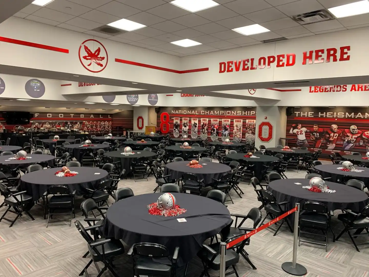
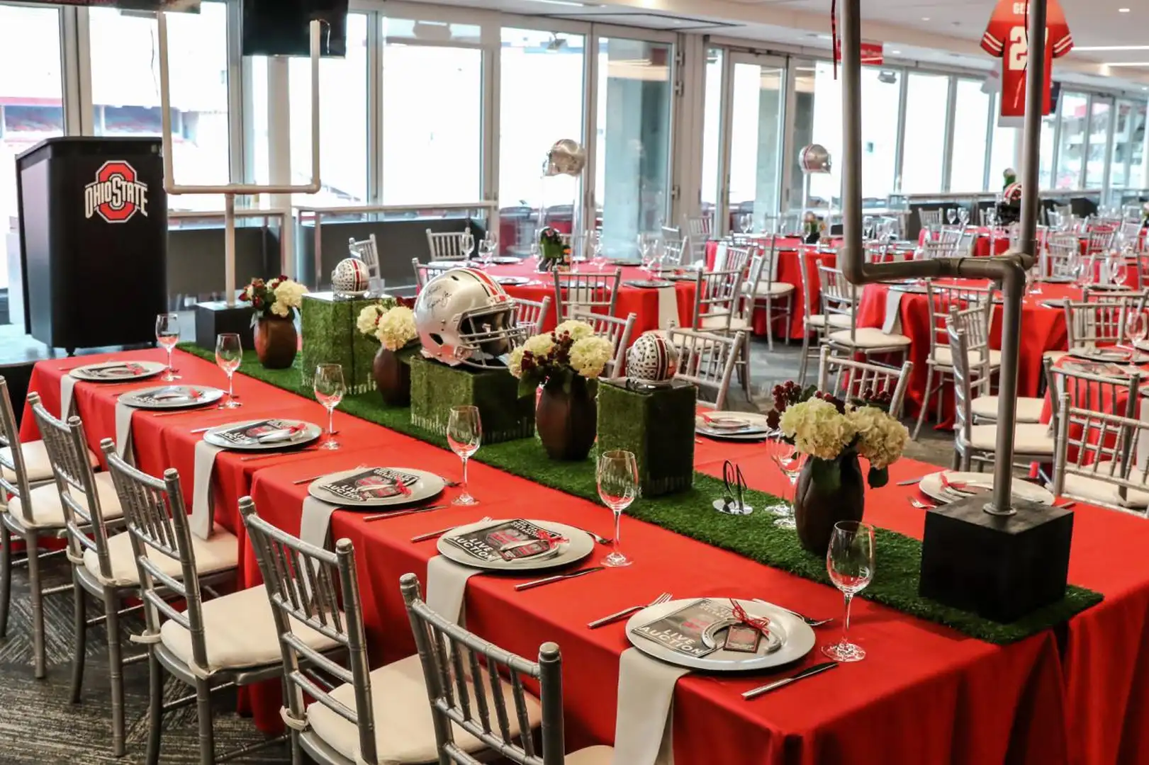
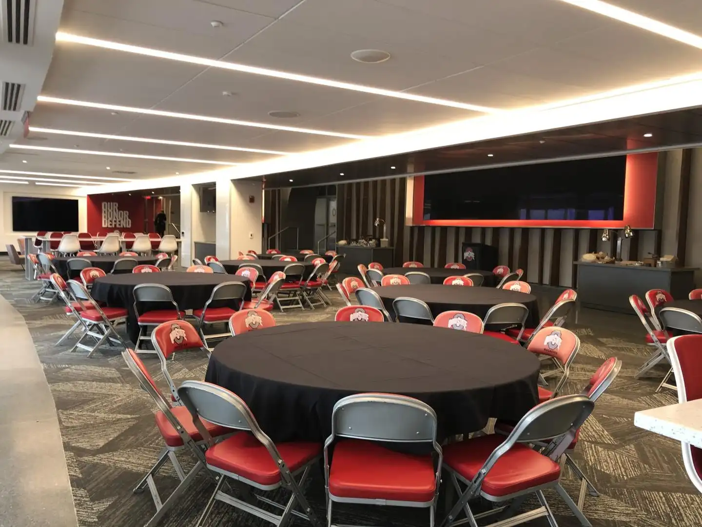
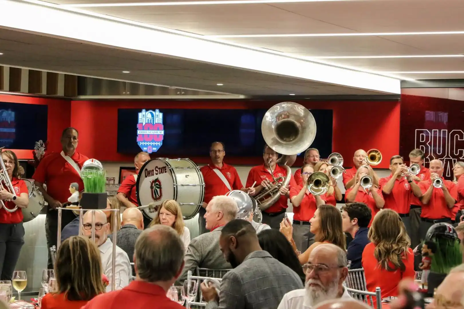
<section
class="bux-selector bux-selector--gallery"
data-slide-item-map="[[0,1],[2],[3]]"
aria-label="Areas of Ohio Stadium"
>
<div class="bux-selector__heading">
<h2 class="bux-heading bux-h2">Ohio Stadium</h2>
</div>
<div class="bux-selector__titles" role="group" aria-label="Areas">
<div class="bux-selector--gallery__announcer visually-hidden"></div>
<div class="titles__indicator" aria-hidden="true">
<div class="indicator__track"></div>
<div class="indicator__active-line"></div>
</div>
<ul class="titles__item-titles">
<li class="item-titles__title">
<button type="button" class="title__text">Dining</button>
<span class="title__text--mobile">Dining</span>
<div class="title__description">
<p class="description__text">
With the banquet room and smaller meeting rooms, dining can be
flexibly set up for between 50 and 250 people.
</p>
</div>
</li>
<li class="item-titles__title">
<button type="button" class="title__text">Field/Outdoor</button>
<span class="title__text--mobile">Field/Outdoor</span>
<div class="title__description">
<p class="description__text">
Treat your guests to a true Buckeye experience with a Stadium tour
or on-field photos.
</p>
</div>
</li>
<li class="item-titles__title">
<button type="button" class="title__text">Hallways</button>
<span class="title__text--mobile">Hallways</span>
<div class="title__description">
<p class="description__text">
Ohio Stadium offers a unique venue that will provide a remarkable
experience for you and your guests.
</p>
</div>
</li>
</ul>
</div>
<div
class="bux-carousel-controls"
aria-label="carousel navigation"
role="group"
>
<button
class="bux-carousel-controls__previous bux-carousel-controls__btn"
type="button"
aria-label="previous"
>
<span class="icon icon-chevron-left" aria-hidden="true"></span>
</button>
<button
class="bux-carousel-controls__next bux-carousel-controls__btn"
type="button"
aria-label="next"
>
<span class="icon icon-chevron-right" aria-hidden="true"></span>
</button>
</div>
<div class="bux-selector--gallery__item-controls bux-selection-dropdown">
<label class="bux-selection-dropdown__label visually-hidden">
Select an item
</label>
<span class="bux-selection-dropdown__helper-text visually-hidden">
Select an item to view its images
</span>
<div class="bux-selection-dropdown__input">
<select class="item-controls__dropdown">
<option value="0" data-item-index="0">Dining</option>
<option value="1" data-item-index="1">Field/Outdoor</option>
<option value="2" data-item-index="2">Hallways</option>
</select>
</div>
</div>
<section
class="bux-slider bux-slider--gallery bux-selector__content"
role="group"
aria-roledescription="carousel"
aria-live="polite"
>
<ul class="bux-slider__slides">
<li class="bux-slider__slide" aria-roledescription="slide">
<div
class="slide__content-wrapper"
data-grid-column-start="1"
data-grid-column-end="8"
data-grid-row-start="1"
data-grid-row-end="7"
data-full-size-url="/images/placeholders/selector/gallery/without-link/1-dining/dining-1.webp"
>
<button class="slide__image-lightbox-trigger" type="button">
<span class="visually-hidden">Open image in lightbox</span>
</button>
<img
class="slide__image slide__content"
src="/images/placeholders/selector/gallery/without-link/1-dining/dining-1.webp"
alt=""
/>
</div>
<div
class="slide__content-wrapper"
data-grid-column-start="8"
data-grid-column-end="13"
data-grid-row-start="1"
data-grid-row-end="4"
data-full-size-url="/images/placeholders/selector/gallery/without-link/1-dining/dining-2.webp"
>
<button class="slide__image-lightbox-trigger" type="button">
<span class="visually-hidden">Open image in lightbox</span>
</button>
<img
class="slide__image slide__content"
src="/images/placeholders/selector/gallery/without-link/1-dining/dining-2.webp"
alt=""
/>
</div>
<div
class="slide__content-wrapper"
data-grid-column-start="8"
data-grid-column-end="13"
data-grid-row-start="4"
data-grid-row-end="7"
data-full-size-url="/images/placeholders/selector/gallery/without-link/1-dining/dining-3.webp"
>
<button class="slide__image-lightbox-trigger" type="button">
<span class="visually-hidden">Open image in lightbox</span>
</button>
<img
class="slide__image slide__content"
src="/images/placeholders/selector/gallery/without-link/1-dining/dining-3.webp"
alt=""
/>
</div>
</li>
<li class="bux-slider__slide" aria-roledescription="slide">
<div
class="slide__content-wrapper"
data-grid-column-start="1"
data-grid-column-end="13"
data-grid-row-start="1"
data-grid-row-end="5"
data-full-size-url="/images/placeholders/selector/gallery/without-link/1-dining/dining-4.webp"
>
<button class="slide__image-lightbox-trigger" type="button">
<span class="visually-hidden">Open image in lightbox</span>
</button>
<img
class="slide__image slide__content"
src="/images/placeholders/selector/gallery/without-link/1-dining/dining-4.webp"
alt=""
/>
</div>
<div
class="slide__content-wrapper"
data-grid-column-start="1"
data-grid-column-end="6"
data-grid-row-start="5"
data-grid-row-end="7"
data-full-size-url="/images/placeholders/selector/gallery/without-link/1-dining/dining-5.webp"
>
<button class="slide__image-lightbox-trigger" type="button">
<span class="visually-hidden">Open image in lightbox</span>
</button>
<img
class="slide__image slide__content"
src="/images/placeholders/selector/gallery/without-link/1-dining/dining-5.webp"
alt=""
/>
</div>
<div
class="slide__content-wrapper"
data-grid-column-start="6"
data-grid-column-end="13"
data-grid-row-start="5"
data-grid-row-end="7"
data-full-size-url="/images/placeholders/selector/gallery/without-link/1-dining/dining-6.webp"
>
<button class="slide__image-lightbox-trigger" type="button">
<span class="visually-hidden">Open image in lightbox</span>
</button>
<img
class="slide__image slide__content"
src="/images/placeholders/selector/gallery/without-link/1-dining/dining-6.webp"
alt=""
/>
</div>
</li>
<li class="bux-slider__slide" aria-roledescription="slide">
<div
class="slide__content-wrapper"
data-grid-column-start="1"
data-grid-column-end="13"
data-grid-row-start="1"
data-grid-row-end="4"
data-full-size-url="/images/placeholders/selector/gallery/without-link/2-field-outdoor/field-outdoor-1.webp"
>
<button class="slide__image-lightbox-trigger" type="button">
<span class="visually-hidden">Open image in lightbox</span>
</button>
<img
class="slide__image slide__content"
src="/images/placeholders/selector/gallery/without-link/2-field-outdoor/field-outdoor-1.webp"
alt=""
/>
</div>
<div
class="slide__content-wrapper"
data-grid-column-start="1"
data-grid-column-end="6"
data-grid-row-start="4"
data-grid-row-end="7"
data-full-size-url="/images/placeholders/selector/gallery/without-link/2-field-outdoor/field-outdoor-2.webp"
>
<button class="slide__image-lightbox-trigger" type="button">
<span class="visually-hidden">Open image in lightbox</span>
</button>
<img
class="slide__image slide__content"
src="/images/placeholders/selector/gallery/without-link/2-field-outdoor/field-outdoor-2.webp"
alt=""
/>
</div>
<div
class="slide__content-wrapper"
data-grid-column-start="6"
data-grid-column-end="13"
data-grid-row-start="4"
data-grid-row-end="7"
data-full-size-url="/images/placeholders/selector/gallery/without-link/2-field-outdoor/field-outdoor-3.webp"
>
<button class="slide__image-lightbox-trigger" type="button">
<span class="visually-hidden">Open image in lightbox</span>
</button>
<img
class="slide__image slide__content"
src="/images/placeholders/selector/gallery/without-link/2-field-outdoor/field-outdoor-3.webp"
alt=""
/>
</div>
</li>
<li class="bux-slider__slide" aria-roledescription="slide">
<div
class="slide__content-wrapper"
data-grid-column-start="1"
data-grid-column-end="5"
data-grid-row-start="1"
data-grid-row-end="7"
data-full-size-url="/images/placeholders/selector/gallery/without-link/3-hallways/hallways-1.webp"
>
<button class="slide__image-lightbox-trigger" type="button">
<span class="visually-hidden">Open image in lightbox</span>
</button>
<img
class="slide__image slide__content"
src="/images/placeholders/selector/gallery/without-link/3-hallways/hallways-1.webp"
alt=""
/>
</div>
<div
class="slide__content-wrapper"
data-grid-column-start="5"
data-grid-column-end="9"
data-grid-row-start="1"
data-grid-row-end="7"
data-full-size-url="/images/placeholders/selector/gallery/without-link/3-hallways/hallways-2.webp"
>
<button class="slide__image-lightbox-trigger" type="button">
<span class="visually-hidden">Open image in lightbox</span>
</button>
<img
class="slide__image slide__content"
src="/images/placeholders/selector/gallery/without-link/3-hallways/hallways-2.webp"
alt=""
/>
</div>
<div
class="slide__content-wrapper"
data-grid-column-start="9"
data-grid-column-end="13"
data-grid-row-start="1"
data-grid-row-end="7"
data-full-size-url="/images/placeholders/selector/gallery/without-link/3-hallways/hallways-3.webp"
>
<button class="slide__image-lightbox-trigger" type="button">
<span class="visually-hidden">Open image in lightbox</span>
</button>
<img
class="slide__image slide__content"
src="/images/placeholders/selector/gallery/without-link/3-hallways/hallways-3.webp"
alt=""
/>
</div>
</li>
</ul>
</section>
</section>
<dialog class="bux-gallery-lightbox">
<div class="bux-gallery-lightbox__backdrop"></div>
<div class="bux-gallery-lightbox__wrapper">
<div class="bux-gallery-lightbox__close-button">
<button class="close-button__button" type="button">
<span class="visually-hidden">Close this gallery</span>
<span class="icon icon-xmark" aria-hidden="true"></span>
</button>
</div>
<div
class="bux-carousel-controls"
aria-label="carousel navigation"
role="group"
>
<button
class="bux-carousel-controls__previous bux-carousel-controls__btn"
type="button"
aria-label="previous"
>
<span class="icon icon-chevron-left" aria-hidden="true"></span>
</button>
<button
class="bux-carousel-controls__next bux-carousel-controls__btn"
type="button"
aria-label="next"
>
<span class="icon icon-chevron-right" aria-hidden="true"></span>
</button>
</div>
<div class="bux-slider bux-slider--lightbox">
<ul class="bux-slider__slides">
<li class="bux-slider__slide">
<figure class="slide__content slide__content-wrapper">
<div class="figure__image-wrapper slide__content">
<img
class="figure__image"
src="/images/placeholders/selector/gallery/without-link/1-dining/dining-1.webp"
alt=""
/>
</div>
<figcaption class="image__caption">
<div class="caption__image-counter">Image 1 of 12</div>
<div class="caption__text">
<span class="text__description"></span>
</div>
</figcaption>
</figure>
</li>
<li class="bux-slider__slide">
<figure class="slide__content slide__content-wrapper">
<div class="figure__image-wrapper slide__content">
<img
class="figure__image"
src="/images/placeholders/selector/gallery/without-link/1-dining/dining-2.webp"
alt=""
/>
</div>
<figcaption class="image__caption">
<div class="caption__image-counter">Image 2 of 12</div>
<div class="caption__text">
<span class="text__description"></span>
</div>
</figcaption>
</figure>
</li>
<li class="bux-slider__slide">
<figure class="slide__content slide__content-wrapper">
<div class="figure__image-wrapper slide__content">
<img
class="figure__image"
src="/images/placeholders/selector/gallery/without-link/1-dining/dining-3.webp"
alt=""
/>
</div>
<figcaption class="image__caption">
<div class="caption__image-counter">Image 3 of 12</div>
<div class="caption__text">
<span class="text__description"></span>
</div>
</figcaption>
</figure>
</li>
<li class="bux-slider__slide">
<figure class="slide__content slide__content-wrapper">
<div class="figure__image-wrapper slide__content">
<img
class="figure__image"
src="/images/placeholders/selector/gallery/without-link/1-dining/dining-4.webp"
alt=""
/>
</div>
<figcaption class="image__caption">
<div class="caption__image-counter">Image 4 of 12</div>
<div class="caption__text">
<span class="text__description"></span>
</div>
</figcaption>
</figure>
</li>
<li class="bux-slider__slide">
<figure class="slide__content slide__content-wrapper">
<div class="figure__image-wrapper slide__content">
<img
class="figure__image"
src="/images/placeholders/selector/gallery/without-link/1-dining/dining-5.webp"
alt=""
/>
</div>
<figcaption class="image__caption">
<div class="caption__image-counter">Image 5 of 12</div>
<div class="caption__text">
<span class="text__description"></span>
</div>
</figcaption>
</figure>
</li>
<li class="bux-slider__slide">
<figure class="slide__content slide__content-wrapper">
<div class="figure__image-wrapper slide__content">
<img
class="figure__image"
src="/images/placeholders/selector/gallery/without-link/1-dining/dining-6.webp"
alt=""
/>
</div>
<figcaption class="image__caption">
<div class="caption__image-counter">Image 6 of 12</div>
<div class="caption__text">
<span class="text__description"></span>
</div>
</figcaption>
</figure>
</li>
<li class="bux-slider__slide">
<figure class="slide__content slide__content-wrapper">
<div class="figure__image-wrapper slide__content">
<img
class="figure__image"
src="/images/placeholders/selector/gallery/without-link/2-field-outdoor/field-outdoor-1.webp"
alt=""
/>
</div>
<figcaption class="image__caption">
<div class="caption__image-counter">Image 7 of 12</div>
<div class="caption__text">
<span class="text__description"></span>
</div>
</figcaption>
</figure>
</li>
<li class="bux-slider__slide">
<figure class="slide__content slide__content-wrapper">
<div class="figure__image-wrapper slide__content">
<img
class="figure__image"
src="/images/placeholders/selector/gallery/without-link/2-field-outdoor/field-outdoor-2.webp"
alt=""
/>
</div>
<figcaption class="image__caption">
<div class="caption__image-counter">Image 8 of 12</div>
<div class="caption__text">
<span class="text__description"></span>
</div>
</figcaption>
</figure>
</li>
<li class="bux-slider__slide">
<figure class="slide__content slide__content-wrapper">
<div class="figure__image-wrapper slide__content">
<img
class="figure__image"
src="/images/placeholders/selector/gallery/without-link/2-field-outdoor/field-outdoor-3.webp"
alt=""
/>
</div>
<figcaption class="image__caption">
<div class="caption__image-counter">Image 9 of 12</div>
<div class="caption__text">
<span class="text__description"></span>
</div>
</figcaption>
</figure>
</li>
<li class="bux-slider__slide">
<figure class="slide__content slide__content-wrapper">
<div class="figure__image-wrapper slide__content">
<img
class="figure__image"
src="/images/placeholders/selector/gallery/without-link/3-hallways/hallways-1.webp"
alt=""
/>
</div>
<figcaption class="image__caption">
<div class="caption__image-counter">Image 10 of 12</div>
<div class="caption__text">
<span class="text__description"></span>
</div>
</figcaption>
</figure>
</li>
<li class="bux-slider__slide">
<figure class="slide__content slide__content-wrapper">
<div class="figure__image-wrapper slide__content">
<img
class="figure__image"
src="/images/placeholders/selector/gallery/without-link/3-hallways/hallways-2.webp"
alt=""
/>
</div>
<figcaption class="image__caption">
<div class="caption__image-counter">Image 11 of 12</div>
<div class="caption__text">
<span class="text__description"></span>
</div>
</figcaption>
</figure>
</li>
<li class="bux-slider__slide">
<figure class="slide__content slide__content-wrapper">
<div class="figure__image-wrapper slide__content">
<img
class="figure__image"
src="/images/placeholders/selector/gallery/without-link/3-hallways/hallways-3.webp"
alt=""
/>
</div>
<figcaption class="image__caption">
<div class="caption__image-counter">Image 12 of 12</div>
<div class="caption__text">
<span class="text__description"></span>
</div>
</figcaption>
</figure>
</li>
</ul>
<div
class="visually-hidden bux-gallery-lightbox__announcer"
aria-live="polite"
></div>
</div>
</div>
</dialog>
{#
Buckeye UX - version 1.7.0
Copyright (C) 2026 The Ohio State University
#}

{#

Gallery Selector

Available Variables:
  - heading:                            H2-sized heading for the whole gallery
  - heading_level:                      Semantic HTML heading tag level for overall gallery heading. Defaults to 2.
  - selector_label:                     Accessible label for the entire gallery selector component
  - items_label:                        Accessible label that describes what the item titles are
  - dropdown_label:                     Accessible label for the item selection dropdown control
  - dropdown_helper_text:               Helper text for the item selection dropdown control
  - items:                              Array of gallery items: title, description, link, and image slides array
  - previous_focusable_query_selector:  Optional. The Gallery Selector manages focus manually in its mobile layout to preseve an intuitive keyboard focus order. When the user tabs backward from the first element in the component, the Gallery Selector looks for the closest preceding focusable element automatically and focuses it. However, if you embed the Gallery Selector in an <iframe>, <object>, or <embed> and there are no focusable elements preceding the Gallery Selector within that window context, you need to provide a CSS query selector for the element in a different window context that focus should move to when tabbing backward from the component. If you do not provide one, or if the query selector does not resolve to a focusable element, the Gallery Selector will disable manual focus management to prevent a focus trap, but this will create a potentially frustrating experience for the user, as the tab order will no longer be intuitive.
  - next_focusable_query_selector:      Optional. The Gallery Selector manages focus manually in its mobile layout to preseve an intuitive keyboard focus order. When the user tabs forward from the last element in the component, the Gallery Selector looks for the closest following focusable element automatically and focuses it. However, if you embed the Gallery Selector in an <iframe>, <object>, or <embed> and there are no focusable elements after the Gallery Selector within that window context, you need to provide a CSS query selector for the element in a different window context that focus should move to when tabbing forward from the component. If you do not provide one, or if the query selector does not resolve to a focusable element, the Gallery Selector will disable manual focus management to prevent a focus trap, but this will create a potentially frustrating experience for the user, as the tab order will no longer be intuitive.

This DocBlock is auto-generated and any changes could be overwritten.
Use the component's corresponding *.config.ts to make changes to this file.

Last Updated: 07-29-2026 15:20:47
#}

{# Build a flat array of slides from the items to pass to the lightbox #}
{% set gallery_slides = [] %}
{% set lightbox_images = [] %}
{% for item in items %}
  {% for slide in item.image_slides %}
    {% set gallery_slides = gallery_slides|merge([slide]) %}
    {% for image in slide %}
      {% set lightbox_images =
        lightbox_images|merge(
          [
            {
              url: image.urls.full_size,
              alt: image.alt,
              description: image.tooltip
            }
          ]
        )
      %}
    {% endfor %}
  {% endfor %}
{% endfor %}

{# To tag each slide with the item it belongs to, we add a dataset attribute to the wrapper containing an array of
items. Each item is itself an array containing the "flat" slide indexes of the slides that belong to it. Then, the
JavaScript part of this component can parse that array and use it to assign each slide to its corresponding item.
Example:
Item 0:
- Slide 0
- Slide 1
- Slide 2
- Slide 3
Item 1:
- Slide 4
- Slide 5
Item 2:
- Slide 6
Item 3
- Slide 7
- Slide 8
Generates: [ [0, 1, 2, 3 ], [4, 5], [6], [7, 8] ]
.....Item:         0           1     2      3
#}
{% set slide_item_map = '[' %}
{% set flat_slide_index = 0 %}
{% for item in items %}
  {% set slide_item_map = slide_item_map ~ '[' %}
  {% set item_index = loop.index0 %}
  {% for slide in item.image_slides %}
    {% set slide_item_map = slide_item_map ~ flat_slide_index %}
    {% if loop.index != loop.length %}
      {% set slide_item_map = slide_item_map ~ ',' %}
    {% endif %}
    {% set flat_slide_index = flat_slide_index + 1 %}
  {% endfor %}
  {% set slide_item_map = slide_item_map ~ ']' %}
  {% if loop.index != loop.length %}
    {% set slide_item_map = slide_item_map ~ ',' %}
  {% endif %}
{% endfor %}
{% set slide_item_map = slide_item_map ~ ']' %}

<section
  class="bux-selector bux-selector--gallery"
  data-slide-item-map="{{ slide_item_map }}"
  aria-label="{{ selector_label }}"
  {{
  previous_focusable_query_selector is defined and previous_focusable_query_selector != ''
    ? 'data-previous-focusable="' ~ (previous_focusable_query_selector|escape('html_attr')) ~ '"'
  }}
  {{
  next_focusable_query_selector is defined and next_focusable_query_selector != ''
    ? 'data-next-focusable="' ~ (next_focusable_query_selector|escape('html_attr')) ~ '"'
  }}
>
  {% if heading is defined and heading != '' %}
    <div class="bux-selector__heading">
      {% include '@bux/heading/heading.twig' with {
        heading_level,
        heading_text: heading
      } only %}
    </div>
  {% endif %}

  <div class="bux-selector__titles" role="group" aria-label="{{ items_label }}">
    <div class="bux-selector--gallery__announcer visually-hidden"></div>
    <div class="titles__indicator" aria-hidden="true">
      <div class="indicator__track"></div>
      <div class="indicator__active-line"></div>
    </div>
    <ul class="titles__item-titles">
      {% for item in items %}
        <li class="item-titles__title">
          <button type="button" class="title__text">{{ item.title }}</button>
          <span class="title__text--mobile">{{ item.title }}</span>
          {% if item.description is defined or item.link is defined %}
            <div class="title__description">
              {% if item.description is defined %}
                <p class="description__text">
                  {{ item.description }}
                </p>
              {% endif %}
              {% if item.link is defined %}
                {% include '@bux/link/link.twig' with {
                  base_class: 'bux-text-link description__link',
                  link_url: item.link.link_url,
                  link_text: item.link.link_text,
                  html_attributes: item.link.html_attributes
                } only %}
              {% endif %}
            </div>
          {% endif %}
        </li>
      {% endfor %}
    </ul>
  </div>

  {% include '@bux/carousel-controls/carousel-controls.twig' %}

  <div class="bux-selector--gallery__item-controls bux-selection-dropdown">
    <label class="bux-selection-dropdown__label visually-hidden">{{ dropdown_label }}</label>
    <span class="bux-selection-dropdown__helper-text visually-hidden">{{ dropdown_helper_text }}</span>
    <div class="bux-selection-dropdown__input">
      <select class="item-controls__dropdown">
        {% for item in items %}
          <option value="{{ loop.index0 }}" data-item-index="{{ loop.index0 }}">
            {{ item.title }}
          </option>
        {% endfor %}
      </select>
    </div>
  </div>

  {% include '@bux/gallery/gallery-base/gallery-base.twig' with {
    slides: gallery_slides,
    attributes: {
      class: 'bux-selector__content'
    }
  } only %}
</section>

{% include '@bux/gallery/gallery-lightbox/gallery-lightbox.twig' with {
  images: lightbox_images
} only %}
Usage
Dos
- Use high-quality imagery that aligns to our Photography standards and guidelines, such as images from our Signature Gallery.
- Include only images that add value, prioritizing the strongest images first.
- Limit image count — typically 4-12 images total.
- Write clear and concise image captions that describe what is being shown.
- Provide clear introductory context on the page so users understand the purpose of the gallery before interacting with it. This might be a heading and paragraph introducing the topic of the gallery.
Don'ts
- Don't use low-quality images.
- Don't use groups of logos (e.g., partnerships).
- Don't overload the gallery with too many images. Users will become disengaged.
- Don't mix unrelated images that don't belong together conceptually.
Implementation Notes
Slides and image sets
The Gallery Controller takes a slides array, where each slide contains an array of images. This is an array of arrays, since each individual slide can be made up of multiple images. When used inside the Gallery Selector, each gallery item provides its slides through the item's image_slides property.
Slide grid
On wide viewports, the Gallery can display several images at a time on one slide. Each slide is divided into a grid of 12 columns and 6 rows. To place your images in this grid, specify each image's column_start, column_end, row_start, and row_end. These are column and row line numbers using CSS grid syntax, so for an image to span the full height of the slide, you'd specify row_start: 1 and row_end: 7 — not 6, because 6 is the line number that begins row 6; you specify 7 because you want it to occupy all of the last row. In the rendered HTML, these become the data-grid-column-start, data-grid-column-end, data-grid-row-start, and data-grid-row-end attributes.
Image URLs
Since the Gallery includes the Gallery Lightbox experience, each image specifies a urls.full_size URL for when it's viewed in the full-screen Gallery Lightbox and a urls.thumbnail URL for when it's displayed in the smaller Gallery slide. Make sure the thumbnail image is still large enough to display without exceeding its native size when slotted into the slide grid.
Lightbox
The click-to-open Gallery Lightbox is included by default in the Gallery Controller. When building a gallery directly on top of the Gallery Base, pass with_lightbox: true to include it.
Accessibility
Image captions
Image captions (provided via each image's tooltip) are not a replacement for or duplicate of alt text.
- Alt text is required and must describe the visual content of the image to a user who cannot see it.
- Image captions are optional and explain why the image is significant.
Both sets of text are accessible to users of assistive technology, so ensure that they are not repetitive. Image captions should contain only text, and no interactive elements like links or buttons.
For example, for an overhead photo of a library:
Alt text: An overhead view of students working at tables in the Orton Hall library.
Caption: Surrounded by knowledge and famed architecture, Orton Hall is a popular study spot.
Controlling the Gallery
The Gallery should only change slides in response to the user's action. Don't programmatically change slides using a timer or other mechanism.
Gallery Selector — details
Usage
Dos
- Use high-quality imagery that aligns to our Photography standards and guidelines, such as images from our Signature Gallery.
- Include only images that add value, prioritizing the strongest images first.
- Limit image count — typically 4-12 images total.
- Write clear and concise titles and supporting text.
- Write clear and concise image captions that name the space and describe the activity shown.
Don'ts
- Don't use low-quality images.
- Don't use groups of logos (e.g., partnerships).
- Don't overload the gallery with more than 12 images.
- Don't mix unrelated images that don't belong together conceptually.
Implementation Notes
The Gallery Selector shares the same slide grid and image URL rules as the Gallery. Provide your galleries through the items variable — each item has a title, an optional description, an optional link, and an image_slides array (an array of arrays, since each slide can hold multiple images).
Mapping slides to items without Twig
For the component to seamlessly transition between galleries — and to display images one at a time on narrow viewports — every gallery's slides are rendered together in the content area. The component therefore needs to know which slides belong to which item.
If you implement the Gallery Selector without the Twig templates, tag the content wrapper with a data-slide-item-map attribute containing an array of items. Each item is itself an array of the "flat" slide indexes that belong to it. The component's JavaScript parses this array to assign each slide to its corresponding item.
For example, with galleries containing 4, 1, 1, 1, 1, and 1 slides respectively:
data-slide-item-map="[[0,1,2,3],[4],[5],[6],[7],[8]]"
Accessibility
Labels
To make the component understandable to screen reader users, provide the following labels:
heading— an H2-sized heading that labels the entire component. Examples could include "Explore Ohio State campuses" or "Areas of Ohio Stadium."dropdown_label— the accessible label for the item-selection dropdown shown on narrow viewports.dropdown_helper_text— helper text for that dropdown control.
Heading level
By default, the Gallery Selector's heading is rendered as an <h2> tag. If you need to use a different heading level to maintain a logical heading order on your page, provide the appropriate level with the heading_level variable. This is a number that defaults to 2. It changes the semantic HTML heading tag without affecting the heading's visual appearance.
Image captions
The same image caption and alt text guidance as the Gallery applies here.
Controlling the Gallery Selector
The Gallery Selector should only change slides in response to the user's action. Don't programmatically change slides using a timer or other mechanism.
Focus management
On narrow viewports, the component manually manages focus because the element order in the DOM doesn't follow a logical tabbing order — a result of how elements re-flow from desktop to mobile. The JavaScript identifies and focuses the first focusable element that follows or precedes the component in the DOM when tabbing out forward or backward, respectively. This is the desired behavior in the vast majority of use cases.
If you need to override this behavior — for example, because the DOM structure before or after the Gallery Selector does not follow a logical visual or structural tab order, or because you've embedded the component in an iframe — you can specify a previous and next focusable element by providing a valid query selector to the component wrapper via the data-previous-focusable and data-next-focusable attributes. If these are not found or do not resolve to a valid focusable element, the component logs a warning in the console and disables its manual focus management to prevent a focus trap.
References
- See Gallery Selector components on osu.edu and osu.edu/about.