
CTA Banner

A prominent banner that uses concise messaging to drive user engagement toward a primary action.

A CTA Banner displays prominent, actionable or informational content within a webpage using concise messaging to drive user engagement.

The CTA Banner is a prominent component designed to draw attention to important information or a primary action. It combines a clear headline, optional supporting text, an optional standard icon or image, and an optional interactive element (for example, a button or form input) into a visually distinct section that stands apart from surrounding content.

Examples

Text Only

Providing no modifiers to the bux-cta-banner class produces the default text-only variant.

Ohio State's Shared Values
Our shared values advance our work in teaching, learning, research, and service.
<div class="bux-cta-banner">
<div class="bux-cta-banner__content">
<div class="bux-cta-banner__body">
<div class="bux-cta-banner__heading">Ohio State's Shared Values</div>
<div class="bux-cta-banner__text">
Our shared values advance our work in teaching, learning, research, and
service.
</div>
</div>

<div class="bux-cta-banner__link">
<a class="bux-button" href="#" rel="noopener">
<span class="bux-button__text">Give today</span>
</a>
</div>
</div>
</div>

With Icon

The --with-icon modifier displays a Standard icon from the DAM alongside the message.

Creating impact now and for the future
Your gift empowers students, fuels research, and strengthens programs that keep the College of XYZ at the forefront of education. Every contribution creates opportunities and drives innovation for generations.
<div class="bux-cta-banner bux-cta-banner--with-icon">
<div class="bux-cta-banner__content">
<img
class="bux-image"
src="/images/placeholders/donate_standard_icon.svg"
alt=""
height=""
width=""
/>

<div class="bux-cta-banner__body">
<div class="bux-cta-banner__heading">
Creating impact now and for the future
</div>
<div class="bux-cta-banner__text">
Your gift empowers students, fuels research, and strengthens programs
that keep the College of XYZ at the forefront of education. Every
contribution creates opportunities and drives innovation for
generations.
</div>
</div>

<div class="bux-cta-banner__link">
<a class="bux-button" href="#" rel="noopener">
<span class="bux-button__text">Give today</span>
</a>
</div>
</div>
</div>

With Form

The --with-form modifier includes a single interactive form input as the primary action.

Join our email list
Stay updated on our programs and events that impact students and campus life.
<div class="bux-cta-banner bux-cta-banner--with-form">
<div class="bux-cta-banner__content">
<img
class="bux-image"
src="/images/placeholders/envelope_open.svg"
alt=""
height=""
width=""
/>

<div class="bux-cta-banner__body">
<div class="bux-cta-banner__heading">Join our email list</div>
<div class="bux-cta-banner__text">
Stay updated on our programs and events that impact students and campus
life.
</div>
</div>

<div class="bux-cta-banner__link">
<div class="bux-text-field">
<label
class="bux-descriptor bux-text-field__label"
for="bux-text-field__text-field-1240380957"
>
Email
</label>

<input
id="bux-text-field__text-field-1240380957"
class="bux-text-field__input bux-text-field__input--with-form"
placeholder="Email"
name="email"
aria-describedby="false"
aria-invalid="false"
/>
</div>

<a class="bux-button bux-button--alt" href="#" rel="noopener">
<span class="bux-button__text bux-button--alt__text">Submit</span>
</a>
</div>
</div>
</div>

With Image

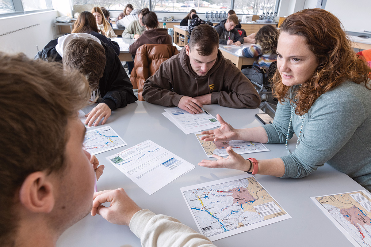
The --with-image modifier displays a supporting image. Images crop to a 16 / 9 ratio, so it's best to provide an image with that aspect ratio.
Graduates performing the O-H-I-O pose
Creating impact now and for the future
Your gift empowers students, fuels research, and strengthens programs that keep the College of XYZ at the forefront of education. Every contribution creates opportunities and drives innovation for generations.
<div class="bux-cta-banner bux-cta-banner--with-image">
<div class="bux-cta-banner__content">
<img
class="bux-image"
src="/images/placeholders/students-working-at-desk.jpg"
alt="Graduates performing the O-H-I-O pose"
height=""
width=""
/>

<div class="bux-cta-banner__body">
<div class="bux-cta-banner__heading">
Creating impact now and for the future
</div>
<div class="bux-cta-banner__text">
Your gift empowers students, fuels research, and strengthens programs
that keep the College of XYZ at the forefront of education. Every
contribution creates opportunities and drives innovation for
generations.
</div>
</div>

<div class="bux-cta-banner__link">
<a class="bux-button" href="#" rel="noopener">
<span class="bux-button__text">Give today</span>
</a>
</div>
</div>
</div>

Usage

Dos

  • Use the CTA Banner to communicate high-priority information or reinforce primary actions (e.g., apply, register, contact).
  • Keep messaging short, focused, and action-oriented.
  • Use only one primary interactive element (e.g., a button or form field).
  • Use an icon only if it is meaningful and supportive of the message. This component requires a Standard icon from the DAM, not a UI icon.
  • Place it near the bottom of a page (just above the Site Footer) or after key content sections, where it can act as a natural point of interruption.

Don'ts

  • Don't overuse banners, as this reduces their effectiveness and creates visual clutter; don't stack multiple banners unless absolutely necessary.
  • Don't overload the banner with multiple paragraphs.
  • Don't include more than one interactive element (e.g., a button or form field).
  • Don't include an icon if it is not meaningful and supportive of the message.
  • Don't place it at the very top of a page, because this component is intended to be secondary to the main content.

Implementation Notes

  • Modifiers
    • Providing no modifiers to the bux-cta-banner class defaults to the text only variant.
    • Available modifiers are --with-icon, --with-form, and --with-image.
  • Image variant
    • Images crop to a 16 / 9 ratio, so it's best to provide an image with that aspect ratio.
  • Icons
    • Variants with icons use a filter CSS property to invert the icon for dark mode.

Accessibility

  • Keep the heading concise and descriptive so its purpose is clear when read out of context by assistive technology.
  • Ensure any interactive element clearly communicates its purpose; the button or form label should make sense on its own.
  • When using the icon variant, the icon is decorative and supportive of the text, so its alt attribute is intentionally left empty (alt="") to hide it from assistive technology.
  • When using the image variant, provide meaningful alt text that describes the image's content.
Back to top